


Tracking metrics can be challenging, but visual analytics make it easier to spot spikes, drops, and outliers that impact our processes. Control charts are one such visual tool that, when combined with other charts, can help uncover the root causes of these trends.
In this blog, part of the Explaining with series, I will go over what Control Charts are, diving a bit into what they can do for you, followed by how to build them in Power BI and make them respond to slicers and filters.
As per usual, the Power BI report is available on my Explaining with GitHub repository if you'd like to dive into it straight away.
1. What are Control Charts and how can they help you?
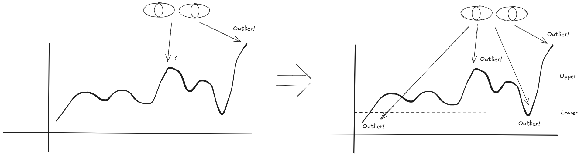
Control charts support us by providing insight into the stability and variation of a process over time. As humans we are pretty good at spotting 'outliers' by eye when it's just a few of them. But once we reach a certain threshold it'll become hard to distinguish and we make a human judgement. This is where control charts come in where we set upper and lower control limits, based on the visual data points, to help us identify those outliers/anomalies, trends and patterns, to take some of the guess work away from us.
All sorts of data can be plotted using Control Charts. Sales trends, customer satisfaction, manufacturing quality, etc.
Whichever we choose to plot, it'll give us additional information about our process:
- Is there variability or are we in control?
- Are there factors contributing to our peaks and throughs?
So how do we set our lower and upper boundaries? We typically assess it based on the data points variation. By calculating metrics as the standard deviation of the data points, we can then set our boundaries based on a multiplication of standard deviations away from our average observation.
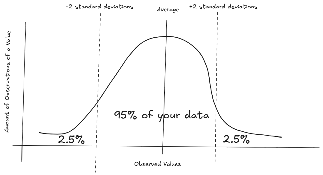
The image above might look familiar, and if not, don't worry let me try to break it down for you.
Think of it as a normal histogram, where we get observed values (x-axis) and count how many times it occurred (y-axis). So let's say we produce size 11 shoes and we measure the length of those shoes every time we make one. Preferably, all shoes will be exactly the same length, in reality there will be a bit of variation. Most of the time it'll be 11 inch, sometimes 11 inch and 1/4 or 10 inch and 3/4, etc.
If we make a bunch of shoes, eventually our histogram should look very close to the above, a normal distribution. Our average (mean) is 11 inch and the spread of all the data points surrounding the mean can be defined by a number called the standard deviation. The larger the standard deviation, the wider the spread of the data points. Luckily, most tools nowadays have functions available to calculate those, but to give you an idea on how it's calculated:
- We take the mean of the data points
- Subtract the mean from all observed data points
- Take the square of each subtraction and sum them
- Divide it by the amount of observations (-1 in case of sample), this is the variance
- Take the square root of that to obtain the standard deviation.
In a normal distribution example, like the image above, we know that if we move +2 and -2 standard deviations away from the mean, we end up with covering 95% of all our data points. Go +3 and -3 and that % goes up to 99.7 or if we go down to +1/-1 we have ~68%.
In most cases though, we'd prefer not to look at the histogram version but instead plot it on a line chart of observations, where the x-axis is a points in time or a batch of shoes, and the y-axis is your observation value.
Sort of a histogram turned 90 degrees.
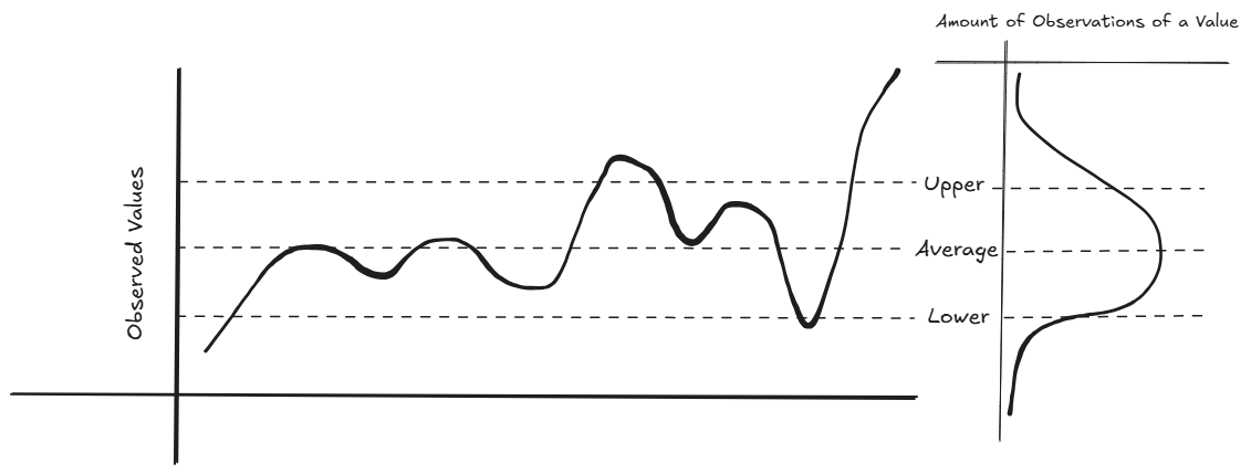
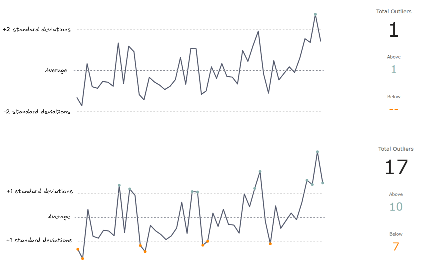
Based on the above, we can determine our upper and lower limits, and typically having the option to dynamically change between 1-3 standard deviations will be helpful to find our data points of interest.
Your data does NOT have to be normally distributed for a Control Chart to work. However, it will be good to keep in mind what the distribution of your data is before making any decisions. As long as we are approaching normal distribution, we are set as we simply want to make our visual decisions quicker to then dive into those points and check the underlying data.
If your data approaches a different type of distribution, like exponential, there are other ways to determine the upper and lower limits, (X-R charts, Individuals Control Charts and more) but these are simple variations on this and out of scope for now.
Once we find our outliers, it could be enough (this batch of products need to be looked at) or we need to dive deeper to figure out what has caused this? Keep in mind that outliers are not necessarily a bad thing, it requires context.
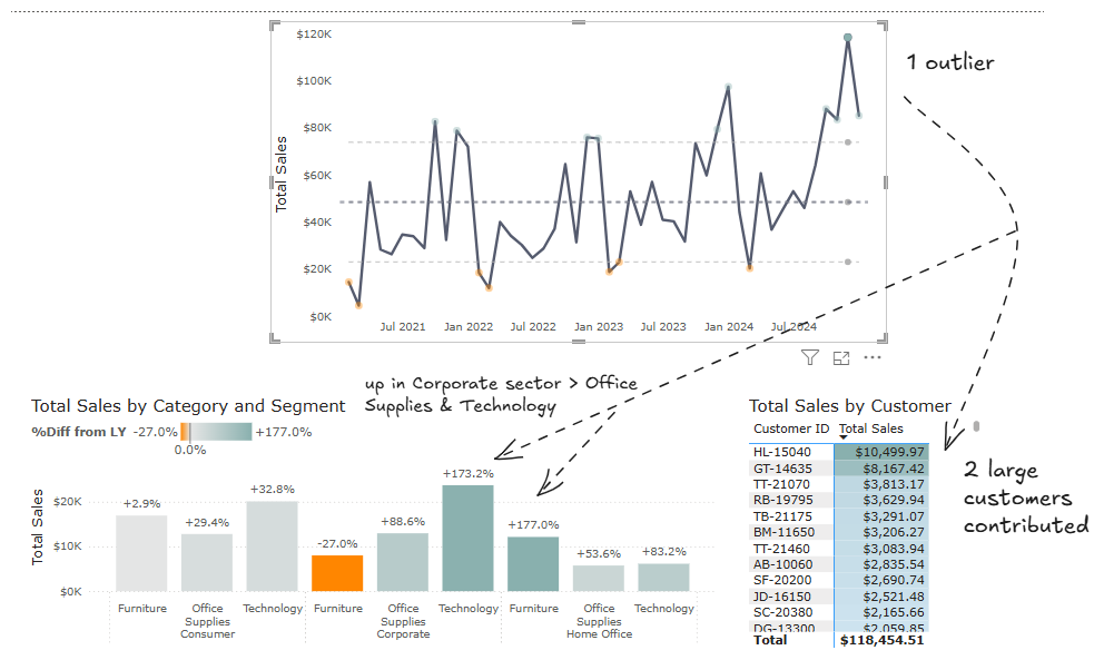
As an example, the Control Chart has two supporting visuals that allow us to dive into the underlying data points. A big sales increase is highlighted and by clicking on the mark, two customers are identified that contributed nearly 10% to this and our office supplies and technology products are nearly tripled for in our Corporate Segment versus last year. Can we continue this going forward?
2. How to build dynamic Control Charts in Power BI
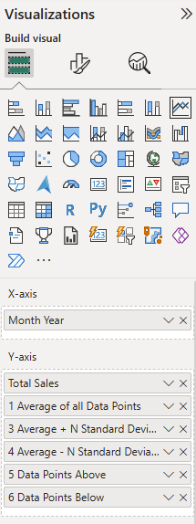
Our aim is the left part of the page above.
I'll breakdown the calculations into steps below, but feel free to jump into the report yourself and go through the numbered versions of the measures (1 to 6) in the _measures explained table.
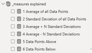
We start with a measure that computes our value we want to track, in the Report we have a single column that stores our individual sales records and our measure is the sum of that column.
Total Sales =
SUM(Orders[Sales])
Measure
From there we calculate the average of all data points, specifying the x-axis we are going to use to plot our data. If you want the x-axis to be dynamic, please refer to the _measures table for examples of how to switch out the Month Year with others.
1 Average of all Data Points =
AVERAGEX(
    ALL(_date[Month Year])
    ,[Total Sales]
)
//total sales gets evaluated over the month year and averaged out (the mean)
//it returns the average of the sum of sales, e.g. every mark, visible in the visual
//this is the same value as the average line in the Analytics tab returns
Measure
Similarly, we calculate the standard deviation of the sample on the data points.
2 Standard Deviation of all Data Points =
STDEVX.S(
    ALL(_date[Month Year])
    ,[Total Sales]
)
//total sales gets evaluated over the month year and the standard deviation sample gets calculated
//it returns the standard deviation of the sum of sales, e.g. every mark, visible in the visual
//the standard deviation is a measure to describe the spread of the data, how far marks are from the average (mean). The larger the value, the more spread apart the data is.
//we use this metric to find out if marks are within 1, 2, 3 standard deviations from the average (mean)
//the further away the mark, the larger we can consider the outlier
Measure
We don't need the first two calculations in our visuals, but they are combined together to return our upper and lower limits.
Before we combine them, we can create a parameter (or table if you prefer), where we generate a series of numbers between 1 and 3.
For the parameter option; go to Modeling tab, New parameter, numeric range.
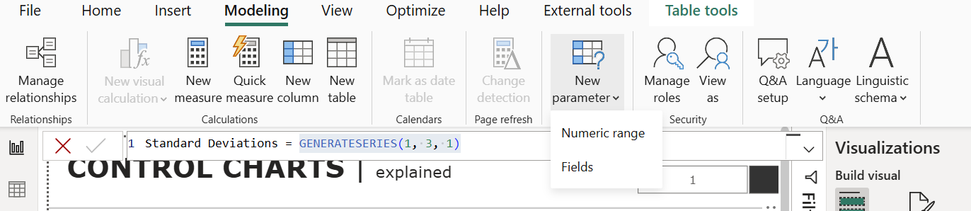
A window will pop-up, were we can set it up to have a minimum of 1, max of 3 (or whichever desired), increment of 1 and a default you prefer.
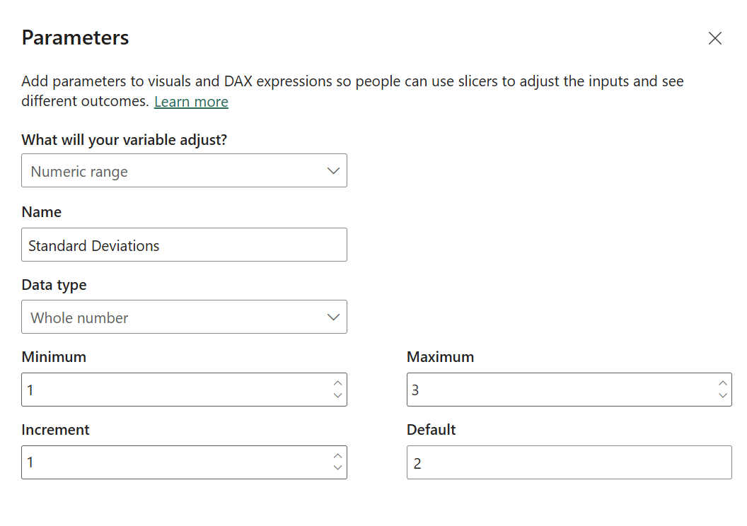
This parameter is now simply a table, disconnected from the data model where we can refer to a selected value of the parameter and use it as a multiplier.
Up next, we create our upper and lower limits.
3 Average + N Standard Deviations =
[1 Average of all Data Points] + [2 Standard Deviation of all Data Points] * 'Standard Deviations'[Standard Deviations Value]
Measure
4 Average - N Standard Deviations =
[1 Average of all Data Points] - [2 Standard Deviation of all Data Points] * 'Standard Deviations'[Standard Deviations Value]
Measure
Lastly, to make it easier for the user to see the marks, we create two measures that we can use as data marks only to show as dots on the line visual.
5 Data Points Above =
IF(
    [Total Sales]>[3 Average + N Standard Deviations]
    ,[Total Sales]
)
//Returns Total Sales only if it's above the amount of standard deviations set by the user
//when adding these to the line chart visual, we turn the line off (show for this series > off) and the markers on
Measure
6 Data Points Below =
IF(
    [Total Sales]<[4 Average - N Standard Deviations]
    ,[Total Sales]
)
//Returns Total Sales only if it's below the amount of standard deviations set by the user
//when adding these to the line chart visual, we turn the line off (show for this series > off) and the markers on
Measure
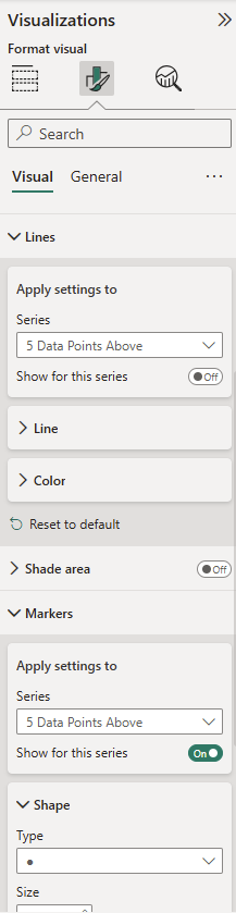
Start by dragging all the measures except for 2 (the standard deviation) and your x-axis of choice onto the line visual and make sure a standard deviation slicer is present to select a value.
Measures 5 & 6 will require some formatting, where we turn their lines off and their markers on.
Beyond that it's your preference on what you'd like to add or remove to the visual.
The average and standard deviations (1,3,4) can be added as constant y-axis lines instead. Just keep in mind that if you go for a switch statement, constant y-axis lines won't work.
And that's it. Additional calculations can be done to retrieve the number of outliers or allow for x-axis switching. These can be found in the report but are a bit more involved to make it work. It still follows the same logic though, so good luck!