Our project this week for DS 39 is to apply all the new skills we have learnt in Tableau Desktop to our first viz completed for the Data School application. That was the first time I have ever opened Tableau and looking back on my work in a new perspective allowed me to see where I could have better decisions based on practices. Which, is amazing to think as I have learnt a lot of new skills in a short amount of time! For the project we were asked to observe the positives and negatives of our original viz and suggest any safe and unsafe changes we would make (safe meaning easy fixes and unsafe meaning techniques we want to apply in theory but do not know how to do practically).
Positives:
In terms of things I did well, the layout of my graphs and text was well organized. The viz incorporated different orientations to keep the reader engaged whilst also being coherent. Each different variable that was being analyzed in the graphs was highlighted a different color and in bold to be prominent to the reader but also display the clear intentions of what information each graph was visualizing.
Negatives:
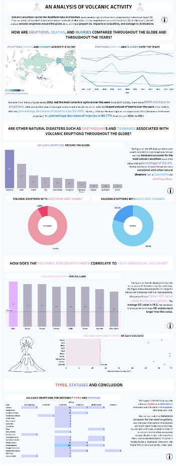
The color scheme did not match the data at all and it is very heavy on the eyes using a pastel palette. The countries with an average eruption count look lighter in color due to the white border around the countries. Since the eruption count is visualized through color, the border makes them seem to have a lower eruption count. The line graph displays three different measures without any axis so, the analysis below is not correct. Also, there are too many graphs which analyze the same detail so this can be summarized.
Safe changes:
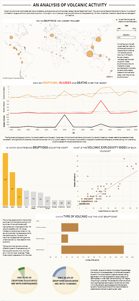
I started by making adjustments to the map by using a darker color and using circles with a black border instead of highlighting the country. I also, used the ZN function to return 0 values instead of nulls in the tooltips. Next, I adjusted the line graph and added individual axis to each measure with gridlines. The bar chart was adjusted to set actions which also filter through time. The bar chart which displays eruption count per volcano and the table with type and status with eruption count were removed and replaced with a drill down bar chart. The scatter plot was also adjusted by size and displays all the volcanos with a trendline. Colors were also changed and filters were added which work on multiple charts.
Unsafe Changes:
My unsafe change would be adding the ring of fire or tectonic plate data onto the map but this requires understanding geospatial data and implementing it.
When I first made this viz, I was very proud of my work and critiquing it was a bit difficult because I felt that my hard work did not result to a good viz. However, this project helped me understand what I did well and what could be improved. Recognizing these improvements means that I have learnt better practices and I have more learning to do which, is quite exciting!
Let's look at the difference!