


This week's project involved recreating an old dashboard from Andy Kriebel and making small changes to it. Only until this week, I have never used containers or even the tiled option to design my dashboard. However, a design and layout lesson with Ellen Blackburn taught how time efficient containers are and little adjustments that can take your dashboard from looking very simple to elegant. Surprisingly, this project taught me a lot of things in terms of preparation and design layout within a time limit, so here are a few tips and tricks when it comes to designing a dashboard.
TIP 1: Plan your dashboard
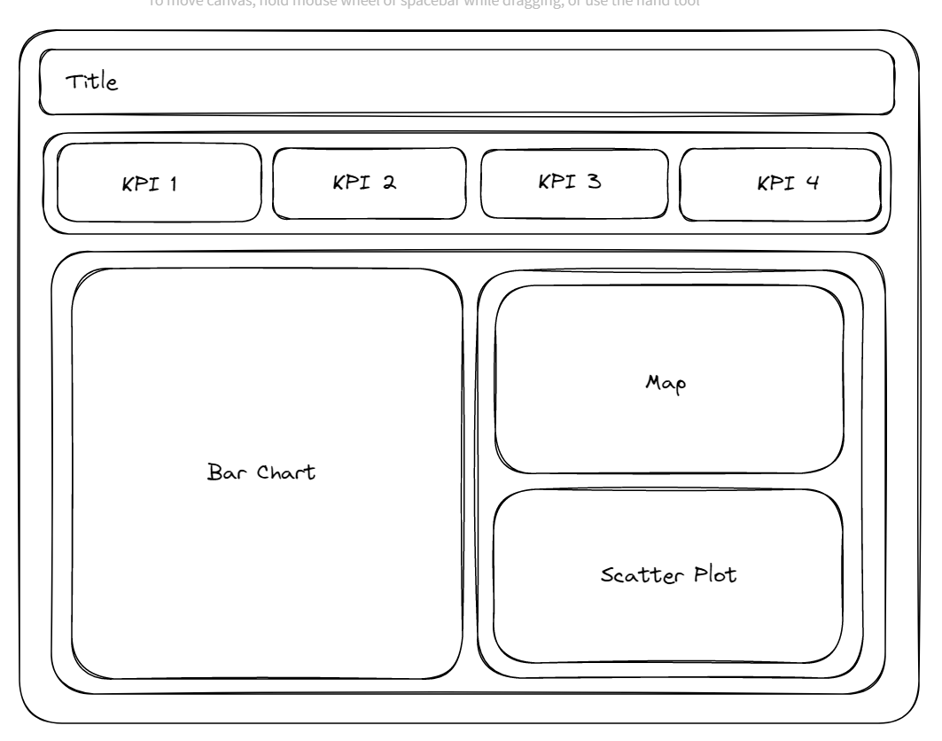
Using Excalidraw to roughly plan the layout of your dashboard can really help understand where you want your containers to be placed. This can prevent adjusting containers and messing up your whole layout.
TIP 2: Color coordination
Bold colors can be very harsh to the eyes, by reducing the opacity of the colors chosen in the marks card allows the dashboard to be much more inviting. Make sure to have no more than 5 colors on your dashboard including the dashboard background color. Lastly, consider accessibility in terms of color blindness, avoid putting red and green together especially. If you are struggling to come up with a color palette, try using https://coolors.co/ and read my blog on importing color palettes!
Tip 3: Line up everything
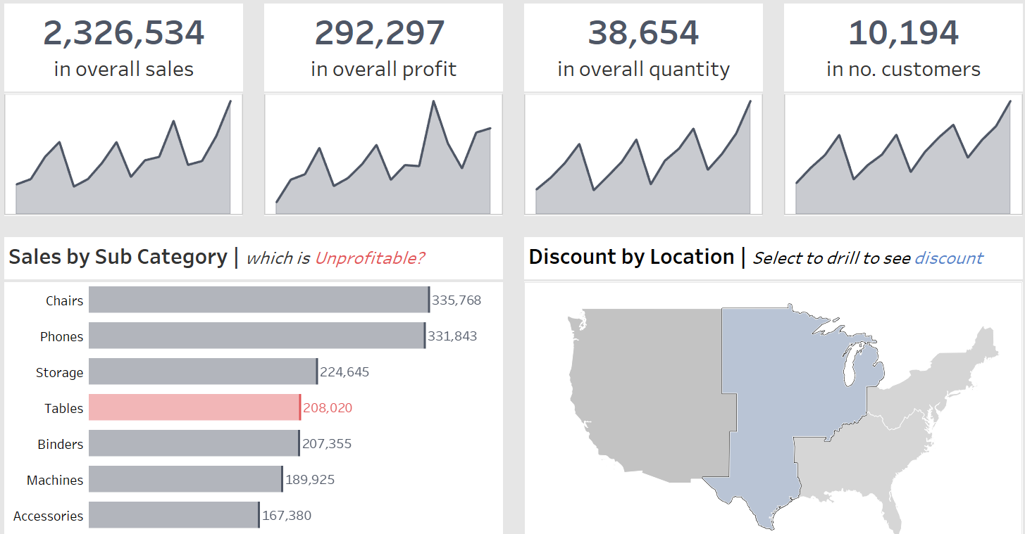
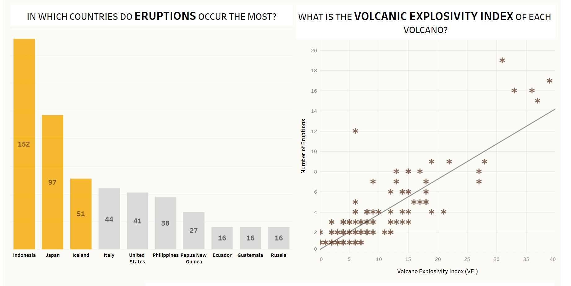
Having each chart and text container line up nicely takes your dashboard to the next level by adding a professional touch to it. As someone who used to make every dashboard by using the floating option - it is very time consuming by adjusting the height, width and positions manually. But, be very careful as containers can be very hard to fiddle with as well. I recommend watching Andy Kriebel's YouTube video on mastering containers. Below is an example of how charts which are not lined up properly look less professional compared to the dashboard displayed above.
By applying these small tips can make your dashboard look very presentable. Hopefully this blog helps with planning and designing a dashboard and make sure to be creative and have fun with it!