


For my personal project, I decided to take one of the dashboards I have hidden on Tableau Public and improve on the design and analysis. This was a Makeover Monday I completed before joining the Data School and it was about internet speeds across Europe. The links to the data, Andy and Eva's video will be attached at the bottom of the blog post. In this blog, I am going to explain my my first attempt at the Makeover Monday challenge, three things I did well and three things that needed to be improved. Then, explain my thought process for my improved version of the dashboard.
My First Attempt
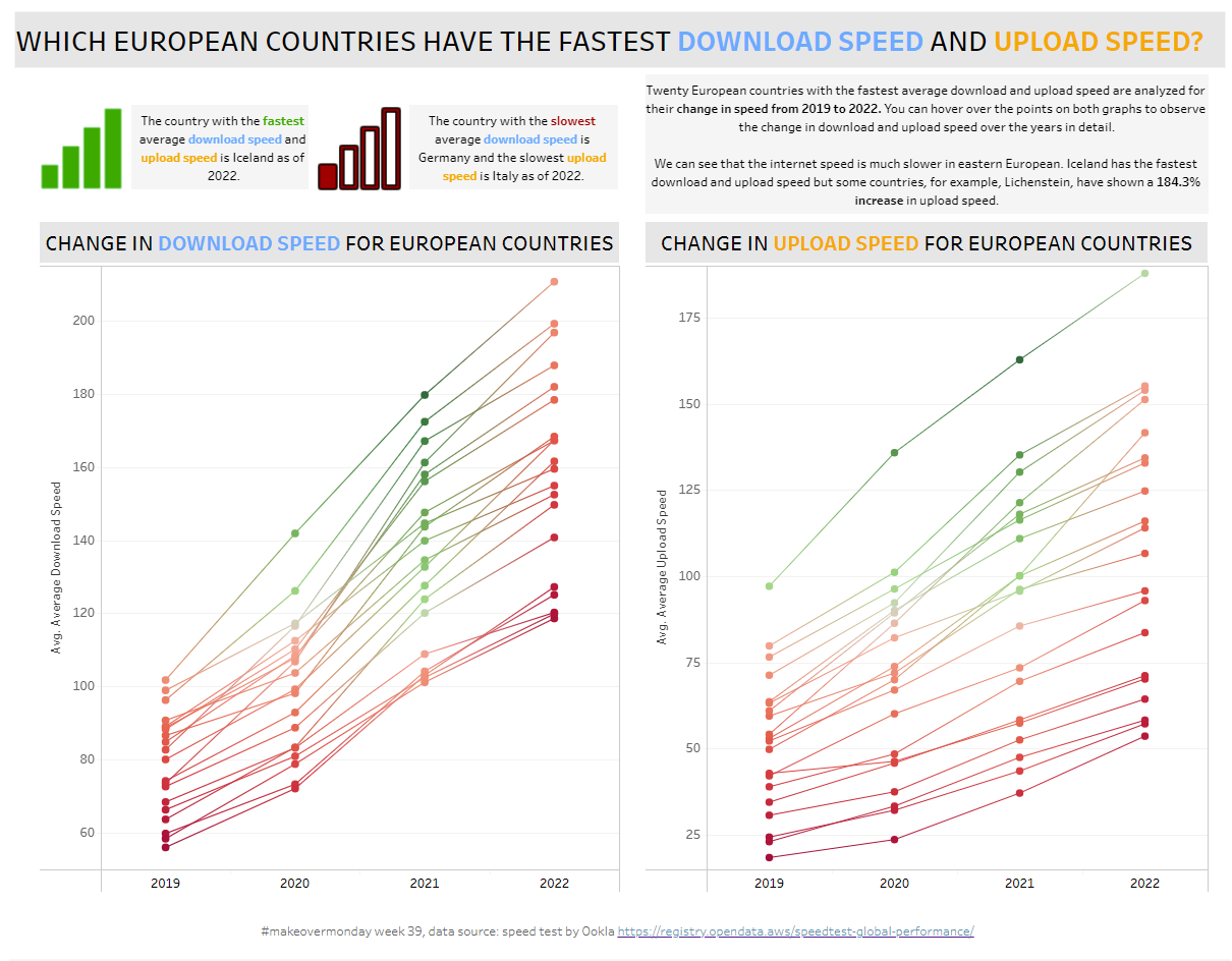
Things I did well
- Provided some context in the text
- Provided a color code for the fastest and slowest download/upload speed
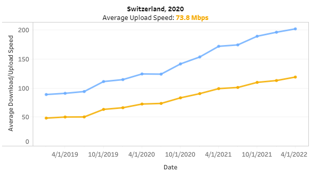
- Added additional information in the tooltips by showing the change in speed for a specific country
Things that I needed to improve
- Red and green is not accessible friendly
- The color palette aggregation is not matching the aggregation on the chart
- The chart is not providing a lot of context (the text is doing all the work)
My Second Attempt
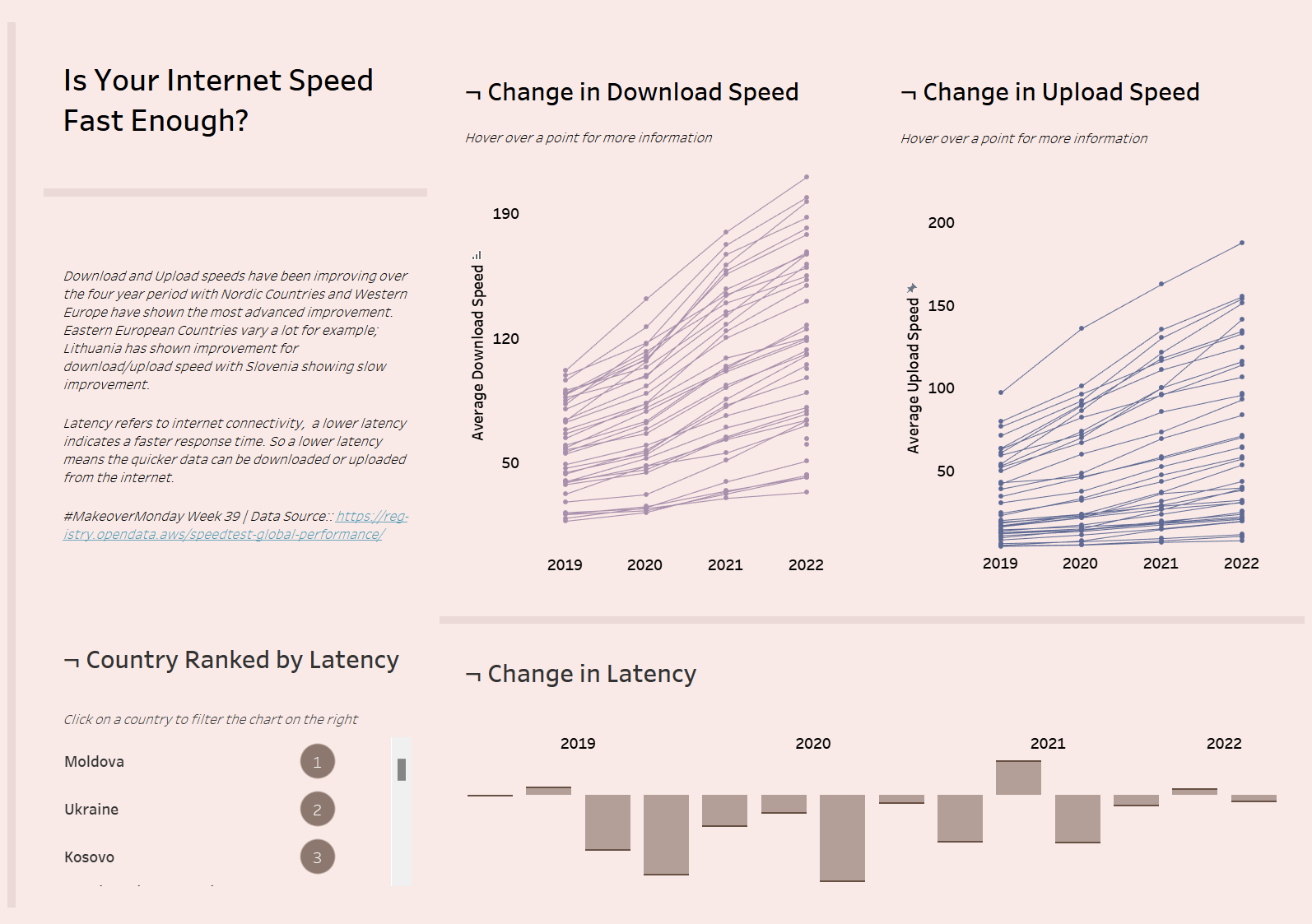
My thought process of improving the dashboard
- My first step was the fix the line chart colors, the red and green was not necessary and the fastest and slowest internet is indicated by the axis
- I kept the change in internet speed for each country chart in the tooltip
- I added a bar chart to show the change in latency for each country
- Added a table to show the ranking of each country in terms of latency
- Utilized containers for my layout
- Added a filter action, clicking on a country in the table filters the change in latency
- Added a highlight action, clicking on a country in the table highlights that country on the line charts
- Provided additional context by text and added user friendly instructions for each chart in terms of functionality
Links
Makeover Monday Dataset: https://data.world/makeovermonday/2022w39
Andy Kriebel Watch Me Viz: https://www.youtube.com/watch?v=fTaxKVEmplk
Eva Murray Viz Review: https://www.youtube.com/watch?v=FqcS5qVIqKQ