


Today was a simple task, similar to Makeover Monday. We were required the use the World Happiness Report dataset and create a dashboard in Tableau, no data prep was needed so I just got stuck into the data!
9:00 - 10:00 am
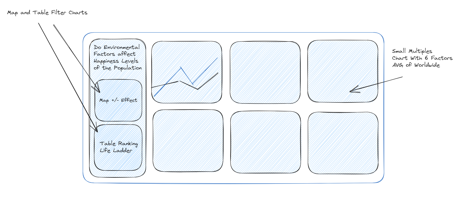
Had a look through the data and analysed what fields and measures I had to work with. I initially wanted to narrow my scope and focus on one country to tell more of a story but since I had a shorter timeframe for this task, I decided on doing an overview.
10:00 - 11:00 am
Planned out my dashboard with a sketch and realized since I had a lot of measures I needed to tackle change blindness. So I used six different line charts with the world average line for comparison. I also understood that the life ladder is a measure of quality of life for each country so I used this as a main filter.
11:00 - 12:00 pm
Started building my charts and formatting. I came across some trouble with creating my world average line as I was using a table calculation instead of an LOD but I was able to fix this.
Overall, I kept it very simple since yesterday I was too ambitious and it worked in my favour. There are a few things to clean up such as tooltips and more information in my icons but I am very proud to end my training with this dashboard! Here is the link to it: https://public.tableau.com/app/profile/reshika.chilakapati/viz/WorldHappinessReport_16905584199670/Dashboard1?publish=yes