Today, we were required to use PowerBi to analyze Eurovision data! Unfortunately, I had no clue what Eurovision was and have never watched it in my life. So today involved conducting a lot of research on my end and trying to pull a good story together to present an explanatory dashboard whilst also navigating my challenges with PowerBi. Tough challenges can actually be very fun in this case!
9:00 - 10:00 am
Received the data set but before I actually touched the data, I spent this hour on Chat GPT asking generic questions on Eurovision and how the competition works. I also generated some dashboard ideas from Chat GPT. The one that resonated with me the most was analyzing the genre of the winning song but I felt like I could explore this further...
10:00 - 11:00 am
I remembered that I spent a lot of my childhood watching MTV which involved watching the UK top 40 charts, this gave me an idea which was to see if the number one song in the UK for each correlated to the amount of votes the UK's song entry received in terms of genre. This was very ambitious looking back but I believed if it worked I would have been able to draw some really interesting insight from it. So, I started my sketch which was to have a timeline of the song entries, a filter for the genre and a table showing the number one song in the UK for each year.
11:00 - 12:00 pm
Tried to create the timeline by downloading sample visuals from the gallery but these were not reliable. I then tried another idea which was a bar chart showing the difference in votes from the previous year and formatting that into a timeline. I ran into trouble using the SAMEYEARLASTPERIOD function which was not giving me the previous year. I had to scrap the timeline and use a regular bar chart.
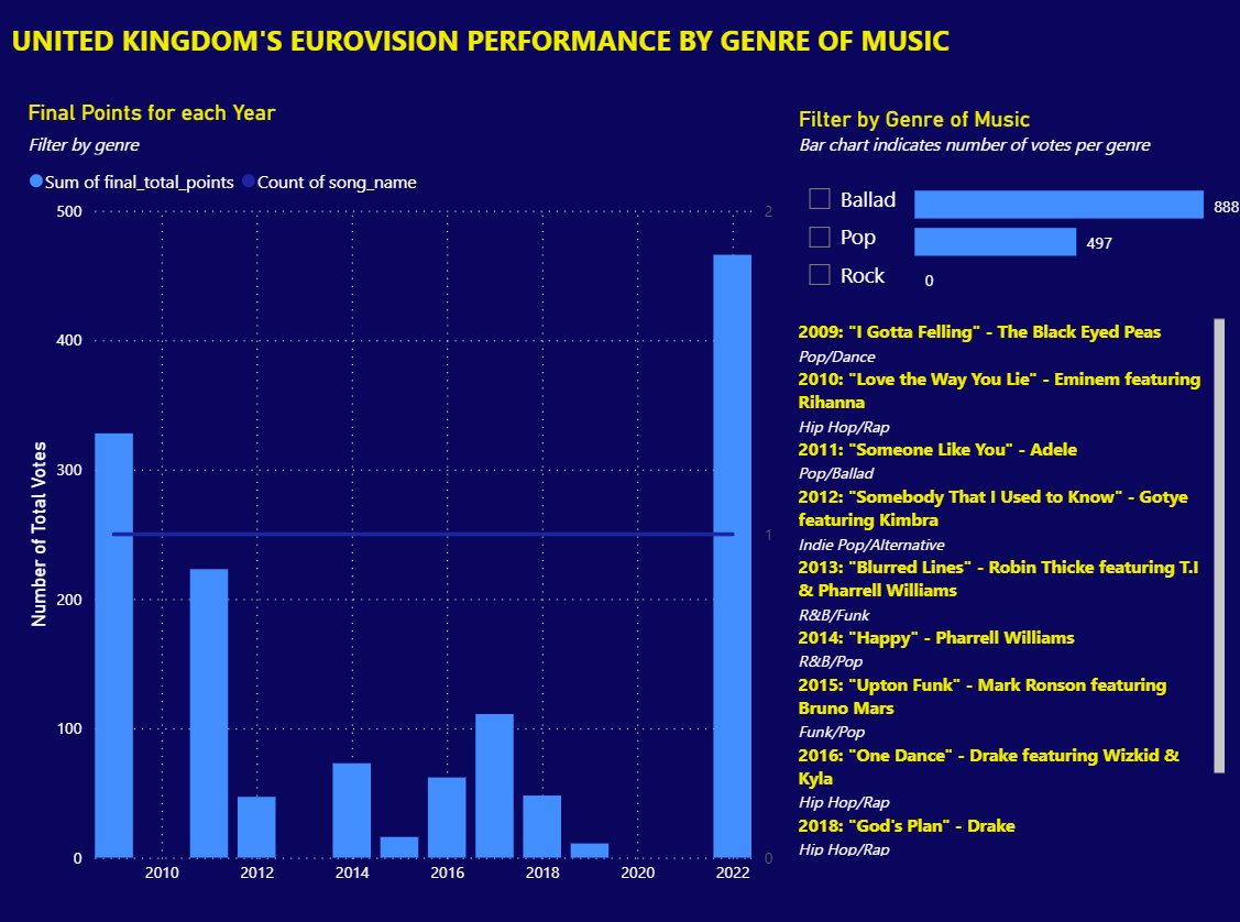
12:00 - 2:00 pm
I tried creating my own dataset in Excel for the number one songs of each year in the UK and joining onto the song dataset. However, the song dataset only had three genres so the join would retrieve nulls and not filter my charts properly. So, another idea I was not able to implement.
2:00 pm - 3:30 pm
I had to work with the charts I had and format my dashboard, I used a standard bar chart for the total final votes and a slicer for the filter for the genres. I also just added some information regarding the number one song for each year in the UK.
Overall, I had a big idea which in hindsight would not have worked in the given timeframe so my lesson here is to narrow the scope further and work within the dataset that I do have. I actually enjoyed using PowerBi, as it gives quick insights and charts and formats very easily. So I'm looking forward to making more dashboards within this tool!
Here is my dashboard for today: