For day 3 of Dashboard week we were focussing on Street Fighter V character stats and usage. We needed to use Alteryx and Power BI.
We were given links to the character stats web page and the characters usage over time.
Plan & Web scraping
I wanted to be pragmatic today and get out a nice looking design, so I opened Power BI and did the web scraping for the first character stats table data, as it was a lot more straightforward for this one table than Alteryx.
Others were then trying to do the paginated web scraping for the data over time in Alteryx and having difficulties due to wifi issues today so I decided to continue in Power BI. For a proof of concept, I web scraped 5 months worth of the character usage over time (Jan - May 2023) and then appended those tables in Power Query.
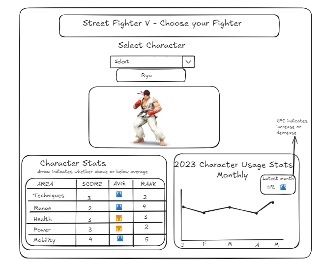
For my sketch I kept it simple. I wanted a user to be able to select a character’s name in a slicer, for a picture of that character to be displayed and below 2 visuals.
The first being a table with the characters stats for the 5 attributes (techniques, range, power, health and mobility). Alongside these I would have the average for each attribute across each character and have a symbol signifying if the character's value was higher or lower than the average. On discussion, Jenny recommended having a rank here as well.
The second visual would be a line chart showing that character’s usage over the 5 months I had data for. I wanted a small indicator to show whether the characters usage in May (last data point) was up or down from January and by how many percentage points.

The Dashboard
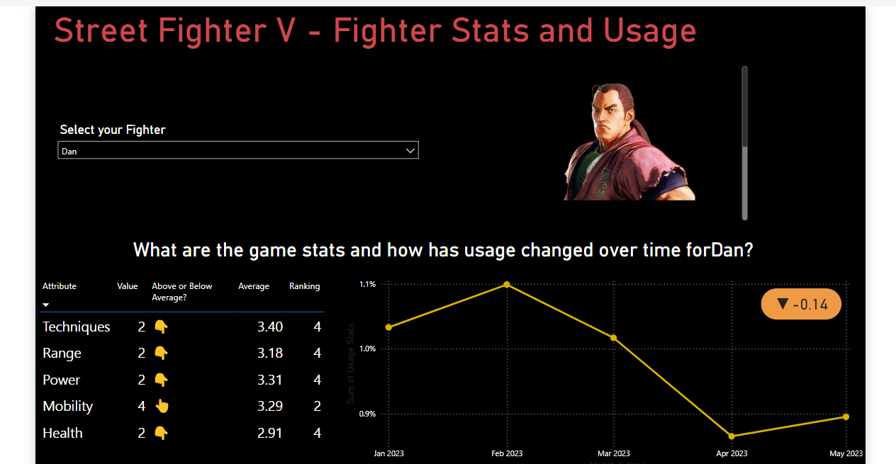
As I had my data ready to go I could start building my visuals. I wanted to start with the pictures however, so I created a table with the list of characters and got the URL for their image, and you need to set that field type as a URL image. Then with a slicer on the page for the Character I used a table and put the URL field in and the selected characters image was shown.
Other elements of my report were quite straightforward. However some DAX was required to get the average for each attribute and also for the ranking. The ranking proved quite tricky as I needed it to restart for each attribute but colleagues were able to assist on Convo.
Additionally I needed DAX to create the difference between usage stats in May and January and for displaying the indicator. I used an emoji for the above or below average and set some colour formatting for my usage indicator.
Once I had all my visuals I wanted to take time to make it look impactful so used a black background and formatted with red and yellow to keep the Street Fighter theme.
Overall I really enjoyed the designing aspect of this report! Although I had forgotten how Power BI can be fiddly with finding some formatting!

Feedback:
- Good to be pragmatic today & delivered sketch
- There is not any ability to make comparison - maybe copy and put side by side so someone can compare two characters
Next steps:
- Add space before characters name on dynamic title
- add context to the indicator on the usage over time chart (difference in percentage points from Jan - May)
- See how it would work with comparison for two characters as per feedback
- I would also like to save the Alteryx pagination workflow as a future challenge for myself in practising my Alteryx skills!
