Tired of using normal shapes in your maps? Would you like to try new formats that give emphasis to other things that not the shape of the areas? Try this tutorial showing how to create hex tile map in Tableau

Hex tile maps are a good option in the cases where it would be great to get rid of the different sizes of each region.
Basically, in a tile map all areas will have the same size. The original shape will be changed to a hexagon and the location will be relatively preserved to each area.
You can imagine it as table divided into columns and rows in which you will point the areas.
The example I will show you is one I created using the data of the last #MakeOverMonday about aircraft collisions with animals in the United States (you can find the data here).
My idea is to build a hex tile map showing the American states and total number of accidents to use it as a filter to the rest of the visualisation.
To create a tile map in Tableau the first step is to get an additional file which draws a table and give the position to each state. To do this you can download and use the table created by the Tableau Zen Master Matt Chambers.
Connecting the datasets
The process starts connecting those two data sources. Both datasets have a common field showing the names of all American states.
For this reason, these fields can be used to create the connection between the datasets, allowing us to use data from both sources in the same worksheet.
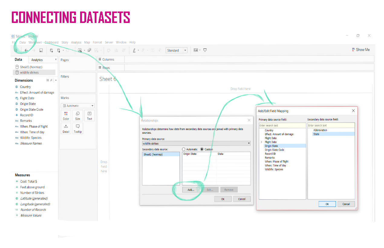
To do that, click on Data >> Edit Relationships.
A new window will pop up showing how the data for the secondary data source is connected to the primary data source. In the new window, change the automatic configuration to custom and then make both fields containing state names coincident (see in the image below).

Drawing the first map
Once you have connected the data, you can effectively start to draw the tile map.
Start using your file. Drag and drop the geographic data to “Detail”.
It will generate a map and automatically add latitude and longitude to columns and rows. Get rid off latitude and longitude and keep only the geographic dimension in “Details”. You need to do this to allow your map to be used as a filter after in the dashboard.
After this step, you can go to the hex tile map file. Matt Chambers gave very clear names to his table, so all you need to do is exactly what the name of the fields suggests: drag and drop the field “Row” into “Rows” and the field “Column” into “Columns”.
It will make all the states appear in the view. However, they will be in a bit weird position.
To solve this, you need to reverse the axis. Right click on it and change the scale to “Reversed”.
Change also the visualisation to “Entire View”.
At this point you should start to recognise the shape of the US, right? It is almost done!

Showing hexagons
Change the type of visualisation to shapes. As Tableau doesn’t has a hexagon by default, you will need to download one and add to the “Shapes” folder inside your “My Tableau Repository” folder.
Luckily, together with the table to create the hex tiles, Matt Chambers also shared a link to download a hexagon that fits perfectly into it. You can get it here.
Once you have added the new shape to your repository, all you need to do is to click on Shapes >> More Shapes >> Reload the shapes (so Tableau will get the shape you have just added) >> And then pick the hexagon.
It will give you the US map with each state represented as a hex tile.
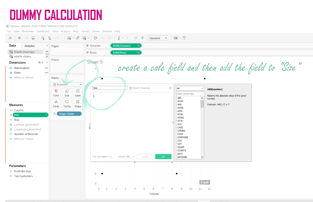
To adjust the size, create a dummy calculated field and drag and drop it to “Size” in Marks.

Using the map
Now that you already have the map, showing the abbreviations to each state inside the tiles is a good idea, isn’t it? In this example, I have the abbreviations in both data sets: in Chambers’ file and also in the wildlife strikes file.
I can use any of those fields to show the abbreviations.
All I need to do is to drag and drop one of them to “Label” in Marks and edit it to change the colour and align to the centre. To edit, click on “Label” and a window will pop up showing the label appearance configuration.
The last step in my case will be to add “Number of Strikes” to colour, this way I can see which states had the biggest number of accidents.
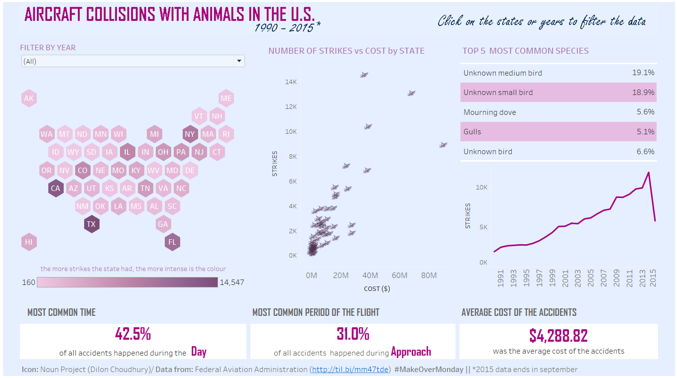
Hopefully, if you followed all the steps detailed above, you will have a map similar to that below (click on the image to access the interactive version of it in Tableau Public):
* THIS TEXT WAS UPDATED AFTER @CharlieHTableau AND @sirvizalot NOTICED THAT IN THE ORIGINAL INSTRUCTIONS FEW STATES WERE CLIPPED IN THE FINAL VISUALISATION. THE NEW INSTRUCTIONS COVER @CharlieHTableau ORIENTATIONS TO SOLVE THIS ISSUE.

