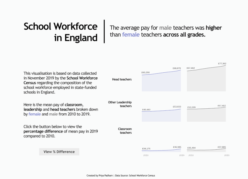
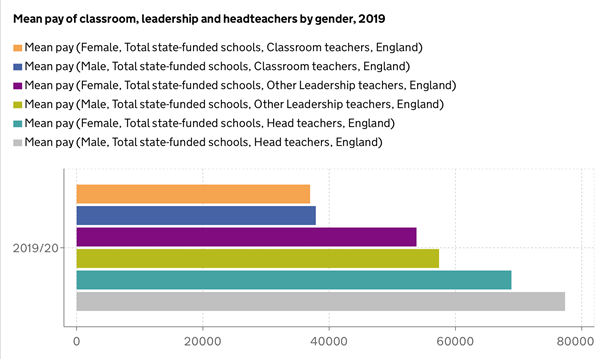
For this week’s #MakeoverMonday, our task was to makeover a visualisation based around the mean pay of classroom, leadership and head teachers in England by gender. Here is the original visualisation:
What I liked:
- I like how it is a straightforward bar chart.
- It is sorted by ascending order which places emphasis on the lowest mean pay bars.
- It focuses on the most recent time period (2019/20).
What could be improved:
- There are too many colours which makes it difficult to understand quickly what the graph is showing.
- The legend is very longwinded and detailed and this could be simplified to make it easier to digest.
- The gridlines could be removed.
- The values could be placed next to the bars as labels instead of on an axis.
- It would be interesting to see changes over time, as this does just focus on one time period.
What I changed:
- I wanted to include all the years within the dataset and to show changes over time, so I used an area chart and divided it between both female and male to make it easy to compare across all teaching roles.
- I added a show/hide container button which allows you to view the percentage difference of mean pay in 2019 compared to 2010, as I thought it would be interesting to see how this may have changed in the past decade or so.
- The new colour scheme is very minimal, with both female and male having different colours only. I think this helped to make things easier to understand, as I highlighted both genders in those colours within the text which meant there was no need for a legend.
- I removed all gridlines and axis rulers to make it appear cleaner and less cluttered.