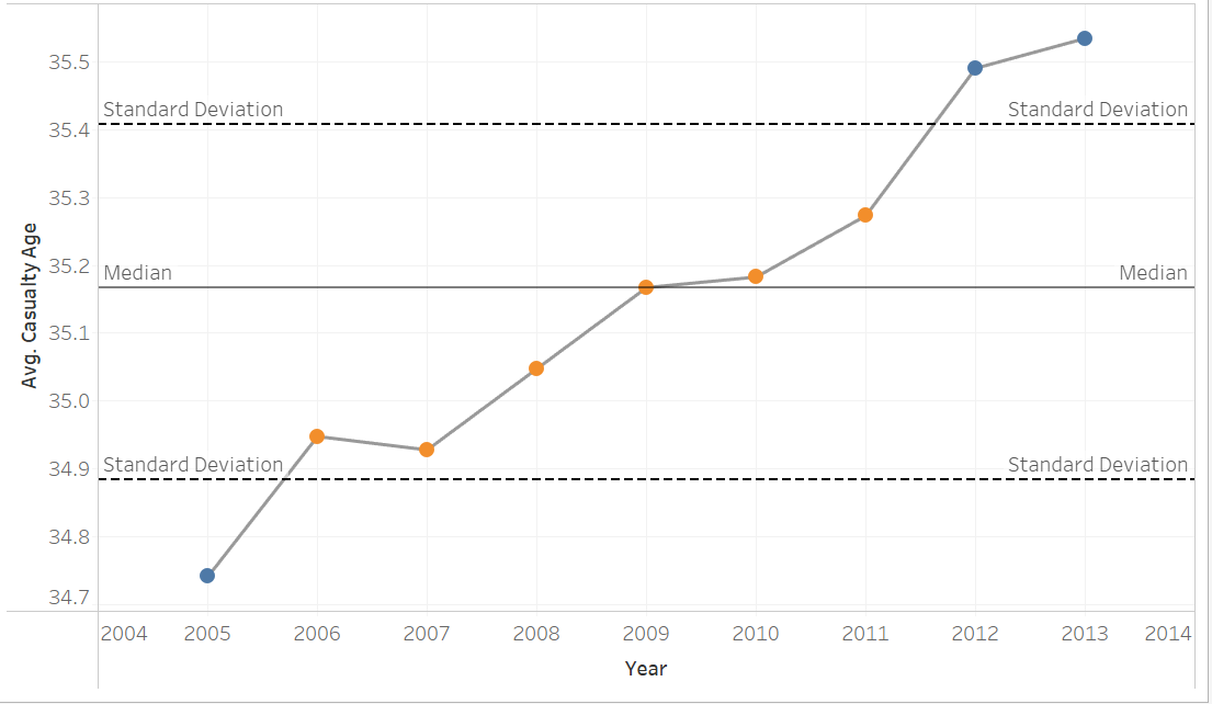
A control chart in Tableau is used to monitor the stability of a process over time. This can be applied to monitoring the stability of a process or assessing quality control. It can also be used in sports to monitor the consistency of performance over time.
It typically involves a line chart with two reference lines which represent the upper standard deviation and the lower.
A standard deviation tells a reader how spread out the values are from the mean (average). The upper and lower control limits in the chart are normally set to 1 so therefore a user would be able to see how far something is straying from the mean or if the process is stable/consistent.
How to build a control chart
Step 1: Drag a time dimension to columns and a measure to rows
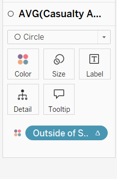
Optional Step 2: Duplicate the measure and change the marks to circles.
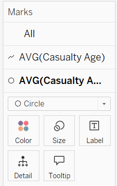
Then right click on axis and click dual axis and synchronise. You can then hide this axis.
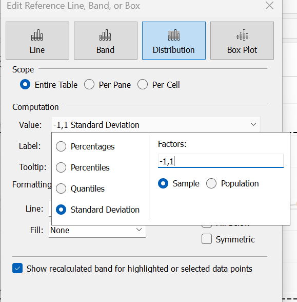
Step 3: Drag distribution lines onto view/chart
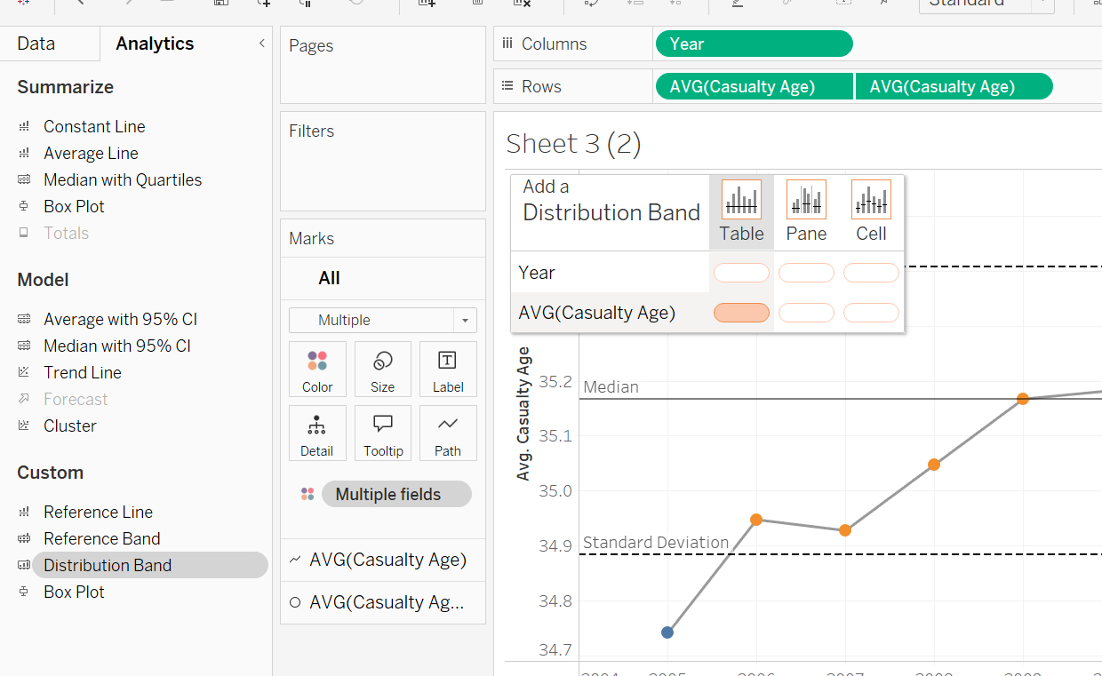
Step 4: Select standard deviation from value drop down
Change colour of lines depending on stability
To change the colour of the dots depending on if they are outside the standard deviation then create 3 calculations
Step 1: Create an upper standard deviation calculation
e.g WINDOW_AVG(avg([measure])) + WINDOW_STDEV(avg(measure))
Step 2: Create a lower standard deviation calculation
e.g WINDOW_AVG(avg([measure])) - WINDOW_STDEV(avg(measure))
Step 3: Create an if statement to determine if 0ver or above its false else true
if avg(measure)> [Window Standard +] then FALSE
ELSEIF AVG([Casualty Age]) < [Window Standard -] THEN FALSE
ELSE TRUE END
Step 4: Drag to marks card