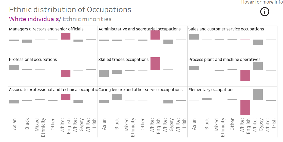
Have you ever had a visualisation with multiple bar charts or line charts that you needed to show in a concise way? Instead of having all the visuals in one column or row, we can create trellis charts, where the bars are essentially shown in a grid.
For example, in a recent personal project, I wanted to show the ethnic distribution of 9 different occupations and therefore I created a trellis chart with a 3 x 3 grid.
Step 1: Create the visualisation that you would like to show
Step 2: Create column and row dividers
For this, you will need 2 calculations that will go respectively onto the column and row part of the data section.
Column divider: (INDEX()-1) % ROUND(SQRT(SIZE()))
Row divider: INT((INDEX()-1)/(ROUND(SQRT(SIZE()))))
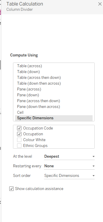
Step 3: Change the Table Calculations
Once the columns and rows are in the view, we need to change the table calculations. You will need to change the compute using section to the specific dimensions you are using. In this case, I was showing all the occupations and therefore it knows to split these up by the specific occupations.
This needs to be repeated for both columns and row dividers.