My application seems like a long time ago however I thought I would write a blog on how I approached the application viz for my 2nd interview. It is quite daunting to get an unknown data set and create a dashboard in a week. However, breaking down the process and taking it one step at a time really helped me to feel confident about the viz as well as staying in regular contact with my mentor and gathering as much feedback as I can.
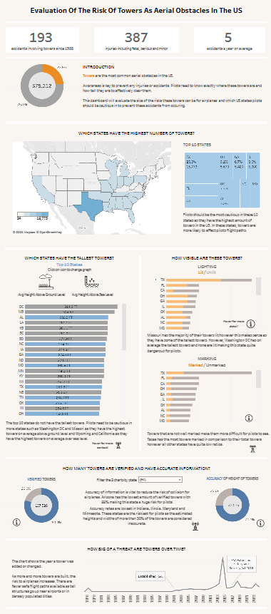
Dataset: Aerial Obstacles in the US: Click below for the Application
Evaluation of the Risk of Towers as Aerial Obstacles in the US
- Understand the data set
The data set given was huge and it is very important to understand what the data is actually telling you. Understanding what each row is representing is very important, for example in this data set, a row was an aerial obstacle.
Having an understanding of each column and each abbreviation is also very important. Try not to figure it out as you go but gain a thorough understanding before approaching the viz.
- Find a focus
Finding a focus will help with the story that you will eventually create in your dashboard. In my case, I decided to focus on the most popular aerial obstacle i.e. Towers. Narrowing down an area also helped me feel less overwhelmed with the data. It will be impossible to analyse every piece of data thoroughly.
- Choose your story or a question
This provides a base for your dashboard and changes the way you approach the data. For example, when focusing on towers as obstacles, I started to think of different subcategories that influence how dangerous they are such as lighting and frequency etc.
- Build charts
Starting to play around with charts and seeing which charts are better for which topic e.g. bar, scatter
- Sketch dashboards
Once I had an idea of the charts and the questions I wanted answering, I began to visualise how this would piece together. Sketching may seem a waste of time however it is a good idea to have an idea of how the final product will look. It also gives you an idea to work towards.
- Build dashboard and format colours
When choosing colours, I decided to pick quite a neutral scheme. I think it is nice to base colours around the topic you have chosen with a few highlight colours that can make certain data stand out. Making the dashboard accessible and also cohesive is very important as mentioned in my feedback from the previous dashboard.
- Add interactivity
Adding interactivity such as filter options, info buttons, buttons for chart switching, can make the dashboard more interesting and also helps to show more information in a succinct way.
It is also a good way to show your tableau skills
- Practice, practice, practice
This was probably the most vital part of the process. Working on explaining your dashboard and creating the story is very important as you could not explain something by just assuming someone would understand. It also helps ensure you show all your interactivity and any extra work you have done.
Also making sure I had justification on why I included certain elements and why I used certain charts helped me to feel more confident on the day.