


Today was the last day of dashboard week and the final day of training. I needed to finish my Alteryx workflow today and then build a dashboard from the pilates data.
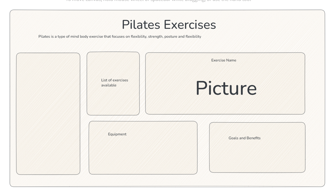
Below was my sketch for the dashboard. I decided to use figma to design a dashboard that had the same aesthetic as a pilates studio.
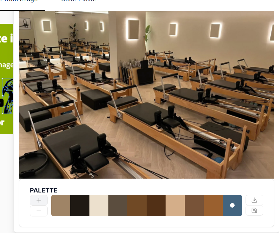
To pick a colour scheme, I used the following website and found the following colour palette.
👍 Color Picker online | HEX Color Picker | HTML Color Picker
Color Picker:Color Picker: With this online tool you can upload an image or provide a website URL and get the RGB Color, HEX Color and HSL Color code. 👍
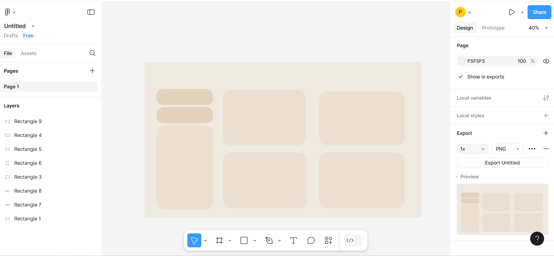
I then used figma to create a background with curved sections to use for the dashboard.
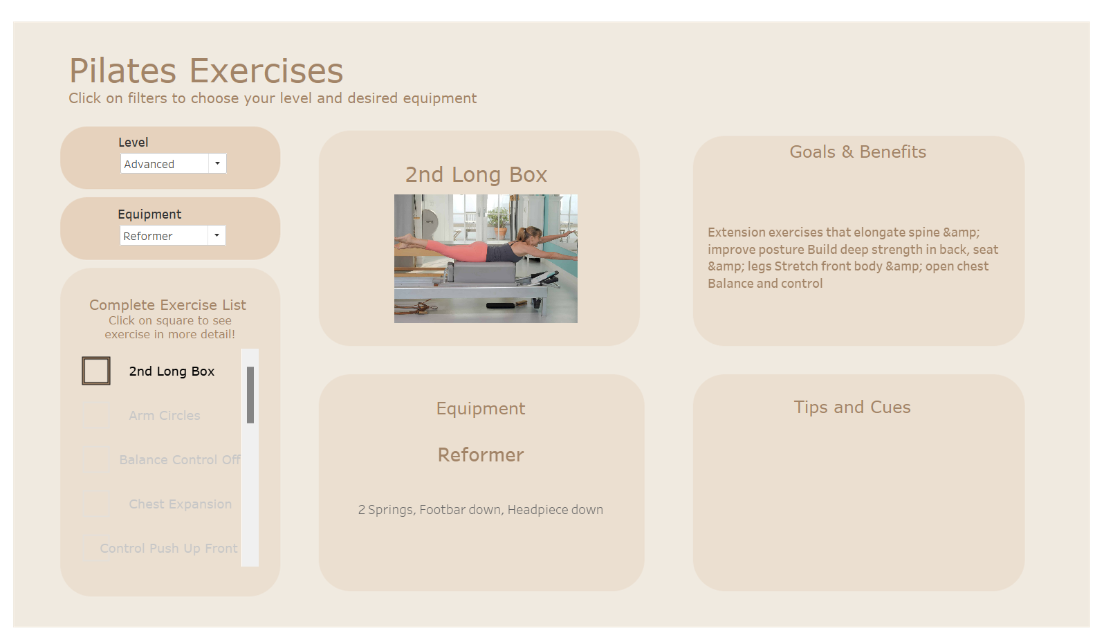
I started to build my dashboard in Tableau using the following background. While it is still in its early stages, I wanted to develop this further to become a true bank of Pilates exercises to make this usable.
Future Iterations
Some feedback and ideas I have received.
- Filters could be bar charts which can filter the rest of the charts
- More design elements to make elements stand out