


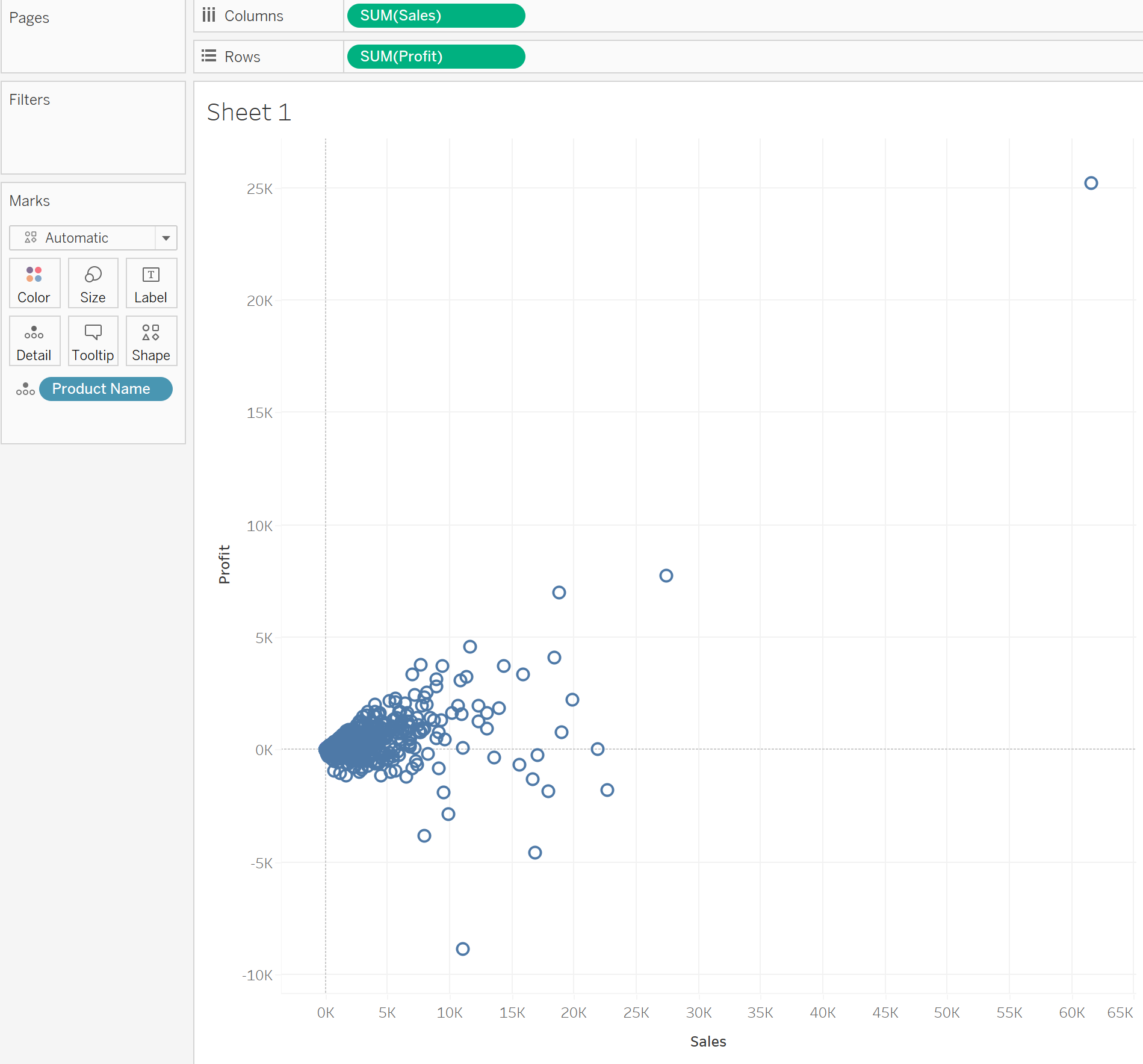
Scatter Plots are one of the most insightful chart type's in an analyst's arsenal. They allow us to directly plot the relationship between two measures.
A simple example being to show the relationship between Profit and Sales, for different products, as shown below.
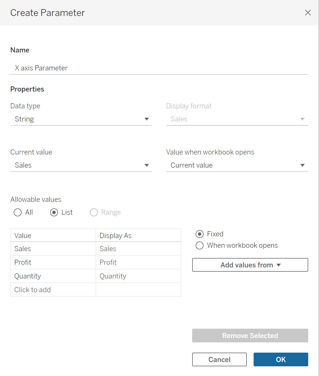
One way we can take this chart further is by allowing the user to select what measures they would like to see on the X and Y axis. We can do this using parameters.
We must create two separate parameters for the X and Y axis, and also two calculations that refer to these parameters.
Let's say we want to allow the user to choose between Profit, Sales, and Quantity to plot and the X and Y axis. We must create two separate parameters as shown below:

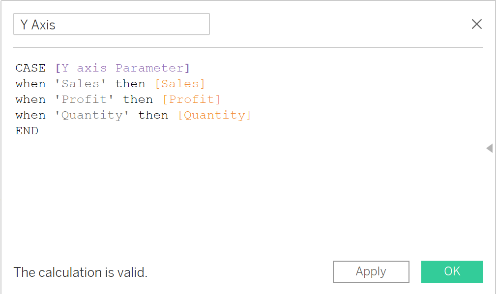
In our existing scatter plot, we have Sales and Profit on the X and Y axis. In order to use our parameters, we must update this with new calculations that refer to our List parameters. We can do this using a CASE statement.

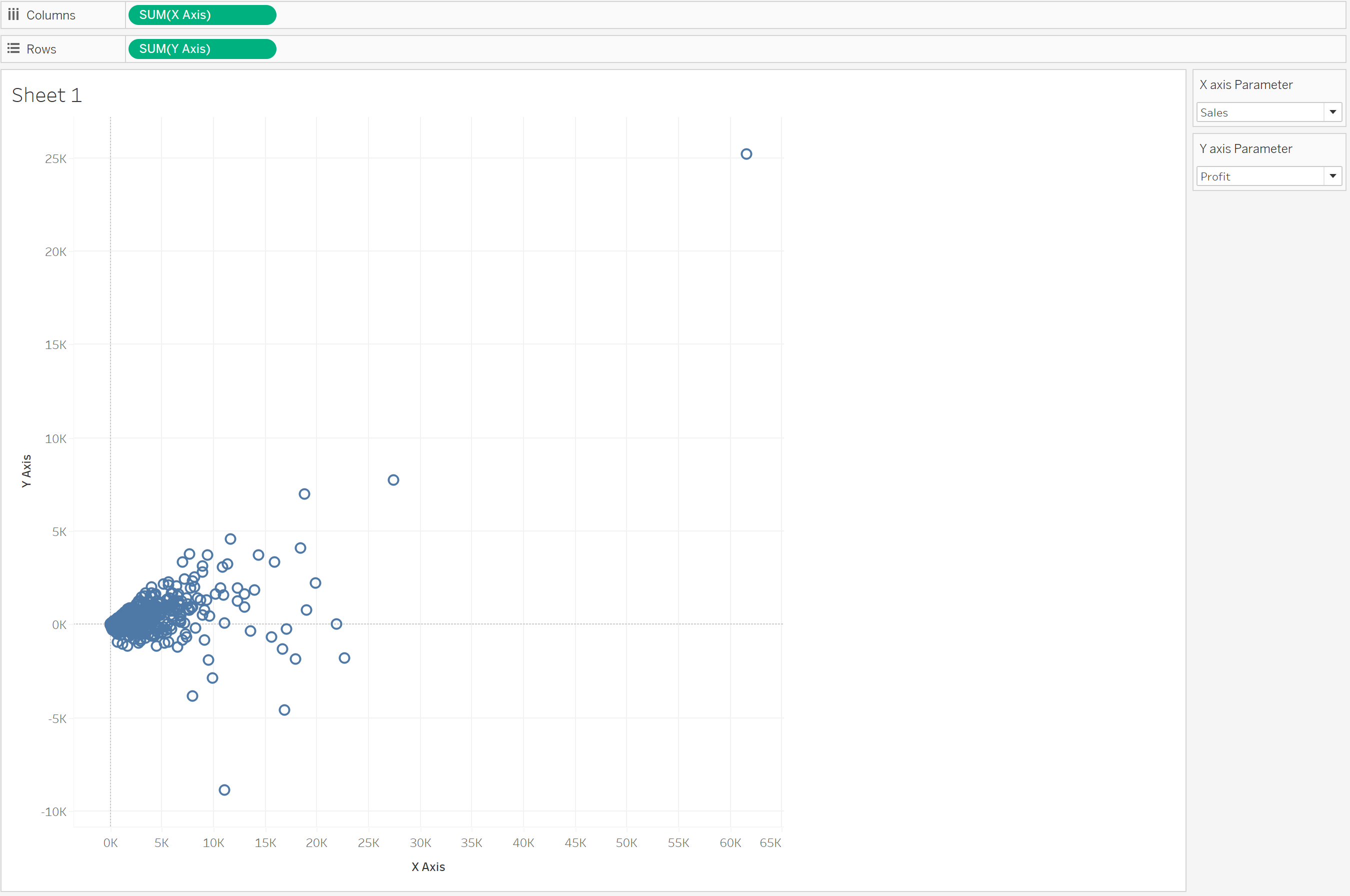
By placing our new calculations on columns, and rows, we have a dynamic scatter plot as shown below.
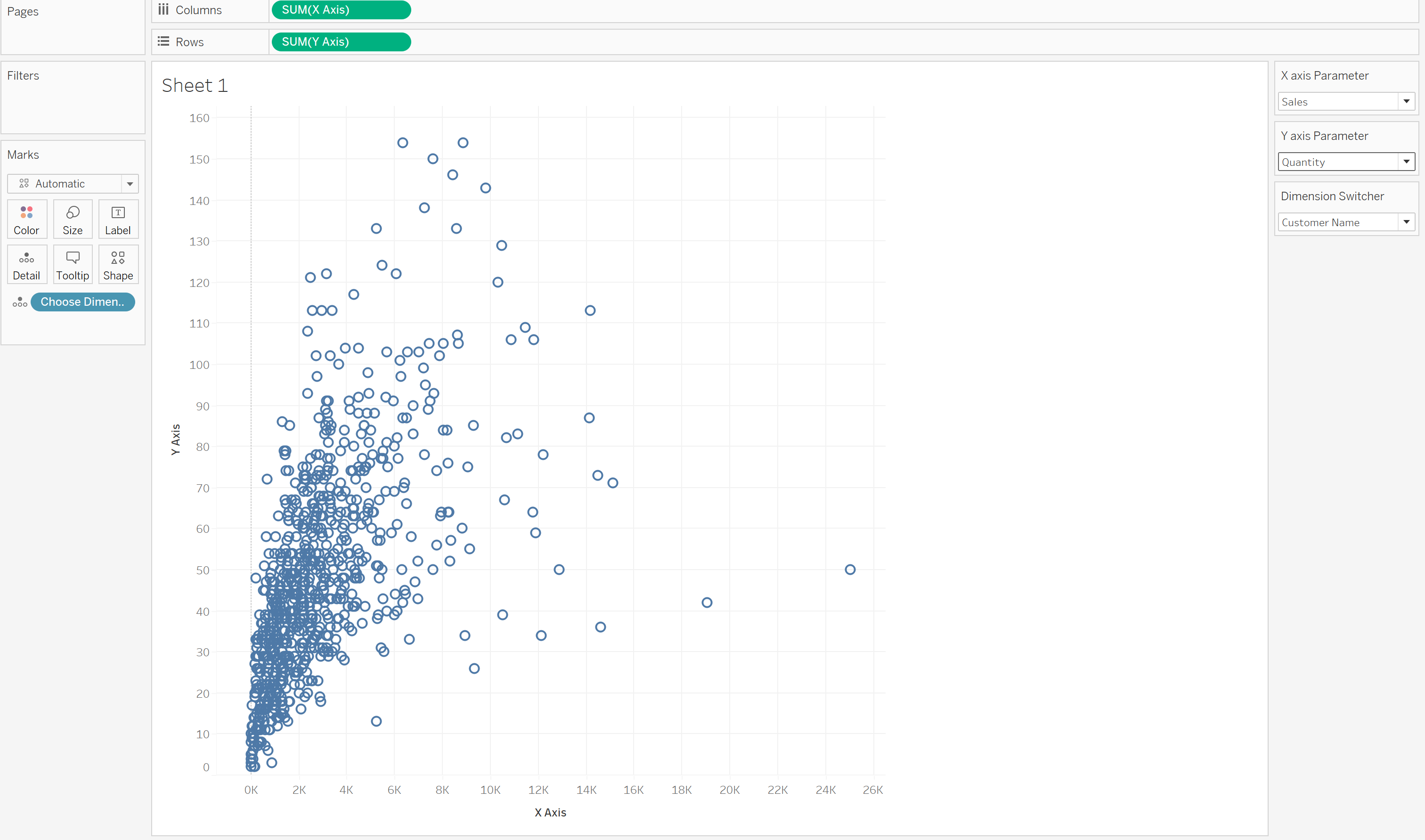
While in this Scatter Plot our X and Y axis are dynamic, our dimension is not. Currently we are just looking at Product Name, lets say we want to also allow the user to dynamically choose to see Customer Name, also. Again, we can do this using parameters.

And again, by creating a new calculation to place in the Marks card.

We now have a fully dynamic Scatter Plot for the end user!
Give it a try :)