I love Dumbbell charts. They are an extremely effective chart type. Making your first Dumbbell Chart in Power BI, however, takes a little bit of work.
Within Power BI we have no default 'Dumbbell Chart' chart type.

This does not mean we can't make one!
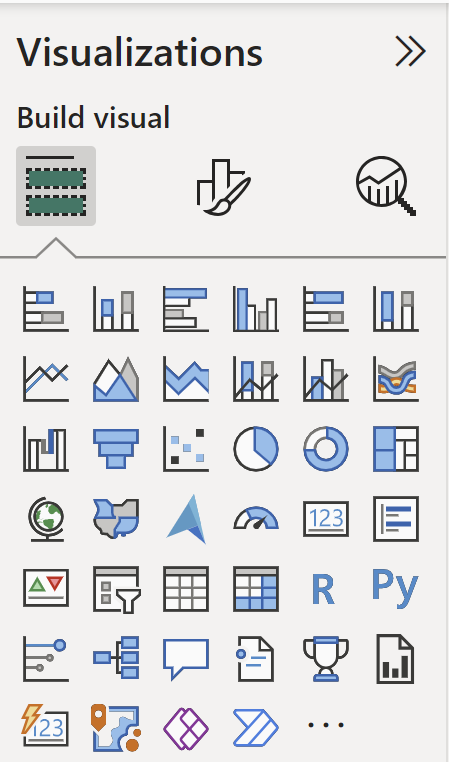
By clicking the ... option we can add more visuals to our Visualizations pane.
When we search Dumbbell Charts, I have found two options that work reasonably.

Dumbbell Chart by MAQ Software, and Dumbbell Chart by Nova Silva. I have had a bit more luck using the Nova Silva, so will be using this visual for the example.
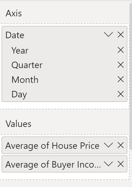
Within the Visualisations window, we have options for Axis and Values. Creating the chart is as simple as adding our axis, and the two values we want to show in the visualisation.

However, it must be noted that I had some issues when trying to change the orientation or the ASC/DES order of the dates.
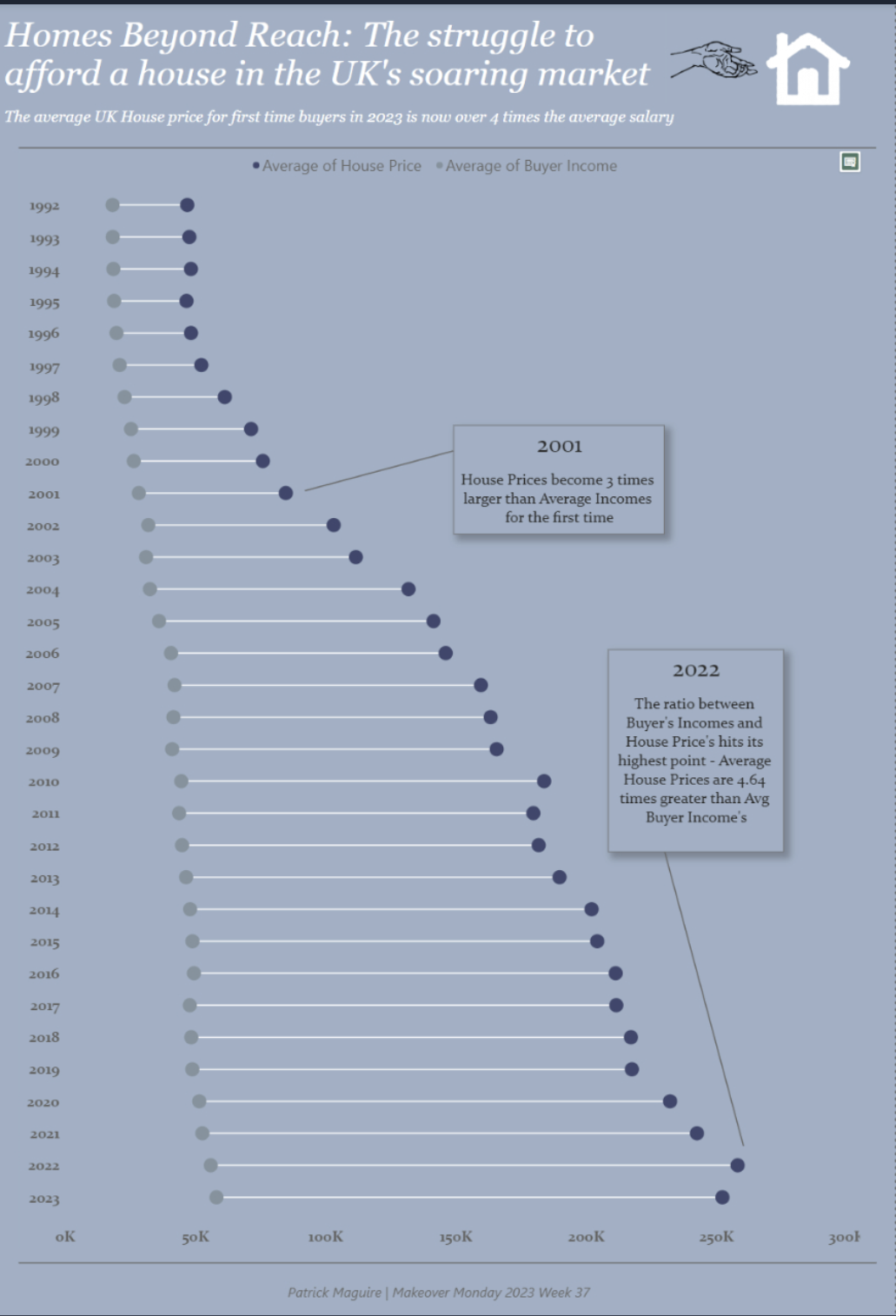
My final product looked like this!

Let me know how you get on building your own Power BI Dumbbell chart.

