


Today marked the first day of Power BI training for DS41. Robbin Vernooij (whilst fighting through his jetlag) took us through the basics of Power Query, and building charts and pages.
While we definitely noted some clear similarities between Power BI and Tableau, there are quite a few nuances that will take some time getting used to.
One of these nuances is dashboard design. The Pages layout is a fairly sharp contrast to the Dashboard's and Containers I had become accustomed to on Tableau.
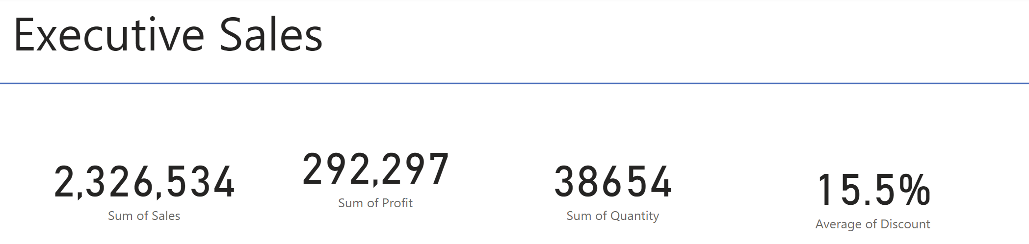
Today, I will take you through how to use the Grouping and Alignment functions within Power BI to turn something like this,
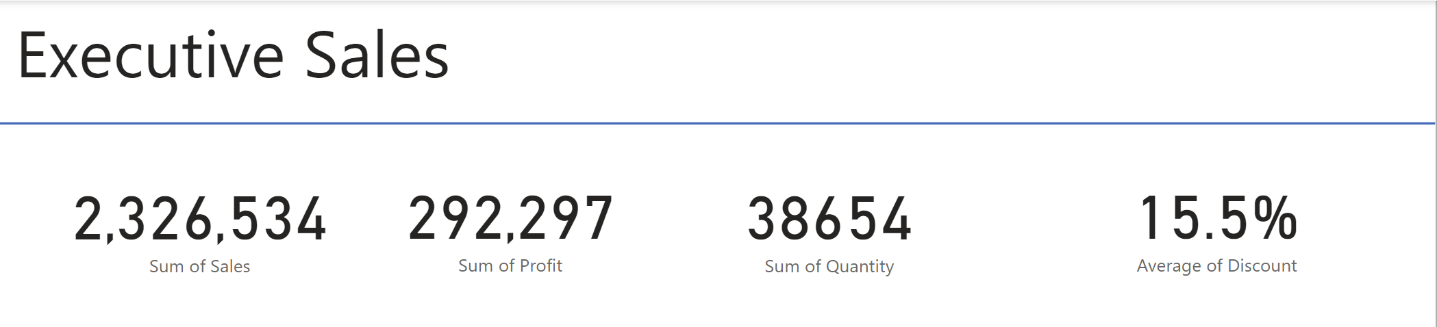
Into something a bit more like this (without having to lose your mind by manually moving around the Cards).
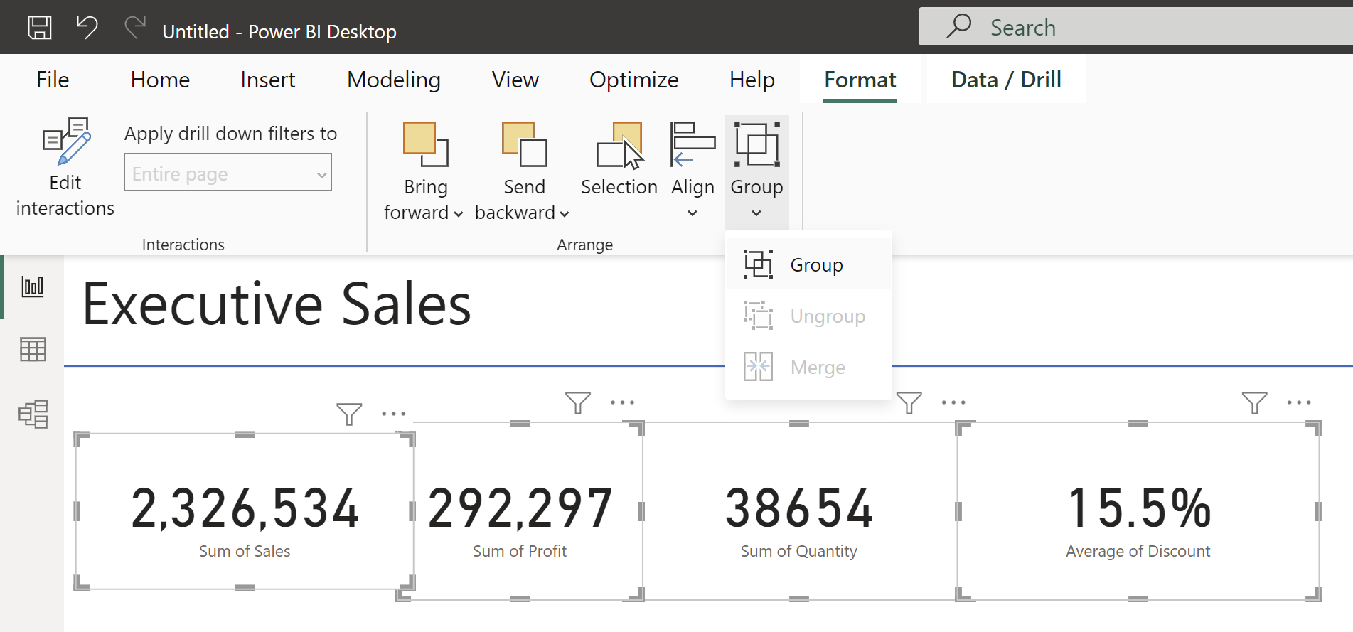
By CTRL selcting our 4 cards,
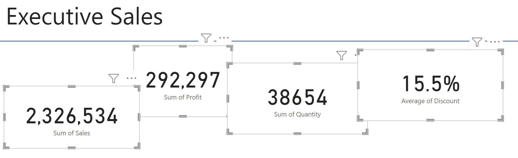
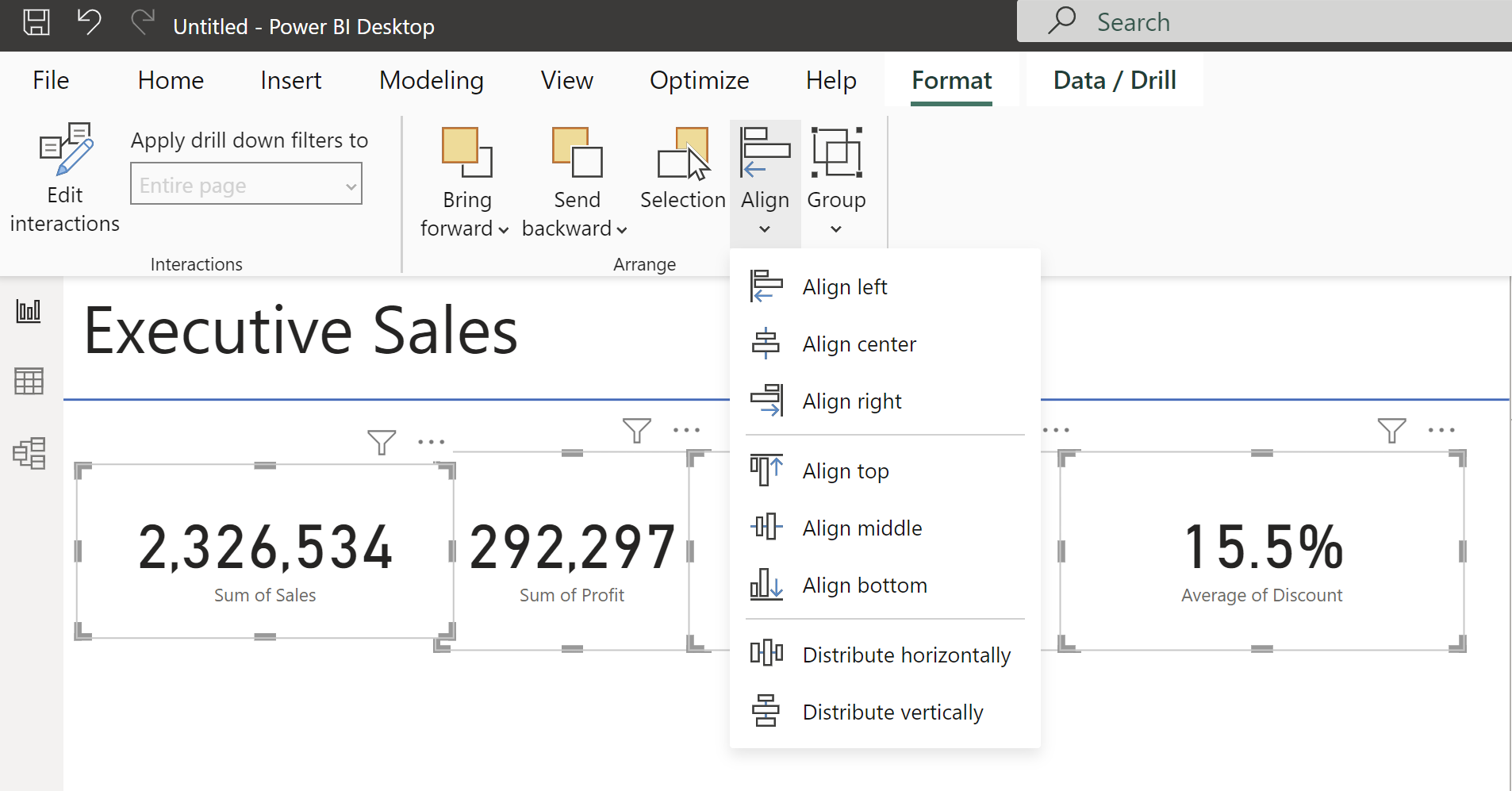
we can simply click Format > Align > Distribute Horizontally and > Align Middle to ensure our cards are aligned and have equal distance between them.
Next, to Group our Cards (thus enabling us to move all our cards at once), we can simply click Format > Group > Group
Voilà, easy as that. We now have our Cards perfectly aligned and ready to be moved around the page as a group.
