


Day 2 - Let's get active.
Today started a lot less than ideal. A defective train delayed my entry to the office by about 15 minutes so I'm slightly behind scheduele. We move nonetheless.
Today's task focuses on data from the OECD, analysing the earnings and wages of different countries over time. We have 8 datasets top choose from, and must implement at least 2 in our analysis.
The initial two datasets that I opted to explore looked at 'Incidence of Low & High Pay' and 'Wage Gap by Age'.
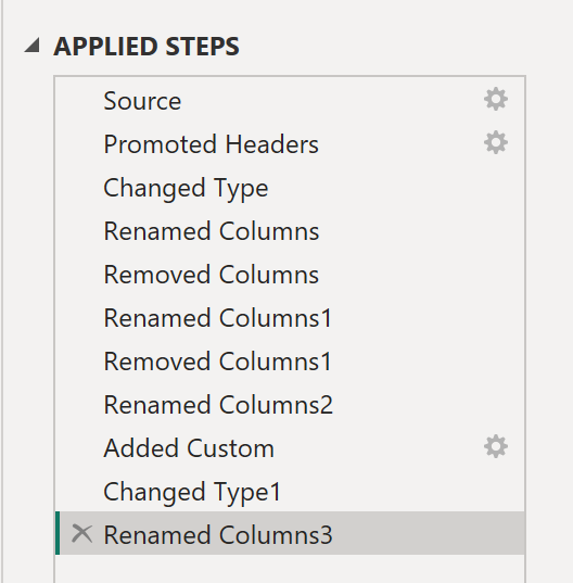
I decided to hop straight into some Data Prep and Data Discovery within PowerQuery. Both datasets contained a large number of unnecessary columns with only 1 value, so much of my work was simply removing these. Further, the dates were saved as a numeric value, so I had to fiddle around slightly to convert these into appropriate date formats. Other than that, the data was relatively clean. The real issue came in interpreting exactly what the figures in each dataset represented.
My steps in PowerQuery looked like this:
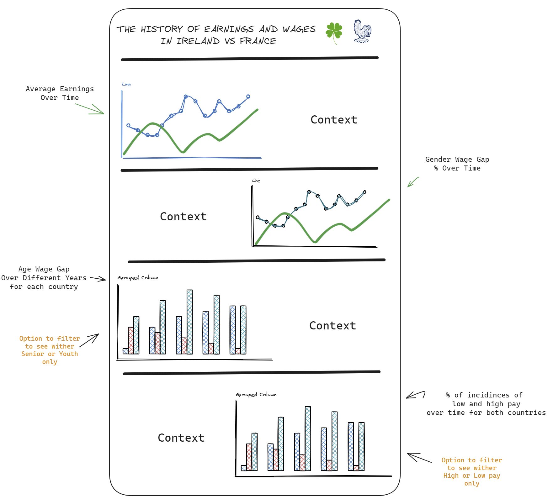
Now it was time to find a story to tell within the data. Upon data discovery I thought focusing in on an individual country could be an effective way to tell a real story, and provide insight. However, to give a true assessment I'm gonna need more than just the two datasets. I went and grabbed in addition the 'Gender Wage Gap' dataset and the 'Average Annual Wages' dataset. When deciding on what country to analyse I opted for Ireland. Whilst being my home nation, I also know the country has a relatively interesting wage history (plus I can give some home grown context to the dashboard!).
However, in true dashboard week fashion this didn't go to plan. When sketching ideas, all I could think to do were line charts. Upon consultation with Jenny, we decided it would be a better idea to compare Ireland to another country within the Eurozone, such that we can see how the two have varied. I opted for France as there was a significant amount of variation in their statistics, and as they are both original members of the Eurozone currency. Finally it was time to get my sketches in order and finished. My initial sketches looked like this:
When it came to creating the dashboard, I had a few issues with DAX, but some YouTube Videos were thankfully able to help out. I managed to create most of the dashboard quickly, although there was a lot of tinkering.
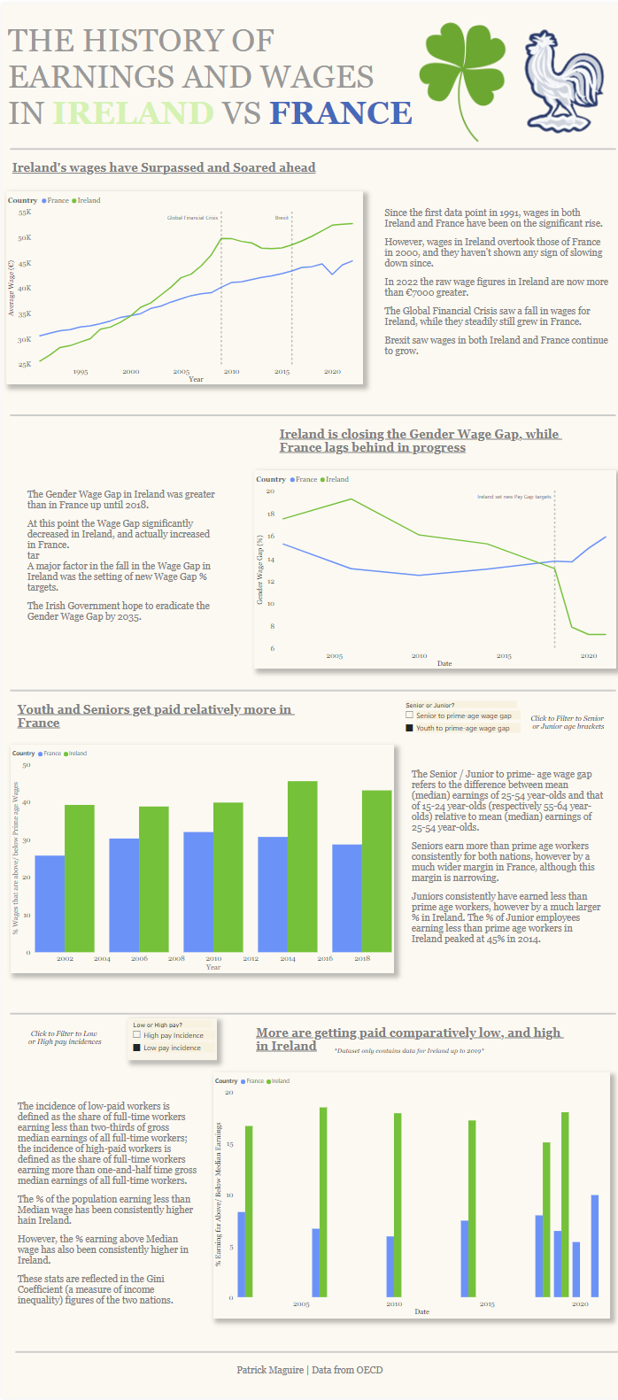
I made an effort to ensure I had left adequate time to polish the formatting and research additional context I could add to the dashboard. The end result came out as below!
See you same time tomorrow :)