


HERE WE GO!
Hot off the heels of a restful week in Portgual, Dashboard Week has arrived!
Today's task looked at data from the Office for National Statistics within the U.K., specifically at a shopping price comparison tool to allow users to see how the price of items have changed over the last year.
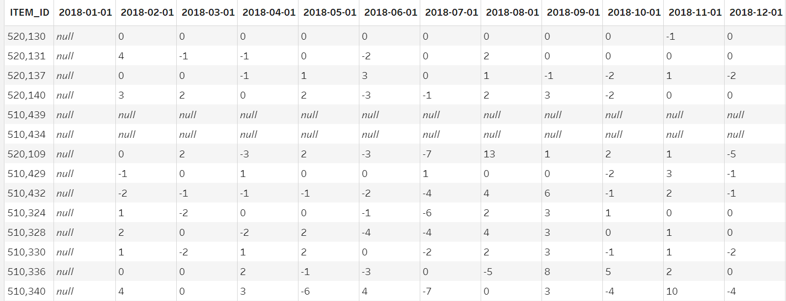
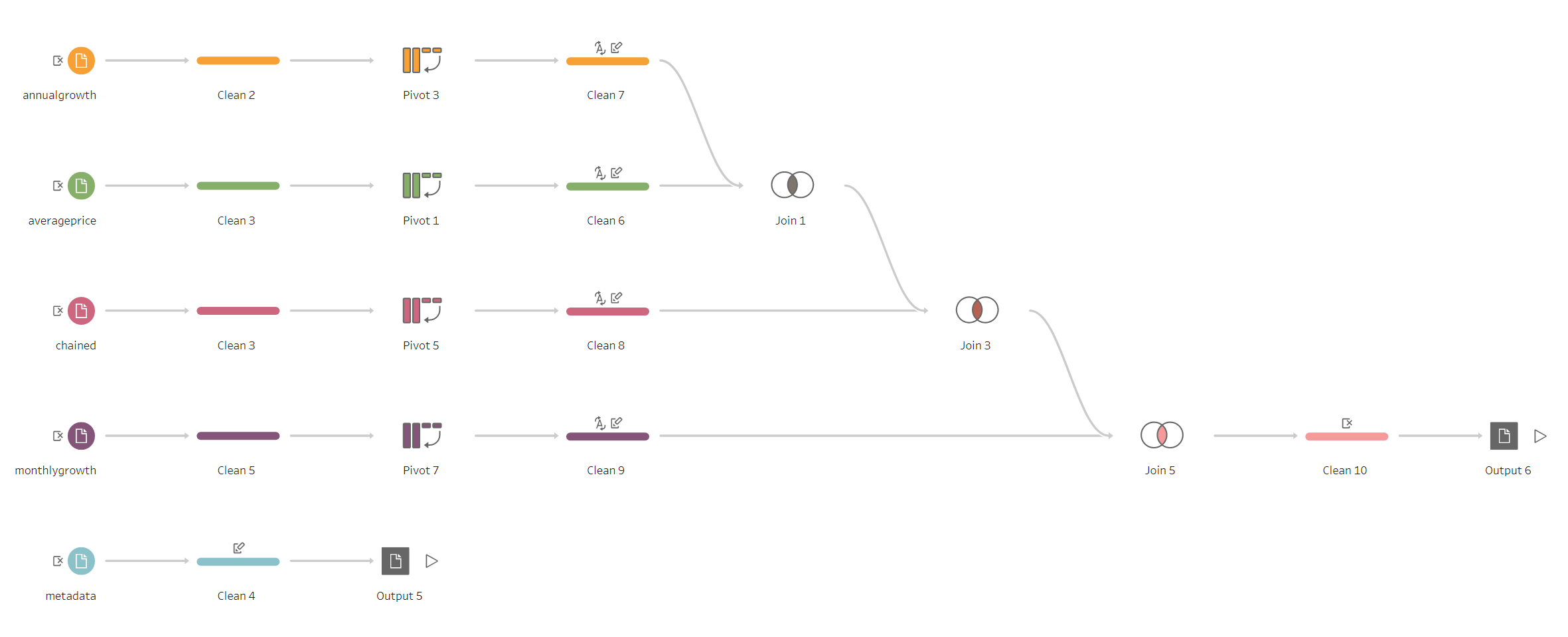
My first task of the day was to download the data and see if any cleaning would be required (Spolier: It certainly was). The data source had 5 unique tables of data, and 4 of them were in the following format:
It's PIVOT time!
Once my tables were pivoted, and columns were renamed, they were more or less ready to go, with just one more Data Prep step remaining, a join.
I joined the 4 pivoted tables together as they had both matching dates and matching Item ID's. In my inner monologue, these tables were known as the STATS tables, as they showed measures such as Annual % Change, Monthly % Change, and Price in £. The final table contained dimensions such as Product Group, Item description, and Item Weight (I termed it the Item Info table). I didn't think joining here would be a suitable step due to the structure of the table, so I opted for a relationship within Tableau Desktop (as you will see!)
The Data Prep looked as follows:
My two output files are ready to go. Desktop time!
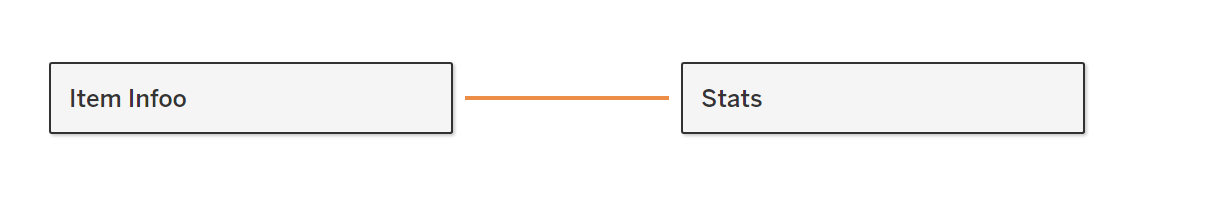
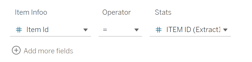
I created a relationship between my newly created Stats table, and the Item Info table on the condition, Item ID = Item ID.
Now that I had my data suitably prepared for analysis, it was time to jump in to some data discovery. When looking at the data, my main aim was to try and find an interesting point for analysis, and specifically an opportunity for me to produce a deep dive explanatory piece. Further, I was hopeful I could find a story which I could supplement with some extra research, to further add context to my dashboard.
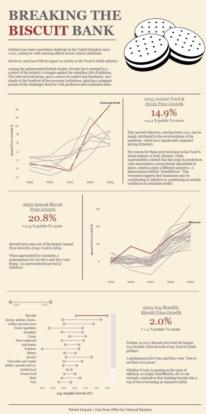
One area that initially struck out to me was Food & Drink Category, as the Annual Price Increase % was the highest across all categories. Further, I thought that this would provide a good opportunity to deep dive into the unique food groups to see if any particularly stood out.
When digging deeper, I discovered that Biscuits had the highest monthly Growth in 2023.
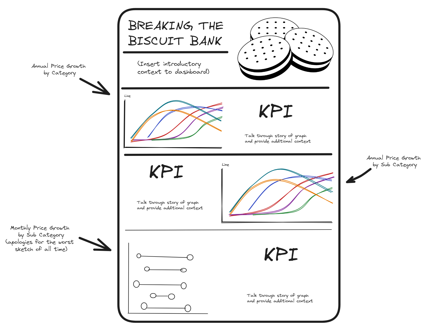
From this point, I began sketching some ideas of how I was going to visualise the data, and tell the story, going from the high level of Food & Drink then into Biscuits.
My initital sketch looked something like this:
The creation of the dashboard was relatively simple, technically. I put a lot of focus into making the design of the dashboard look clean and visually appealing.
Further, I tried to include some research into the context of the dashboard, such as some of the different arguments as to why we have seen Inflation in the Food & Drink Industry, and specifically the Biscuit industry.
The end product can be seen below:
See you tomorrow!