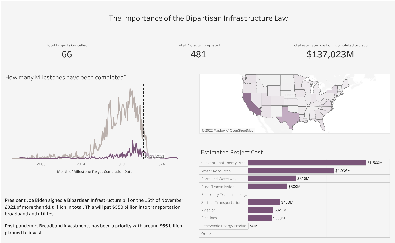
My approach was to start by understanding the Permitting Dashboard and find out any interesting information about infrastructure. In this was I can easily find key variables to analyse in my dashboard. After a bit of reading on the website, I was able to find something interesting I could base my insight on.
After that, I put the dataset right into tableau to see what I was working with and what fields I would need to prep. I quickly saw that in regard to my analysis, the dates and the costs fields might be an issue. I then tried to prep the data the way I wanted in Alteryx, however due to me having to rearrange my day, I decided to scrap Alteryx and do simple calculations in Tableau.
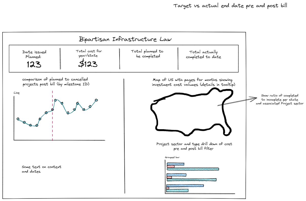
This made the project much easier for me because I was able to simple it down a bit. I update my sketch with the fields I knew I would be able to use and also a few notes on what I planned to include.
I then jumped right into making my charts, starting with the ones I knew would require the most calculated fields. I did change my mind on fields I would analyse because it started the make more sense to use different variables as I built my chart. My focus quickly leant towards cancelled and completed projects as well as costs in my final dashboard.