


Week 2
After the first and exciting week, the second one couldn’t be less. The week started with the assignment of our new project: search for educational data and prepare a visualization, but, this time
we should prepare all the data in Alteryx previously. To accomplish this objective we started with our Alteryx training sessions, carried out by Chris Love and Laszlo Zsom. Both helped a lot to see the power of the software and the correct approach to carry out our projects.
After a long search of educational data, I decided to join data from 4 different sources: OEDC, Eurostat, UNESCO and Transparecy.org. The idea was to have as much information as possible, join all and try to make a complete trend analysis of the educational sector in the world by country.
The first problem was that there are lots of countries with no available data, so I finally limited my project to European countries, and after preparing, cleaning and joining the data, I finally
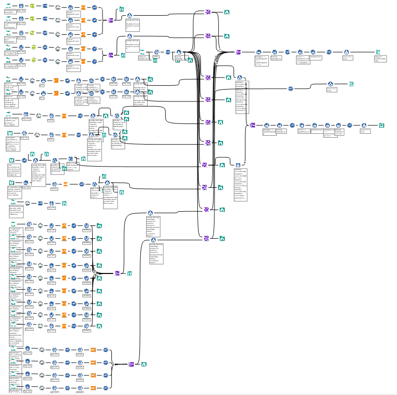
create a workflow with 3 main tables to work with that looks like this:
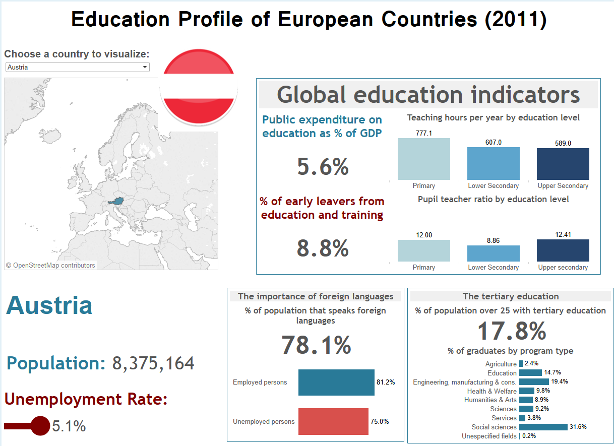
The second problem began during the analysis process, because I expected to get much more interesting insights in the analysis over time, but there were no significant trends and also some countries had no data for some years. So after all this work I change the approach again, and focus the project on educational KPIs in Europe, trying to create a dashboard as clear as possible to get an understandable but detailed educational profile for each country. Here you can see the final dashboard, which includes from total population and unemployment rates to public expenditure on education, teacher/pupil ratios, teaching hours per year, situation of tertiary education and knowledge of foreign languages. Hope you like it!
Week 3
Back to London after a fast visit to my home country (Spain) to attend a wedding, the third week in the Data School started with the realization of the Tableau Desktop 9.0 Qualification Exam during the Tableau Conference On Tour, and I passed it! And we have been training with Tableau only two weeks, what is the best proof of the high quality of the training we are receiving and the excellent work from all the coaches.
Tuesday and Wednesday we were attending as much conferences and presentations as we could. I tried to focus specially in the customer cases, to get a better knowledge of how companies are using Tableau to improve processes and take an advantage of advance data analysis. Specially interesting were the presentations made by Firas Qaimary, from UNOCHA, and the use of data to to ensure a coordinated and effective response to humanitarian needs. David Foster from Global Radio, and how a recommendation system can be built in Tableau that is able to capture live feedback from users and resurface the information in a separate dashboard. And Paul Banoub’s presentation, from UBS, about how to develop a Tableau service from your initial “big idea”
to selling the service and gaining approval, through to implementing a community, encouraging interaction and promoting passionate data visualisation debate.
The week ended with Francois Ajenstat and George Mathew visiting the school to explain us how are Tableau and Alteryx internally as companies. These days have been very inspiring, specially for the kindness and availability of everyone to talk, help and encourage us to take advantage of the opportunity we have during this training.
What will be the challenge for next week?