


After past “Tips & Tricks” week, this one in the Data School we have the challenge to create one dashboard per day with a different dataset each day.
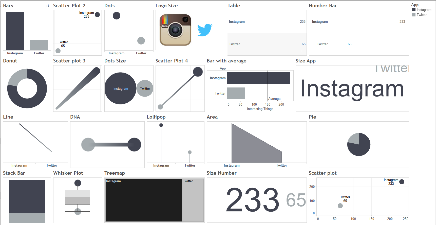
Monday started with the challenge of making in Tableau as many visualizations and charts as possible using only two numbers, a very useful exercise to use your imagination and see all the visual possibilities that Tableau offers. Here is an example of the different charts I created:
After that, we all use this “small data” training to design a postcard for Dear Data 2, a project by Jeffrey Shaffer and Andy Kriebel, inspired by Dear-Data.com, creating visualizations every week on postcards about very different topics. I decided to visualize Andy’s Instagram’s Likes and Twitter’s Favorites during a week using two different charts: a bar chart with the difference between both measures and a radar chart:
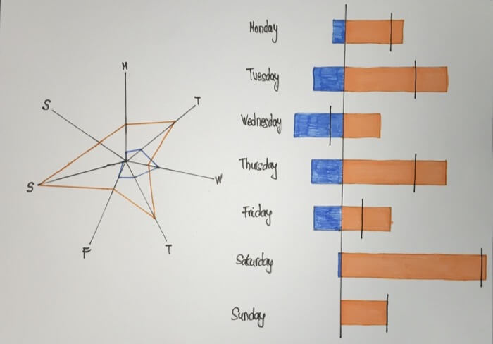
Are you curious about how making radar charts in Tableau? Here’s a blog post that explains how you can create it.