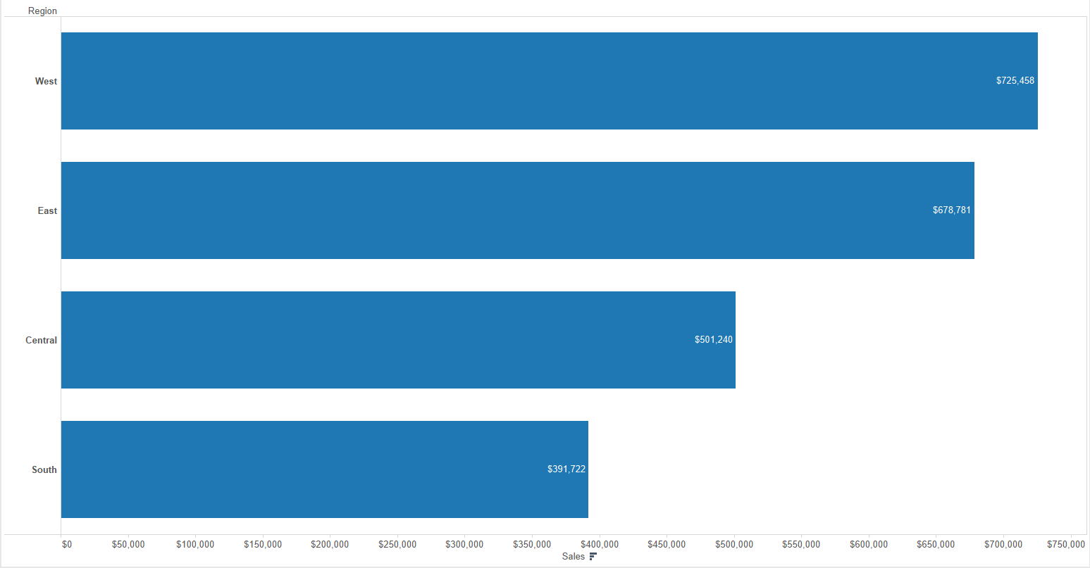
Apart from the habitual week project, this week at the Data School we also learn some useful tips for labeling bar charts to the right inside, a very good way to gain some space in our charts if the axis and tooltips are not enough and we want to label the bars, like in this image:

By default, if we click on the Label Shelf of the Marks Card, Tableau only allows us to align the labels to the right of the bar, in the middle, or to the left of the bars, but this last option will align the labels at the base of the bar, not in the left side of the end. Here are two different ways to have or labels align inside the bar chart, but at the end of the bar. For this examples I will be using the Sample – Superstore dataset:
Method 1: Dual Axis
1) Create the bar chart as usual. If we want to visualize the Sales by Region just drag & drop Sales to Columns and Region to Rows.
2) Drag & drop again the Sales measure to columns to duplicate the bar chart. Now you will have to Sum(Sales) green pills in Columns.
3) Right-click on the second Sum(Sales) green pill in columns and select Dual Axis.
4) Right-click on the top axis and select Synchronize Axis so both use always the same range. Right-click again in the top axis and uncheck Show Header to show only one of the axis.
5) In the Marks Card now you will have different cards – All, SUM(Sales) and SUM(Sales) (2) – click on the last one and change the mark type to a Gantt Bar.
6) In that same Marks Card, click on Label > Show Mark Labels and change the alignment to the left (and maybe change the color to white).
Voilà! Now you have the labels align in the top right side of the bars. The only issue with this method is that you maybe have figured that now your axis doesn’t start at 0. That’s caused by the aligment of the Gantt Bar labels. You could fixed the axis, but maybe you want it to be automatic in case the bar changes with some other filters in your dashboard, so let’s see the second method.
Method 2: Reference Lines
1) Create the same initial view: Sales in Columns and Region in Rows.
2) Go to the Analytics pane, drag Reference Line to the view and drop in the Cell option.
3) A new windows to Edit Reference Line will open. And in the middle of it, select SUM(Sales) as your value and SUM as the aggregation and select Value on Label.
4) Just below it’s the formatting options, so select None for the Line and click Ok.
5) Right-click on the label, choose format, and in the Reference Line Label options to the left open the Alignment options, select Left in the Horizontal and Middle in the Vertical, change the color of the label if necessary and reduce the shadowing to 0%.
Now you have again the labels in the right-inside of the bars, but the axis hasn’t change and we have gain some extra space in our dashboard.
