


Don't let my hard exterior fool you: when I was younger, I loved boy bands as much as the next young girl. My very embarrassing fandom was McFly and Busted (if anyone remembers them). But I also listened to classic 90s R&B boy band hits. So when I was tasked with today's Dashboard Week challenge, I approached it with glee fueled by childhood nostalgia.
The data was sourced by a pudding website, an audio-visual history of every boy band to chart on the Billboard Hot 100 since 1980. Once downloaded, I put on the Spotify playlist provided by the site and got jamming (both dance and data).
The data was essentially clean: just a join, checking date formats and potential date scaffolding. My plan, too, was simple and sleek.
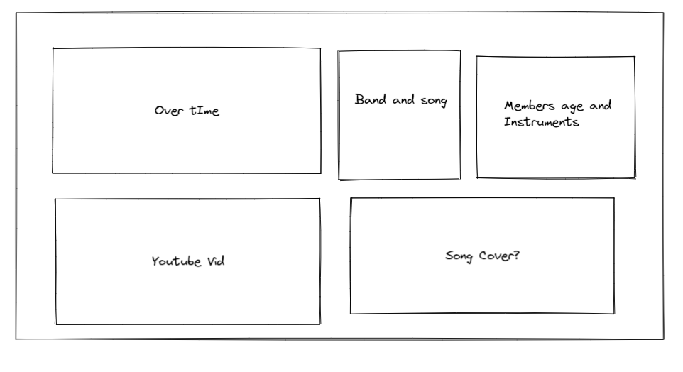
I finished my dashboard to the extent I am happy to present it. However, there are some missing elements I plan to incorporate at a later date (hence why I will be inputting a screenshot and not a live Tableau Public dashboard).
- When I published to Tableau Server, fonts have changed (probably because they were not web-safe), so that will need to be fixed.
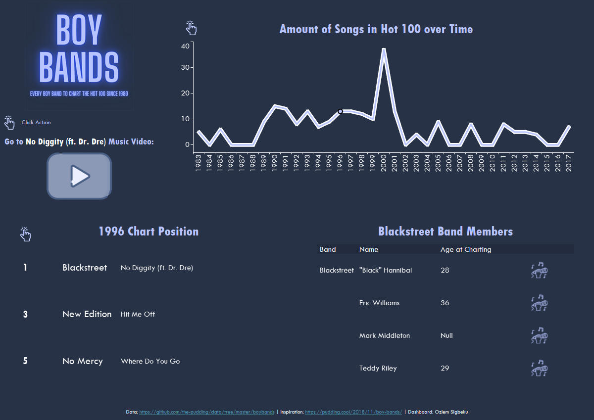
- You may have noticed I planned to include album/single covers to pop up as an image when clicking a song. I would not have time to input the URL for the images or download each song image so left this for later.
- Finally, I would have liked to have a Midi-player or the embedded YouTube video but encountered barriers with YouTube and settled for a URL action instead. I would like to better explore other options.
Another great task. I am yet to hear the feedback.