


Day three of Dashboard Week started rather unorthodoxly: trains delayed, cancelled then delayed and possibly canceled again. Finally finding a rest stop in Bishop Stortford, I am welcome, an hour late, to a session with Louisa O'Brien on accessibility.
What is accessibility in reference to data visualization?
In a most condensed description, it is being cognizant of accessibility needs when making visualizations. This can include, but is not limited to:
- Colour blindness
- Motor-issues
- Neurodiversity
- Vision-impairment
The Task
Glasgow City Council are trying to make their city’s data more accessible to residents, and have given us a sample of road repair data from FixMyStreet to show what we can do. Create a product which enables users who are not well served by current interfaces to access data about their surroundings. Be prepared to explain every design choice on your dashboard.
Requirements
- Product outcome must utilize features we learned about accessibility and universal design.
- Any products must have written credit to FixMyStreet on the final product.
- Deadline for uploads to Tableau Public is 3.30pm today.
- Presentations must be done from Tableau Public.
- Blog posts by 6pm today. Blog content should cover your design reasoning reflect on the advantages and limitations of your final product.
How did I tackle the task?
When making a accessible dashboard for our task for Dashboard Week, I spent more care than I usually do to change my perspective. From the start, I did not want to take anything for granted. When doing data discovery, I went through each field, trying to assess whether the field is reader-friendly or in need of further data transformation.
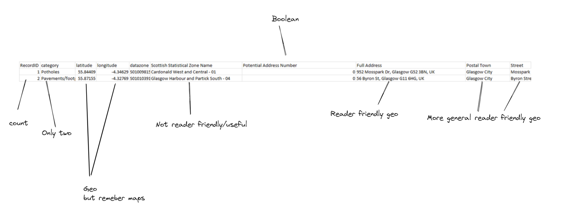
Because I do not have any accessibility requirements, I struggled to know if I was accurate about my assessment on accessibility. No duh. I was hoping to create a dashboard that would cover a wide range of accessibility needs.
My plan included a easy-read version for viewers who have either have learning-related accessibility needs or non-English-speakers with a majority of the wording supplemented or replaced my symbols and images. This was a throwback to my government days when every major document required an easy-read version. This did not manifest in the end, due to the time it would have taken to make this.
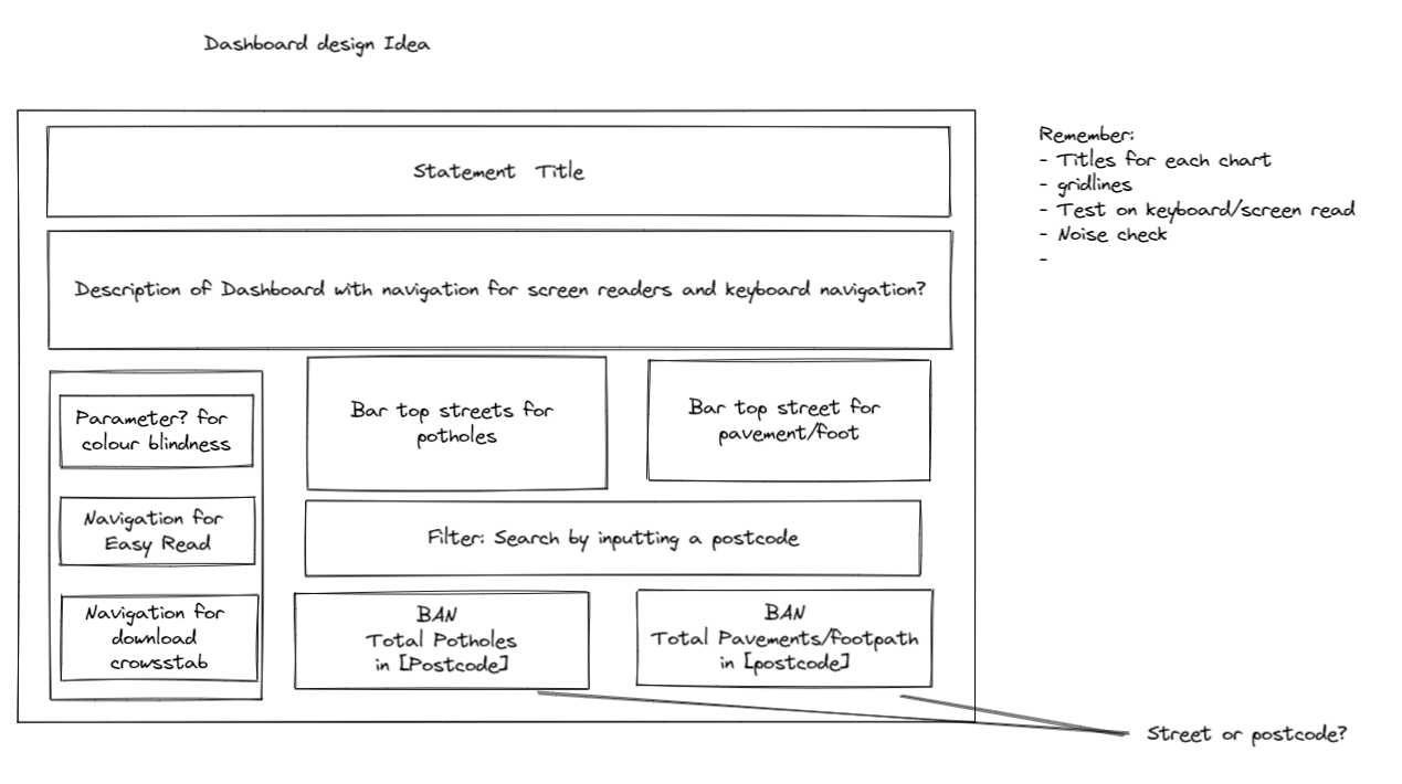
I wanted to keep it simple and effective so opted for two bar charts and two BANs.
It also included a download button for easier screen-reading of the data. All charts and colours were also considered with both neurodiversity and colour-blindness in mind.
One comment Louisa had mentioned about making a accessibility friendly dashboard was:
Just because your making a accessibility dashboard, doesn't mean you can't make a good looking dashboard
And I really took this to heart. So when picking colours and thinking about the design, I really wanted to reduce the noise, and remember contrast. As a result, I used a gray-scale colour palette generator. It allowed me to choose the colours I wanted but to ensure the contrast was sufficient for colour-blind accessibility requirements.
My final dashboard and feedback

Although it needs further improvements on the back of the feedback, I was quite proud of the outcome. I did plan for a left container with all the buttons but wanted to simplify and create some control with the order a keyboard user would be able to access buttons and charts so opted for less left to right reading in favour of a top to bottom read.
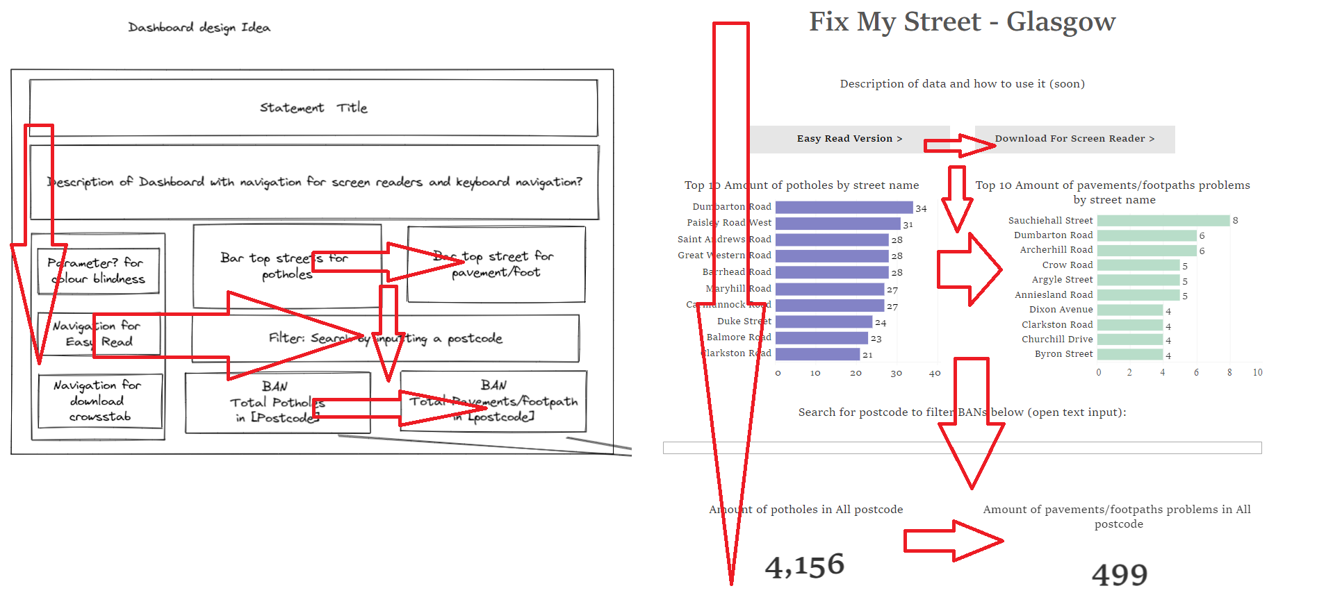
Some things I didn't realise until final presentation of my dashboard was Tableau Public doesn't always look like the Tableau Desktop version. When I published up to Tableau Public, the fonts looked smaller, and keyboard users and screen-readers would not be able to pickup dashboard text boxes.
I was also asked on why the BANs were placed below the bar charts which I had planned purposefully as the bar charts were an overview of the most problems by streets and the BANs were filterable by user input. I do wonder if this was a overthink on my part but as it stands, I like it.
The updates I will need to do are:
- Credit FixMyStreet
- Write a description for the dashboard and how to use it
- Put text in textboxes in either sheets or dashboard title to be picked up by screen readers and keyboard users
- Increase the font and double check the Tableau Public version
- Fix the postcode filtering
Further updates for a bit later:
- Make a easy-read version
In all, great task. I will be spending time to finish the dashboard.