


SLOPE CHARTS
So there is a new tradition in our company where we create a Christmas calendar that explains for each day in the Christmas period how to create a particular visualization in Tableau. I volunteered for a topic and my colleague gave me the task to explain what a slope chart is. So here we go:
What is a slope chart.
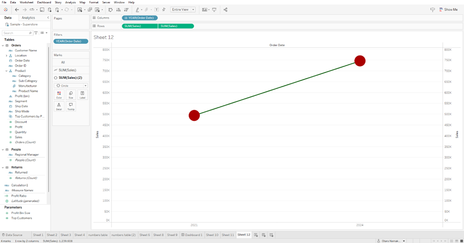
A slope chart is a line that is used to show the development between two points.
How is it used?
It is used to compare the developments of a particular thing, in two different period instances.
When is it used?
Used especially when you want to compare two different stages or timelines of a particular instance.
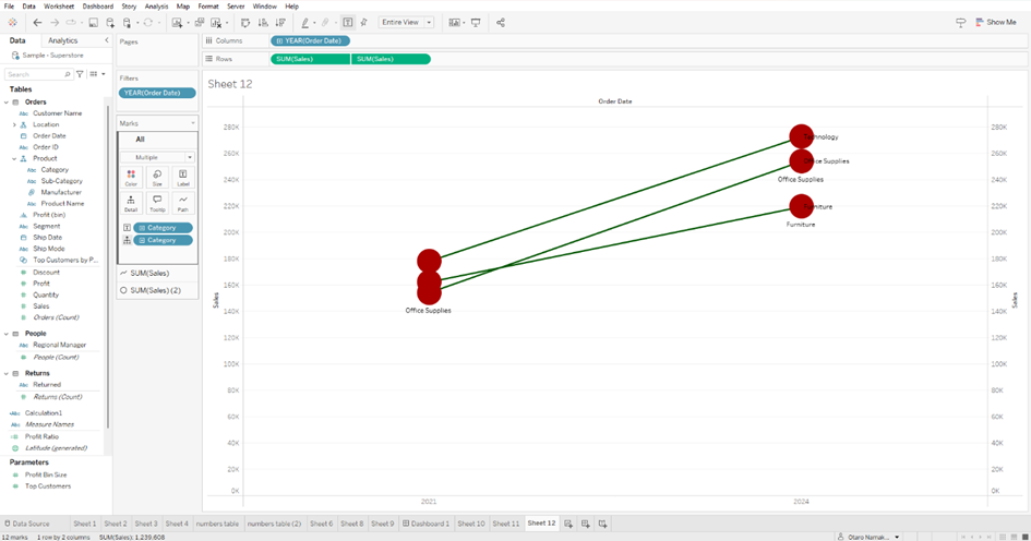
Used to show how different ranks have changed over time or vary between two categories
What are the advantages?
· Best used to communicate a story happening in two different timelines.
· Less cluttered than line charts
· Story is easily understood
· Best in showing crucial aspects of the business
· The details are not necessary to show.
How to build a slope chart?
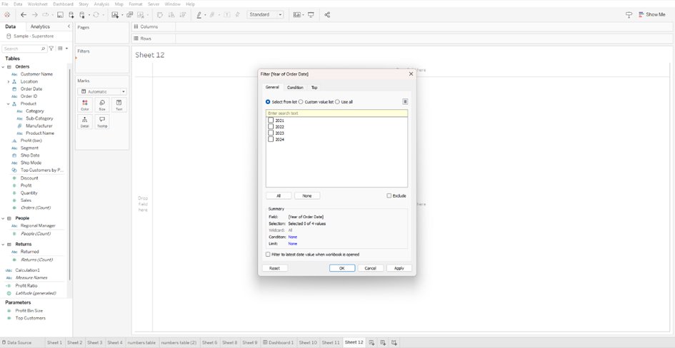
Make sure you have two different instances that you want to compare your data with. Place the date variable to the filter shelf

Then filter the date variable to the two points you want to compare, either in years, months, weeks, or days.
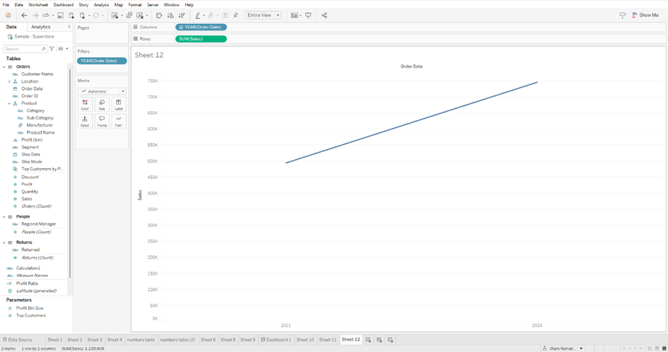
Now place the date variable to the column shelf

You can now add a numerical field to the row shelf e.g profit, sales or quantity
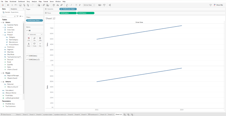
Create a second chart as a dual axis with the same measures.
On the second axis you can select circle on the marks card, so that the second axis just shows two circle points.
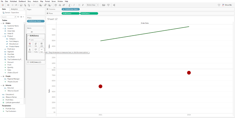
Create a dual axis for both visualizations.

Sychronize the axes
You can now add a categorical variable to the details shelf and text shelf to show the difference within the durations
· And there you have it, a method on how to create a slop chart.