I was given a task to analyze the Permitting Dashboard website as part of the dashboard week assignment. To create an impactful dashboard is a journey that requires careful planning, data preparation, and iteration. In this blog, I will walk you through the entire process of building a Milestone Status Dashboard, from the initial stages of data preparation to the final presentation, including the challenges I faced and how I overcame them. Finally, I’ll share additional insights and analyses that can be derived from the dataset for future exploration.
Let’s start with Data Preparation
I worked with a dataset containing milestone and project details for large infrastructure projects, and luckily the dataset also came with a dictionary, which then made it easier for me to understand the dataset.
Some of the key columns included:
Project Details:
Project ID, Project Name, Lead Agency, Category, Sector.
Milestone Details
Milestone ID, Type, Group, Target Completion Date, Actual Completion Date.
Status Information
Action Status (e.g., Completed, In Progress, Paused, Cancelled), Delays (days), On-Time Status.
After understanding the dataset I then jumped into Data Preparation, and did the following steps in Tableau Prep to clean the data:
Initial Cleaning:
I removed unnecessary columns such as full addresses and geolocations, as they weren’t relevant to the analysis.
I then checked for missing values in critical fields like milestone dates, and action statuses.
Gathering Metrics:
I created a calculated field to calculate milestone delays, as Actual Completion Date - Target Completion Date.
I then categorized delays into "On Time" or "Late" based on the calculated days.
Categorization of Milestones:
I then grouped milestones by “Action Status” (“Completed,” “In Progress,” “Paused,” “Cancelled”).
I afterwards decided to focus on fields directly relevant to milestone statuses, such as responsible agencies and milestone groups.
Aggregation:
Once I was done with the grouping the next step was to aggregate milestones by agency, project, and milestone groups to prepare the dataset for summary visualizations.
Challenges in Data Preparation
- Cleaning and preparing the data took longer than I had anticipated because my initial scope of analysis was somehow to broad. To stay on track, I had to narrow the scope of my analysis.
- Initially, I had planned to calculate delays independently, but then realized that the Action Status column already categorized milestones efficiently. This saved me quite a considerable amount of time, but required some adjustments to my original scope.
Visualization and Dashboard Creation
Original Scope vs. Adjustments
My original plan included trend analysis and delays across timelines. However, due to time limitations and data constraints, I had to shift my focus to categorical analysis of milestone statuses. This allowed me to maintain relevance to my original user story without overcomplicating the scope.
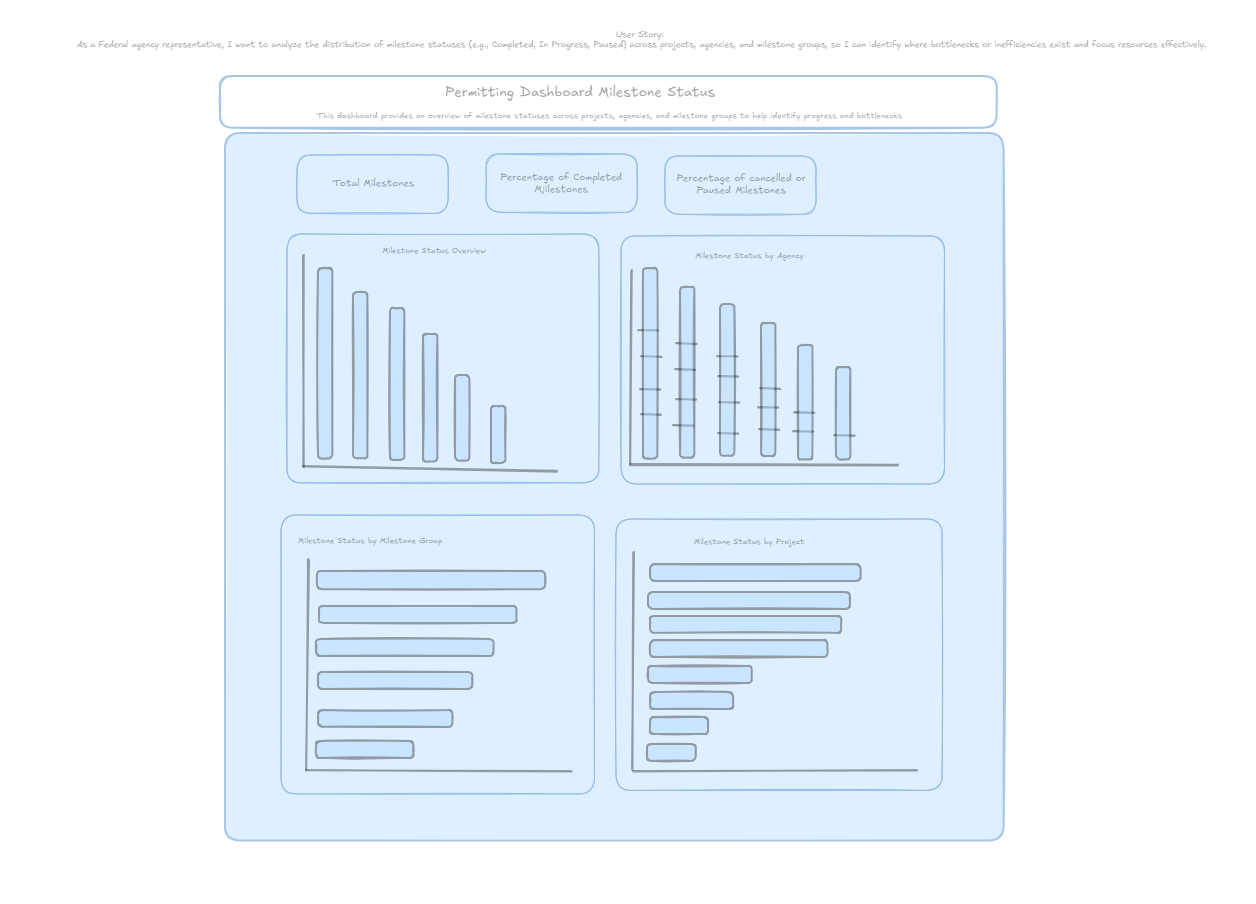
This was then my simplified user story:
"As a Federal agency representative, I want to analyze the distribution of milestone statuses (e.g., Completed, In Progress, Paused) across projects, agencies, and milestone groups to identify bottlenecks and focus resources effectively."
I then went a head and sketched my imagination of the final dashboard on Excalidraw, which is a nice way of organizing thoughts and the planned analysis, as well as giving an initial idea of how the dashboard might end looking like.
User Story Dashboard Sketch:
After getting an idea of what I wanted to do, it was time to build the Dashboard
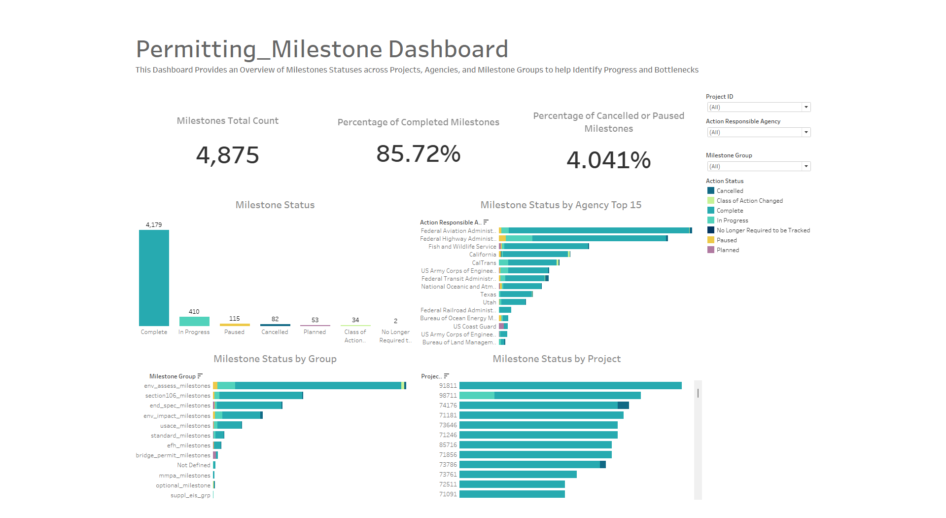
The dashboard consisted of:
1. Key Performance Indicators (KPIs):
- Total Milestones: Total count of all milestones in the dataset.
- Percent Completed: Percentage of milestones marked as “Complete.”
- Percent Cancelled/Paused: Percentage of milestones in “Cancelled” or “Paused” statuses.
2. Visualizations:
- Milestone Status Overview: A bar chart showing the distribution of milestones by action status.
- Milestone Status by Agency: A stacked bar chart displaying milestone statuses across agencies.
- Milestone Status by Group: A stacked bar chart illustrating how milestone groups correlate with action statuses.
3. Filters:
- Enabled filters for Project Lead Agency, Project ID, and Milestone Group to allow interactive exploration.
Final Presentation
The dashboard provided actionable insights:
- A majority of milestones were completed, but certain agencies and groups showed higher rates of cancellation or pausing.
- Milestone groups associated with environmental reviews experienced the most delays.
- The dashboard’s interactivity enabled stakeholders to drill down into specific projects or agencies for targeted analysis.
Challenges and Lessons Learned
Challenges:
- Formatting KPIs in Tableau Desktop required manual adjustments to ensure they displayed correctly without duplicating percentage calculations.
- With many agencies and milestone groups, stacked bar charts became overcrowded. So I decided to filtering to show only the top 15 agencies which then resolved this issue.
- My initial user story was too broad for the available amount of time. Therefore simplifying the scope to focus on milestone statuses was crucial for success.
Lessons Learned:
- Flexibility is Key: Be ready to adjust the scope and focus of your analysis based on the data and time constraints.
- Iterate Quickly: Start with basic visualizations and refine as you go.
- Prioritize Interactivity: Filters and drill-downs greatly enhance the dashboard’s usability and impact.
Future Possibilities
The dataset offers opportunities for further analysis:
- Trend Analysis: Examine changes in milestone statuses over time to identify systemic improvements or declines.
- Cost Correlation: Link delays and cancellations to project costs to assess financial impacts.
- Geographic Analysis: Use the location data to map projects and milestones geographically, highlighting regional bottlenecks.
- Predictive Insights: Analyze patterns in delays to predict which projects or milestones are at risk of delays or cancellations.
Conclusion
This project showcased the importance of planning, adaptability, and a focus on actionable insights. By narrowing the scope and leveraging the data effectively, I delivered a dashboard that met the user’s needs within tight deadlines. The Milestone Status Dashboard provides a solid foundation for decision-making and opens doors for deeper analysis in the future.