Understanding seasonality in data is critical for identifying recurring patterns and planning strategies. Tableau provides powerful tools to uncover these trends effectively. Seasonality Analysis helps businesses anticipate demand, plan resources, and identify cyclical opportunities or risks.
Below are three methods to visualize seasonality, each with its unique advantages.
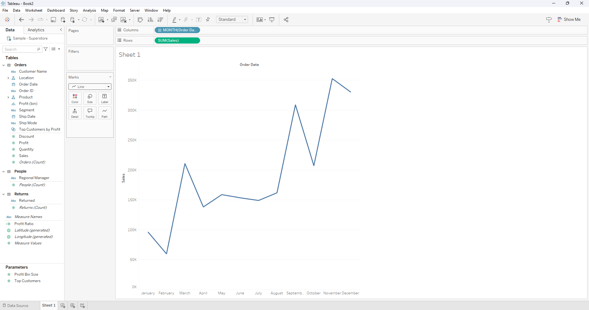
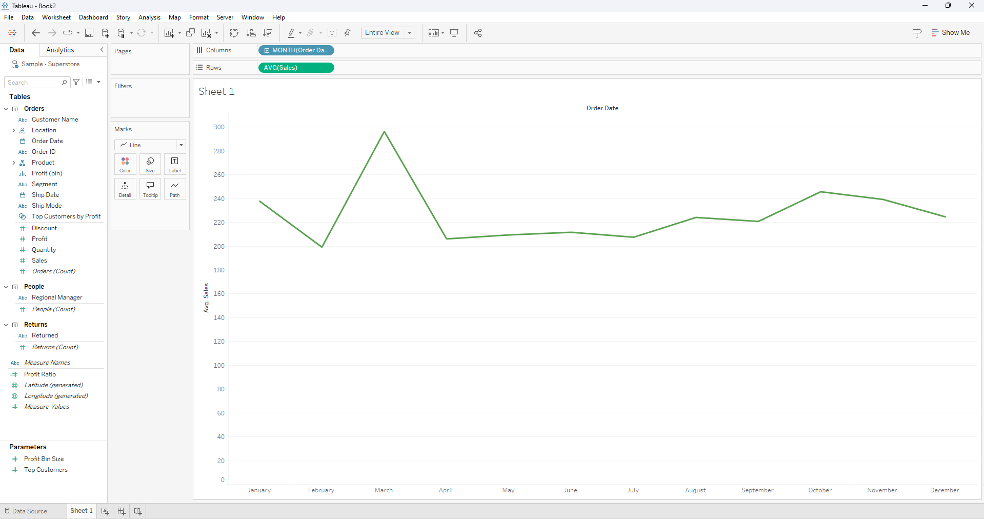
1. Line Chart for Clear Trends
Why: Line charts are straightforward and great for displaying seasonal fluctuations over time. They allow viewers to see trends, peaks, and troughs intuitively.
To create a Line chart that shows clear trends we:
- Drag Order Date to Columns.
Convert Order Date to Month-Year (discrete).
Drag Sales to Rows and set the Marks card to Line.
Right click on Sales and change measure to Average
Optionally, we can add Region to the Color shelf for comparisons.
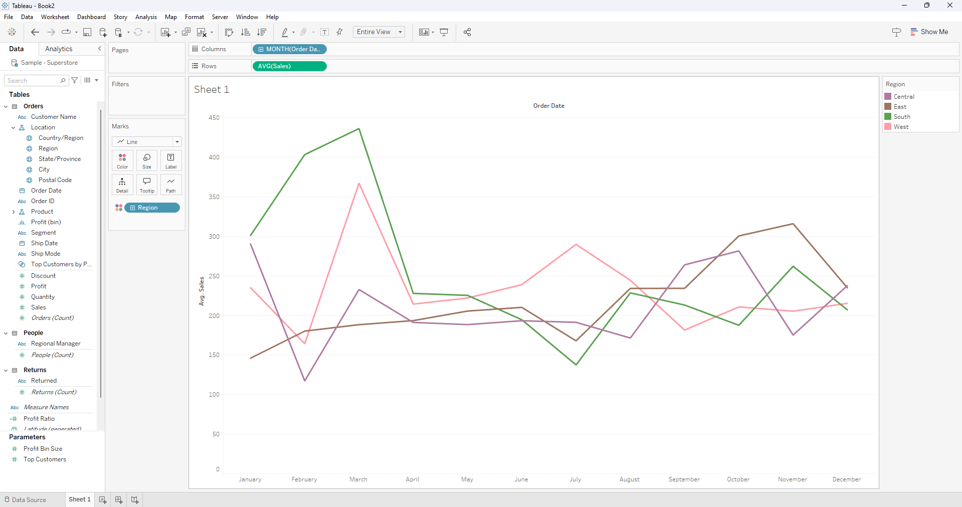
Example: A line chart showing regional monthly sales trends, highlights peak shopping seasons, such as spikes in the month of March.
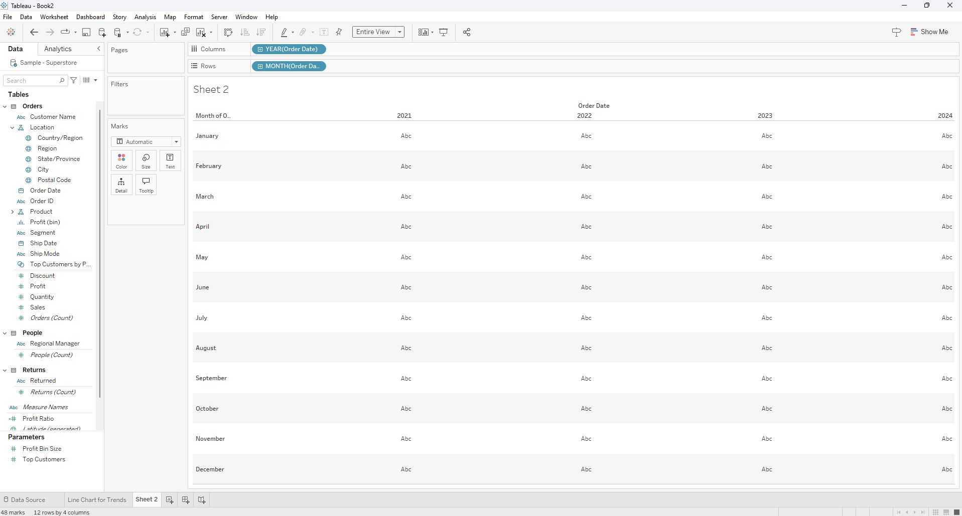
2. Heatmap for Intensity
Why: Heatmaps are ideal for displaying seasonality in a dense, compact format, making it easy to identify patterns at a glance.
So how do we create a Heatmap?
- Place Month(Order Date) on Rows and Year(Order Date) on Columns.
Drag Sales to the Color shelf.
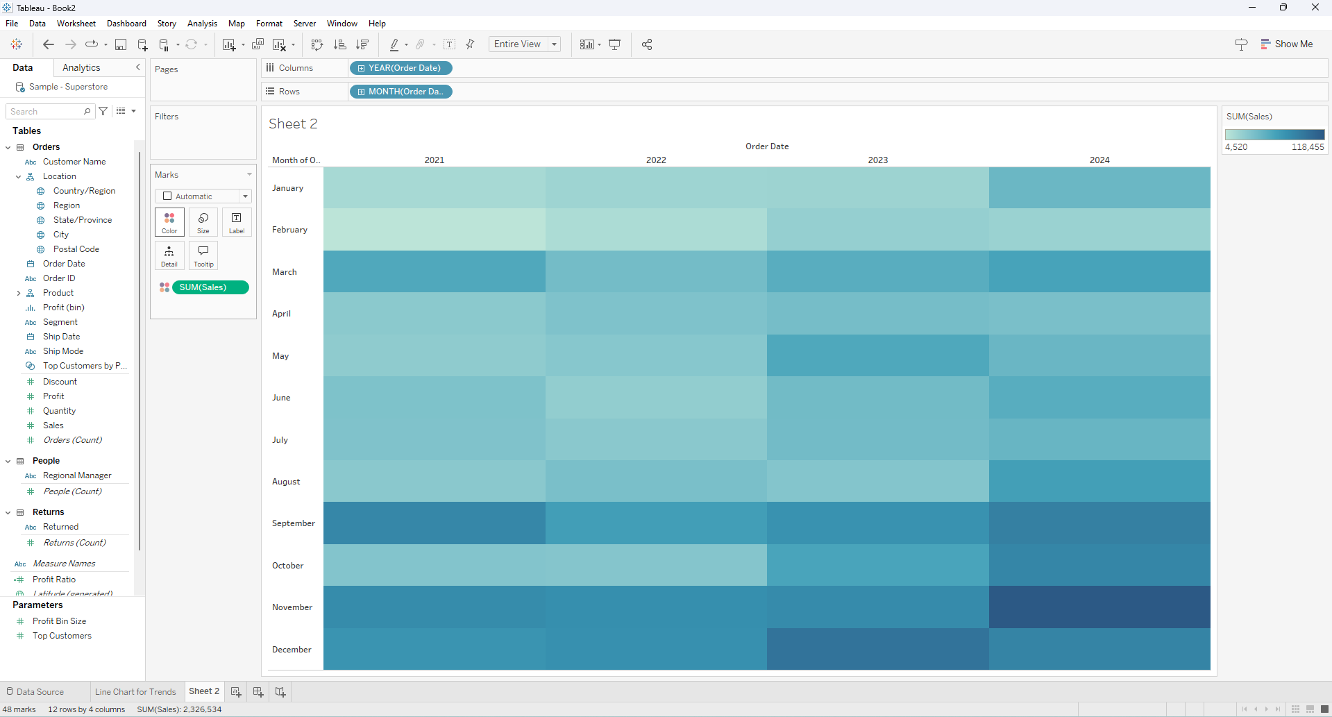
Right click on Sales and change measure to Average
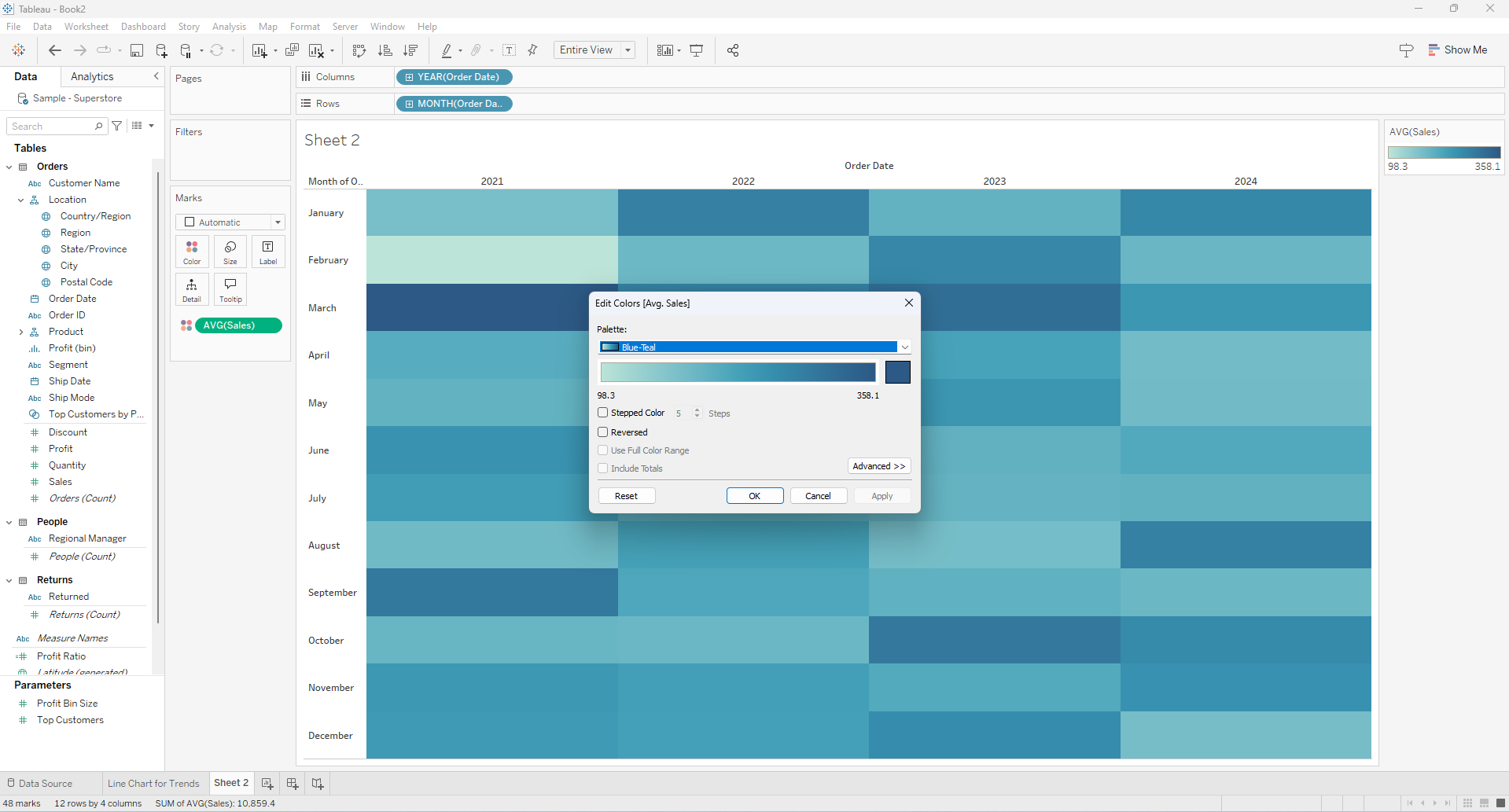
Adjust the Color settings to enhance visual clarity.
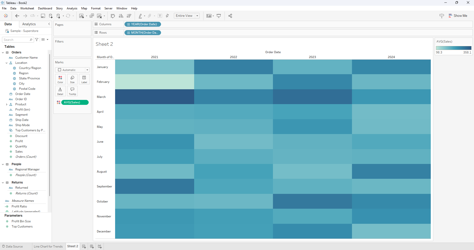
Example: The heatmap displaying monthly sales intensity by year, immediately reveals that the highest-performing month is March.
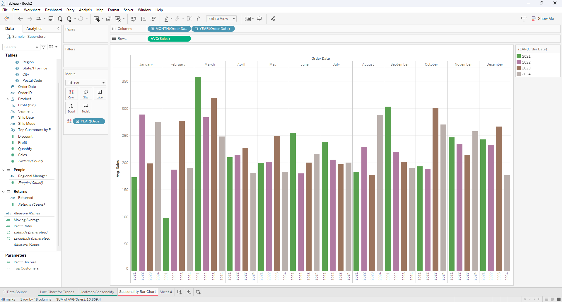
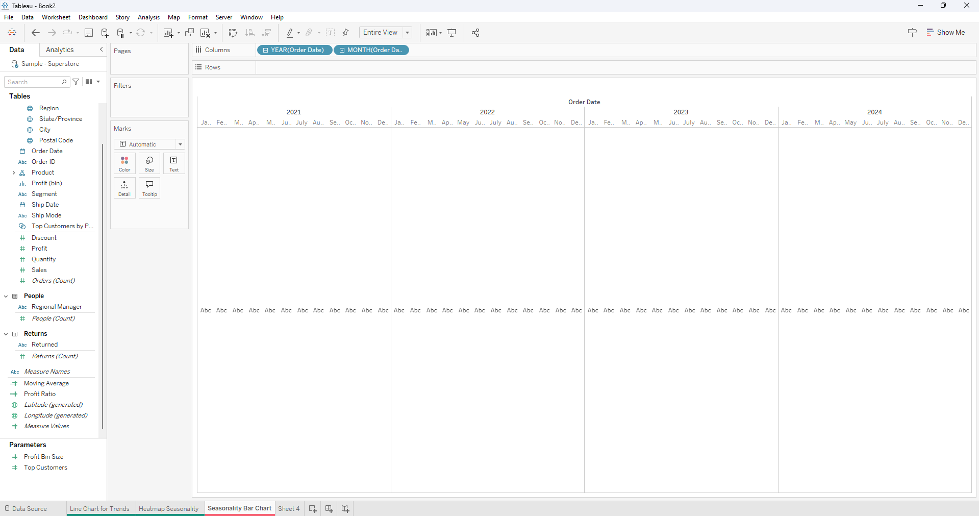
3. Seasonality Bar Chart
Another way of showing seasonality is through the use of a month year bar chart that can be great in comparing seasonality over a period of years.
To create this we start by:
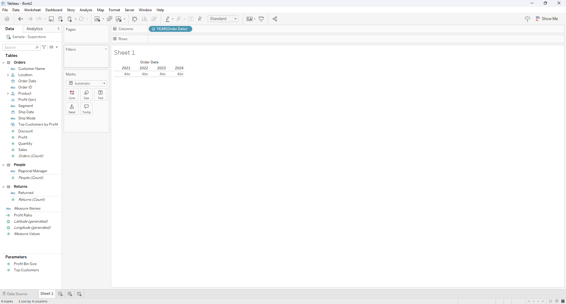
Dragging the Date field to the columns
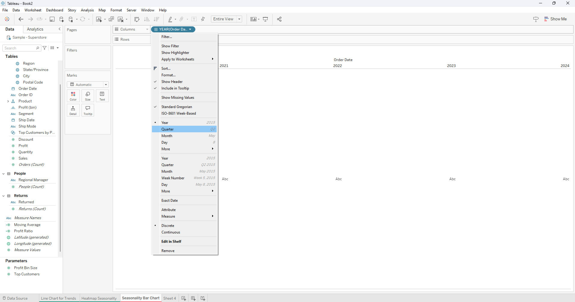
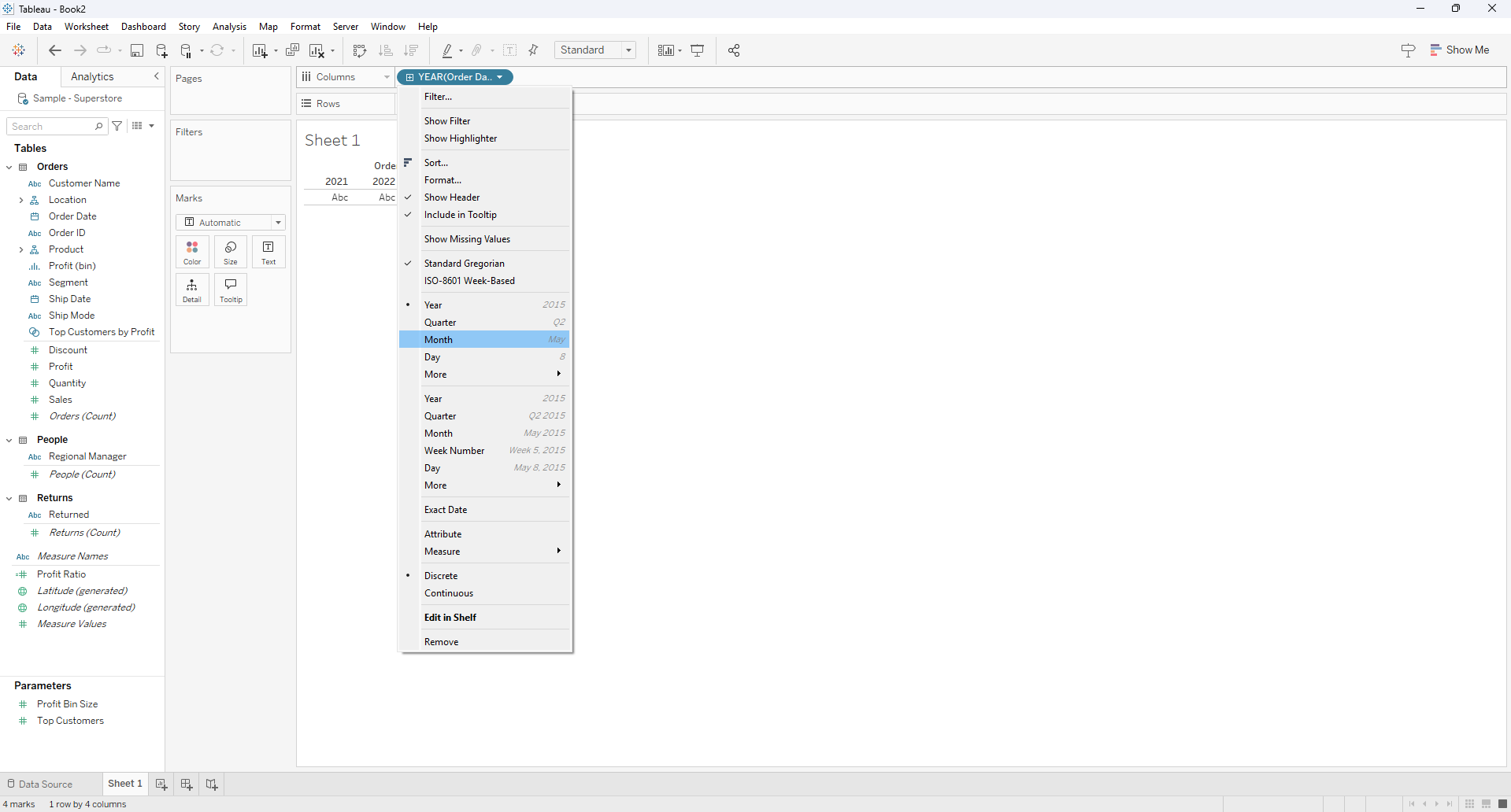
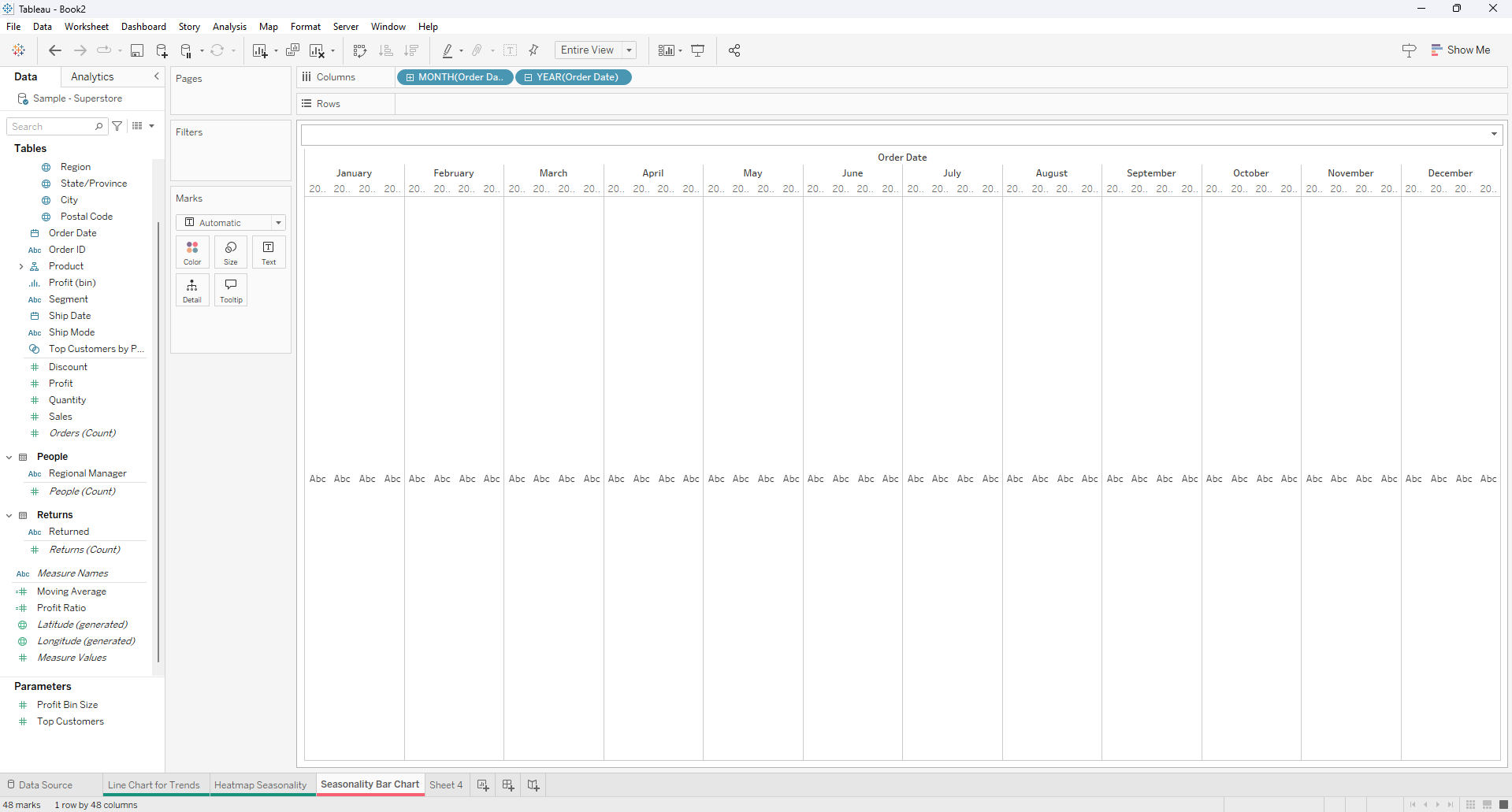
Click on the date field to have a quarter year display.
Right click on the Quarter Date field and select month.
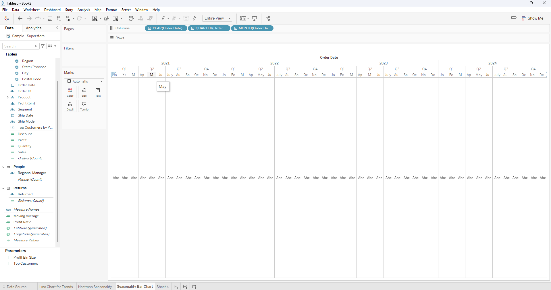
Remove the quarter date field
Switch the month and the year position on the columns
Drag the measure value (in this case Sales) to rows and change the mark type to bar chart.
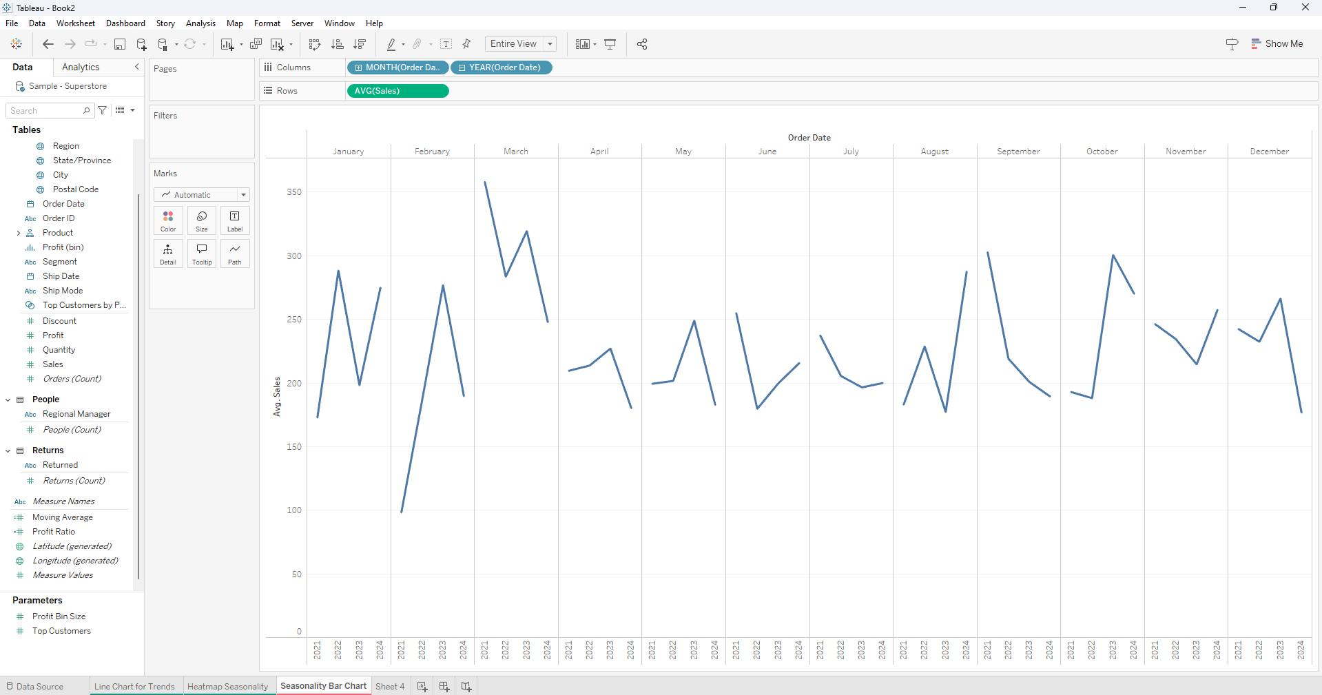
Finally drag year to color.