At the data school, there is this tradition that before a cohort graduates, they get an assignment to create a dashboard daily for a whole week. It is one of the most dreaded or well talked about to dos that frightens almost everyone, that it was natural that I also became worried, wondering how can it even be possible to do that.
The idea is to collect or create data that you can analyze and have it visualized in Tableau within a day. So today was our first day, and the assignment was to create a dashboard visualization of our resume. At first it sounded implicitly difficult, but after our coach Peter advised us to find inspiration from Tableau public it then started looking like it was actually doable.
After looking up a couple of inspirational visualizations, it was time to work and this is how I went about visualizing my resume.
I started by creating 5 excel sheets that captured my resume data:
· personal information,
· education,
· career development,
· certifications
· skills
Each sheet contained the necessary information of what happened, when it happened and where it happened, as well as capturing my skill set level measured on a scale of 1-10.
I then went ahead to upload the sheets in Tableau before I realized that I might have a challenge in connecting the sheets together, due to a lack of a common field in any of the sheet. At first I contemplated on creating a unifying column for the sheets, that could provide the required connection, before asking my coach Peter, who advised that I could as well upload the sheets as separate Data sources. This was a wonderful piece of advise and a reminder of what I learnt, that saved me a considerable amount of time.
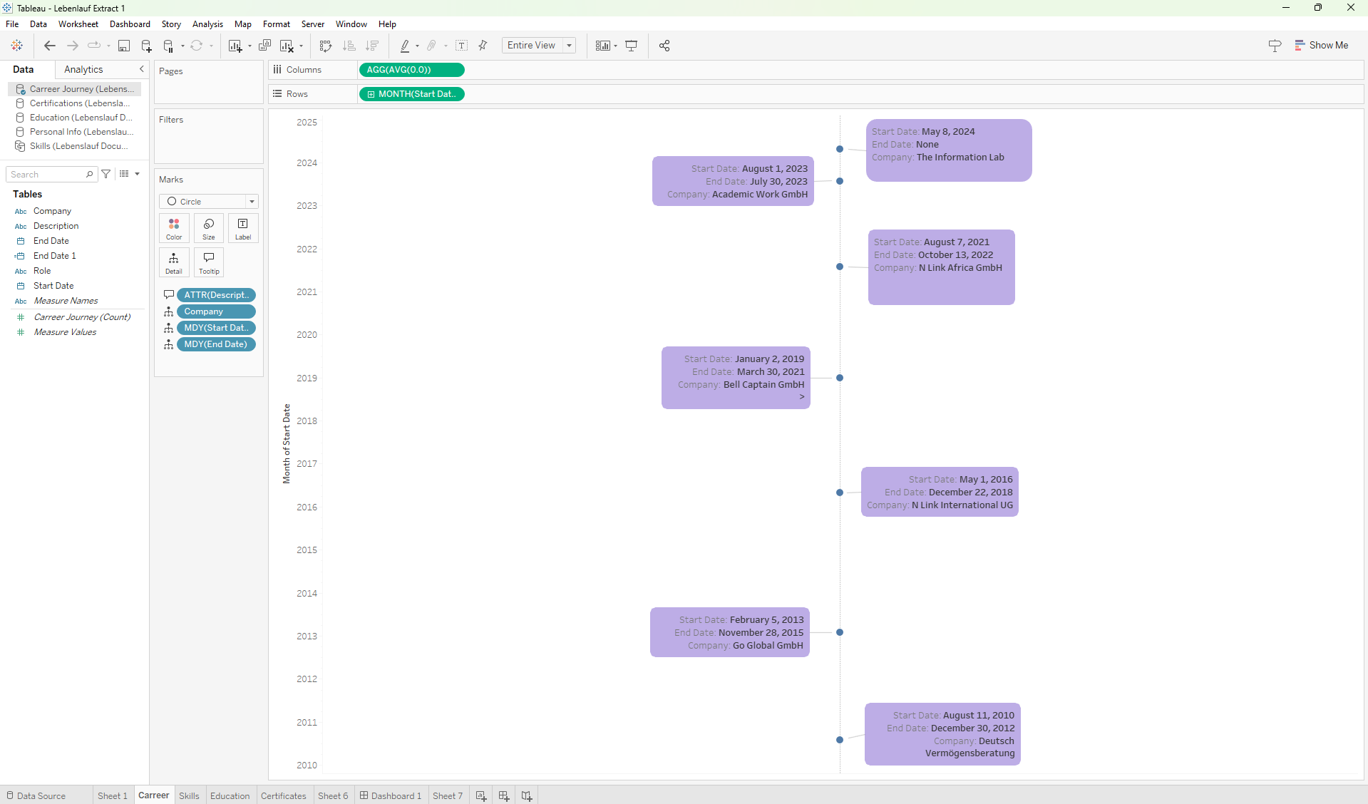
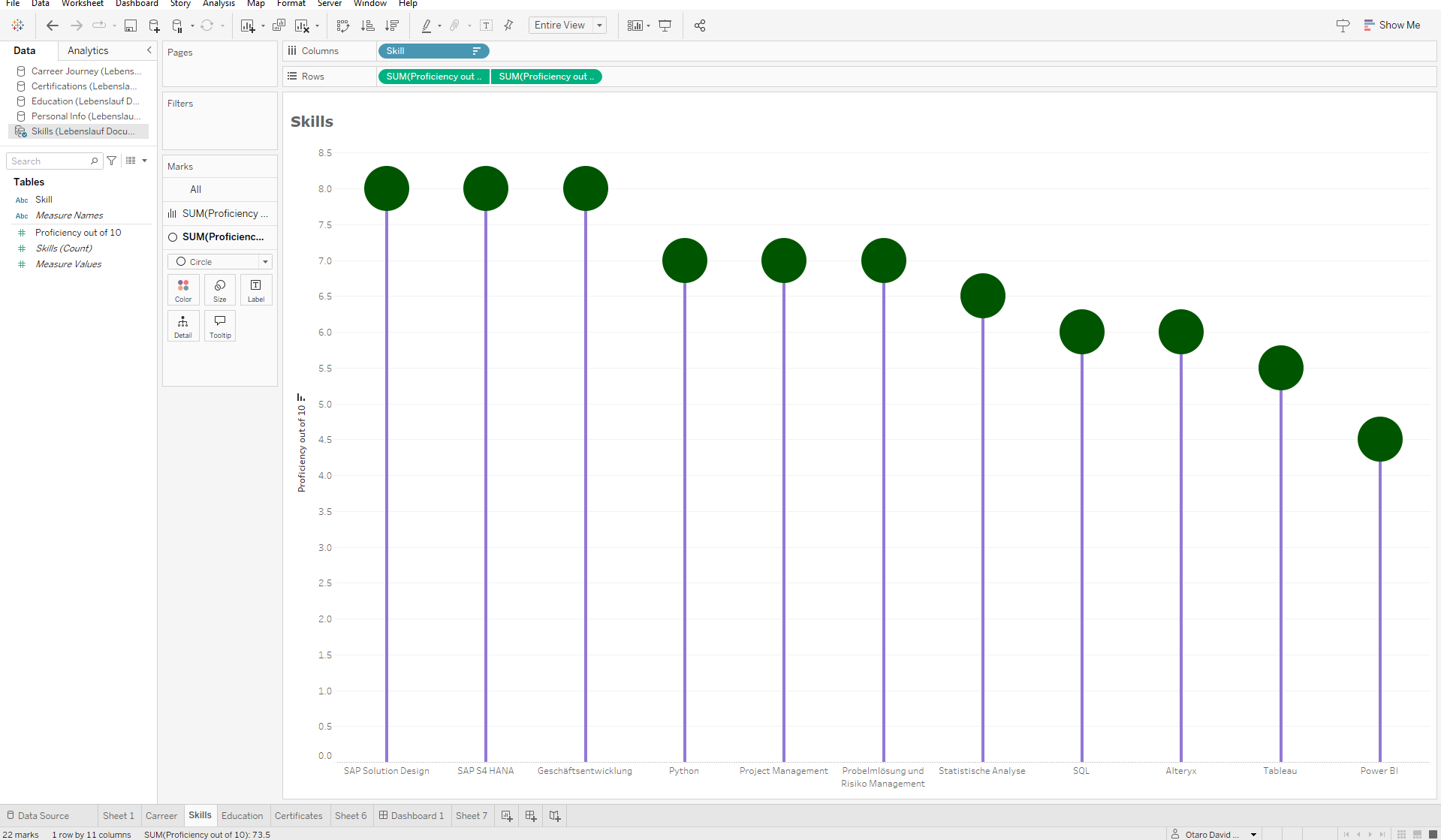
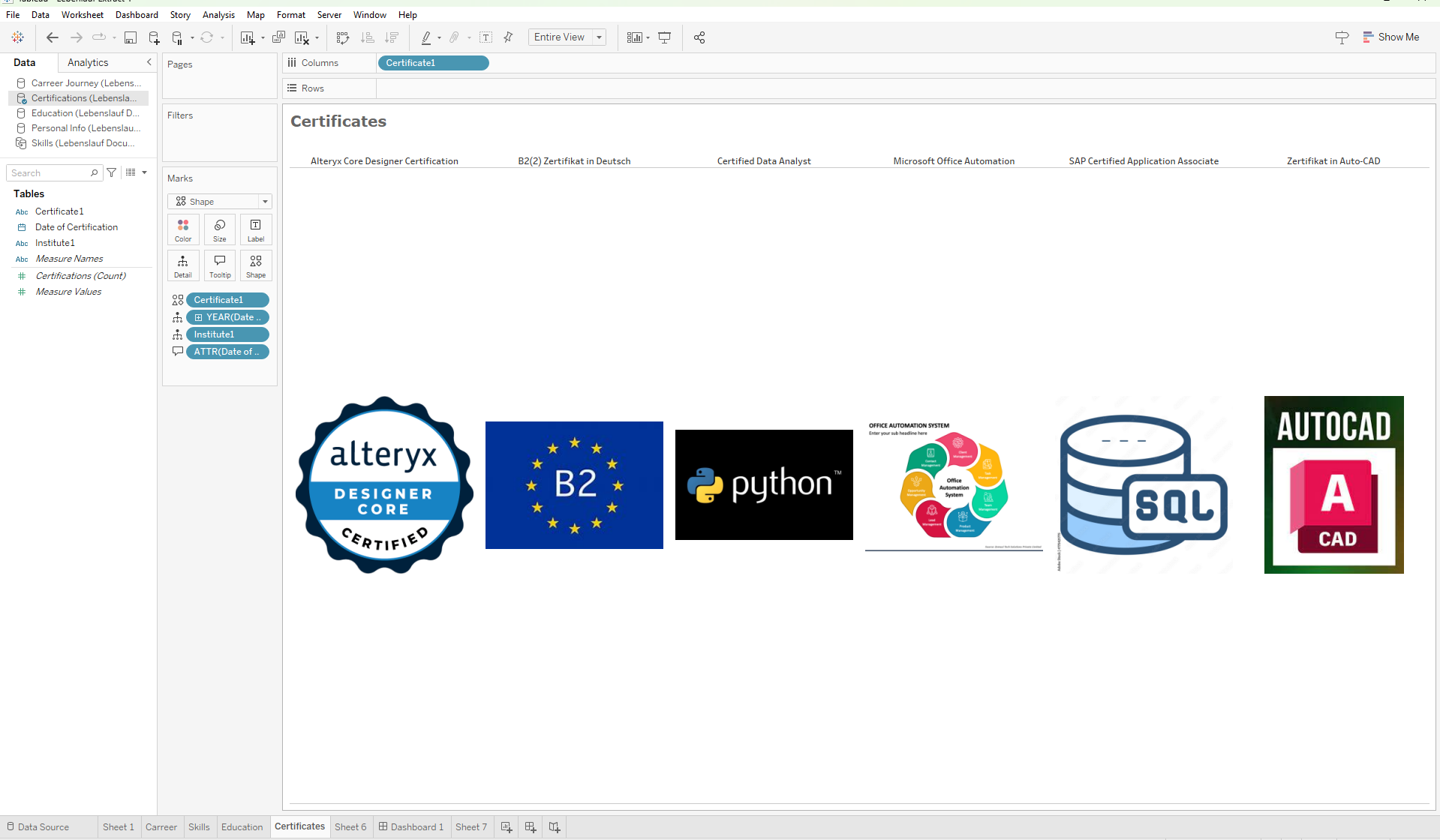
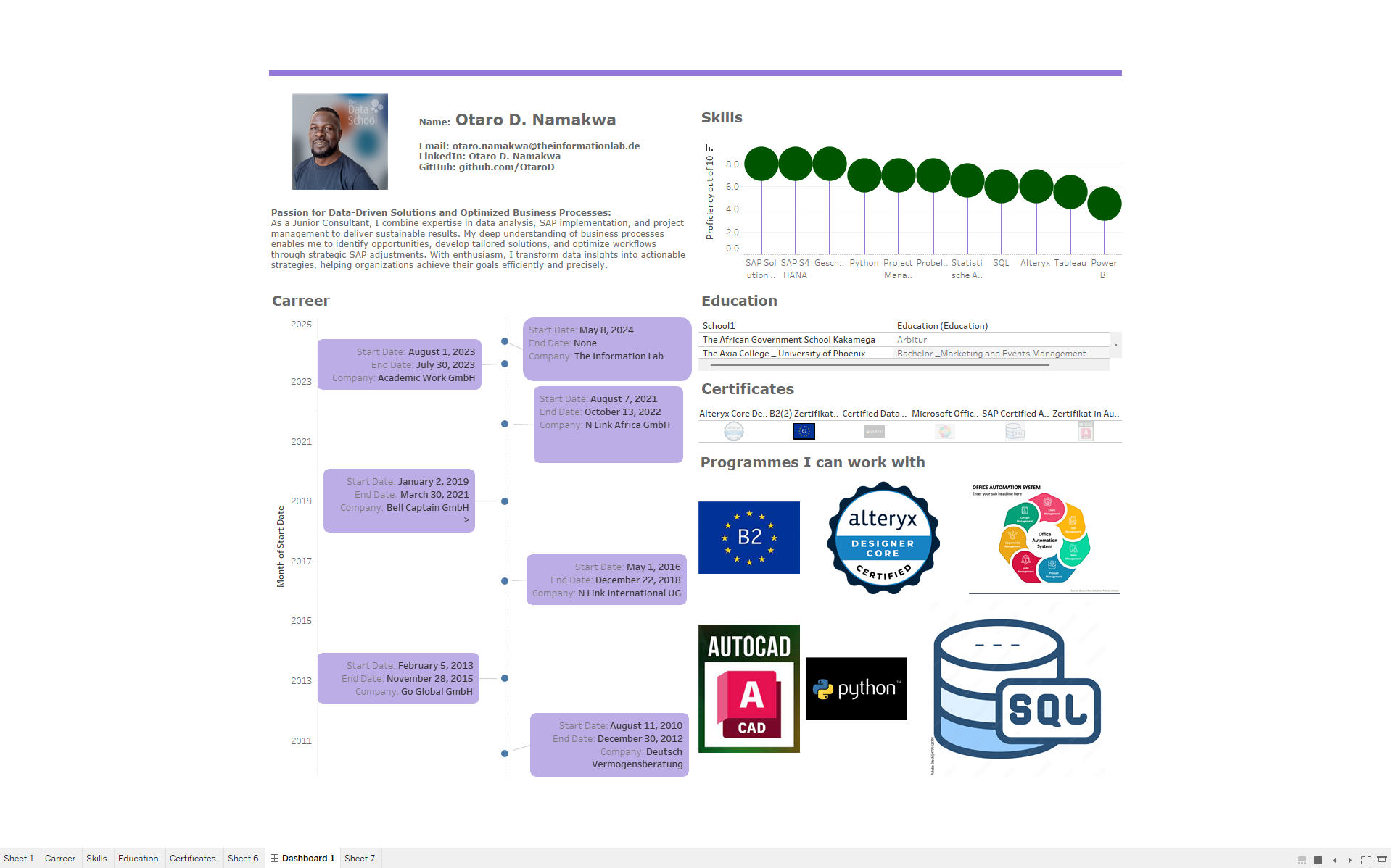
The first visualization was a timeline, that showed my career progress over the years, whereas my second visualization was a combined bar and circle chart showing my skill set compared on a scale of 1-10. I then decided on visualizing my educational background and certification as tables, and then went ahead and imported some images in shapes to represent the software programs I am able to work with.


After doing some cleaning on the vises, it was time to place the vises on a dashboard. Here I must admit, I was kind of struggling again with time, having wasted a lot of it trying different ideas on the visualizations as well as image downloads and preps. At this time Peter warns us, that we have about 30 minutes left before our presentation, and it was at this point that my creativity left. I hate it when I cannot finish something the way I want to, but we as have learnt from the job, work with what you already have, and finish the job. So I quickly rushed in creating the dashboard before the time was over, which of course meant that it will not be exactly what I wanted to visualize but it would be enough for the results that were expected.
It was challenging, especially at the end, but all in all a very nice experience. To imagine it is possible to analyze data and create a dashboard within a day, is quite impressive.

