


A useful aspect of data visualization is that it can allow you to easily compare different categories against each other. One way to do that is through barbell charts.
A barbell chart allows you to compare how two different measures compare against each other, or how different dimensions compare on a measure. This allows for a visual way to direct compare different properties to one another. And in the rest of this blog post, you'll see how you can create the two different versions of a barbell chart. For the examples provided, we'll be using Tableau's Superstore dataset to create our two charts.
Two Different Measures
When we want to compare two different measures, this is where a barbell chart comes into play. As we are using the Superstore dataset, let's find out how the sales compares to the profit for each sub-category of the products sold.
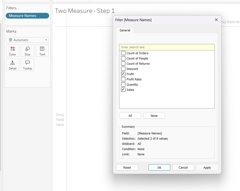
Step 1:
Since we want to see the profit and the sales, we'll need a way to show just those two measure on our chart. This means that we want to us the Measure Names and Measure Values to get them both on the chart. One way to get sales and profit as our Measure Values is to put Measure Names on our filters and only including the measures we want to see.
Step 2:
Next we can drag Measure Values onto our column and the Sub-Category onto our rows. This automatically displays as a bar chart.
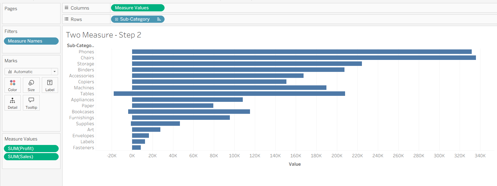
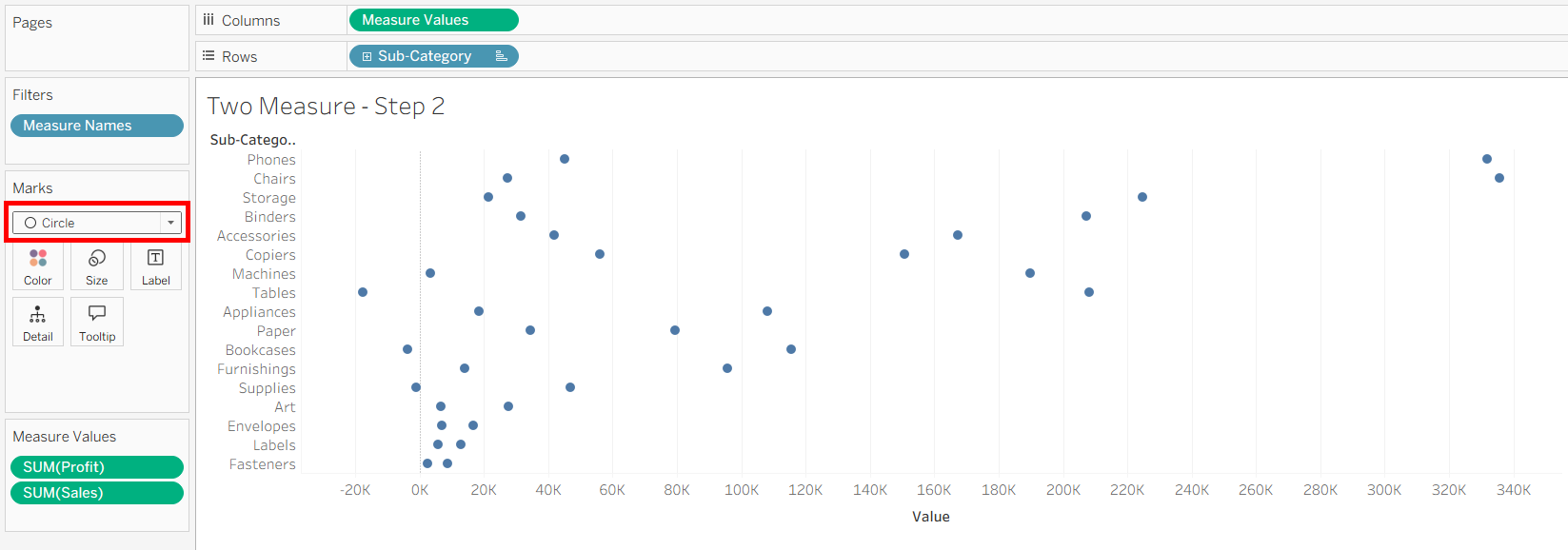
So you can click on the marks card to swap it to a circle. This will be what the ends of the barbell looks like.
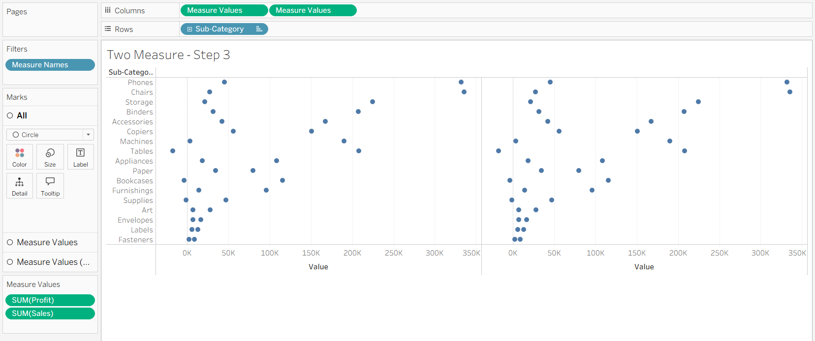
Step 3:
Next is to put a second Measure Values on columns. This creates a duplicate chart next to the original one.
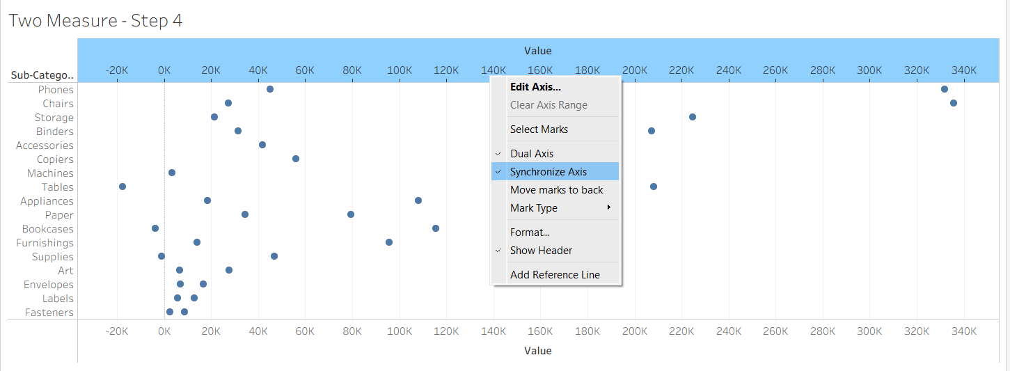
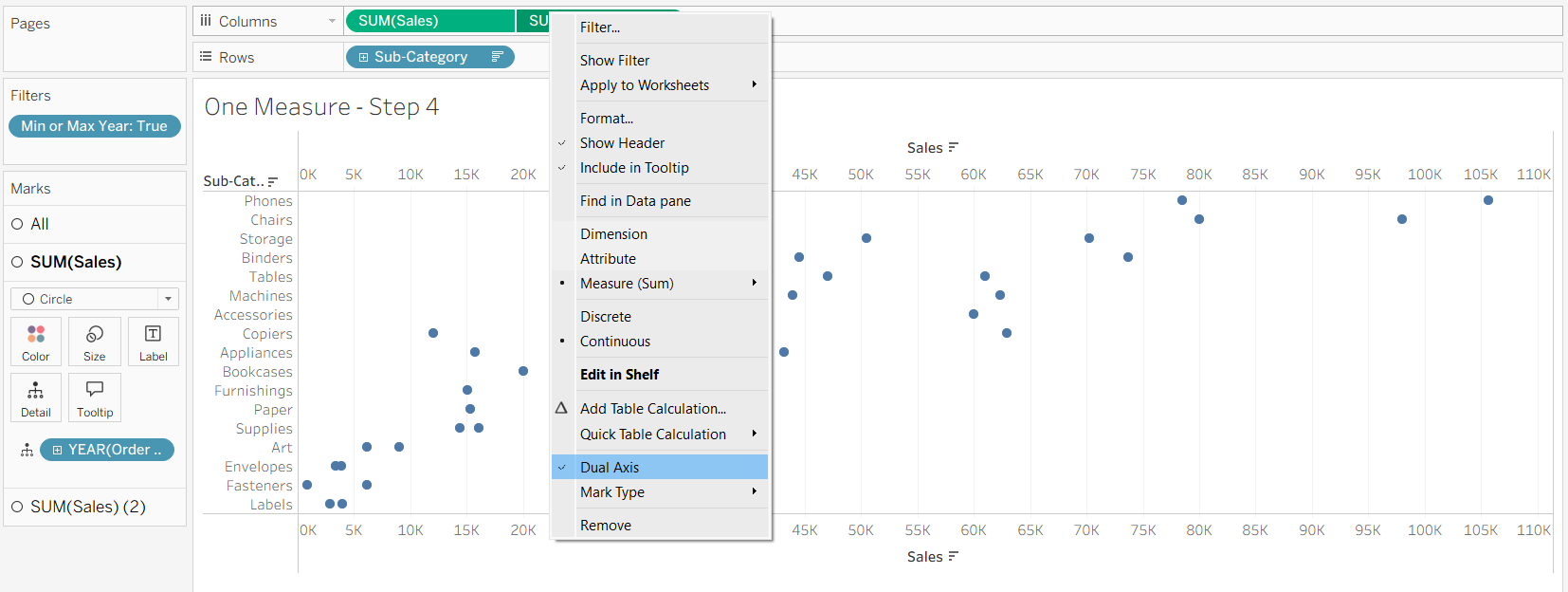
Step 4:
After that, right click on the second Measure Values pill on columns and tick 'Dual Axis' to combine the two charts together.
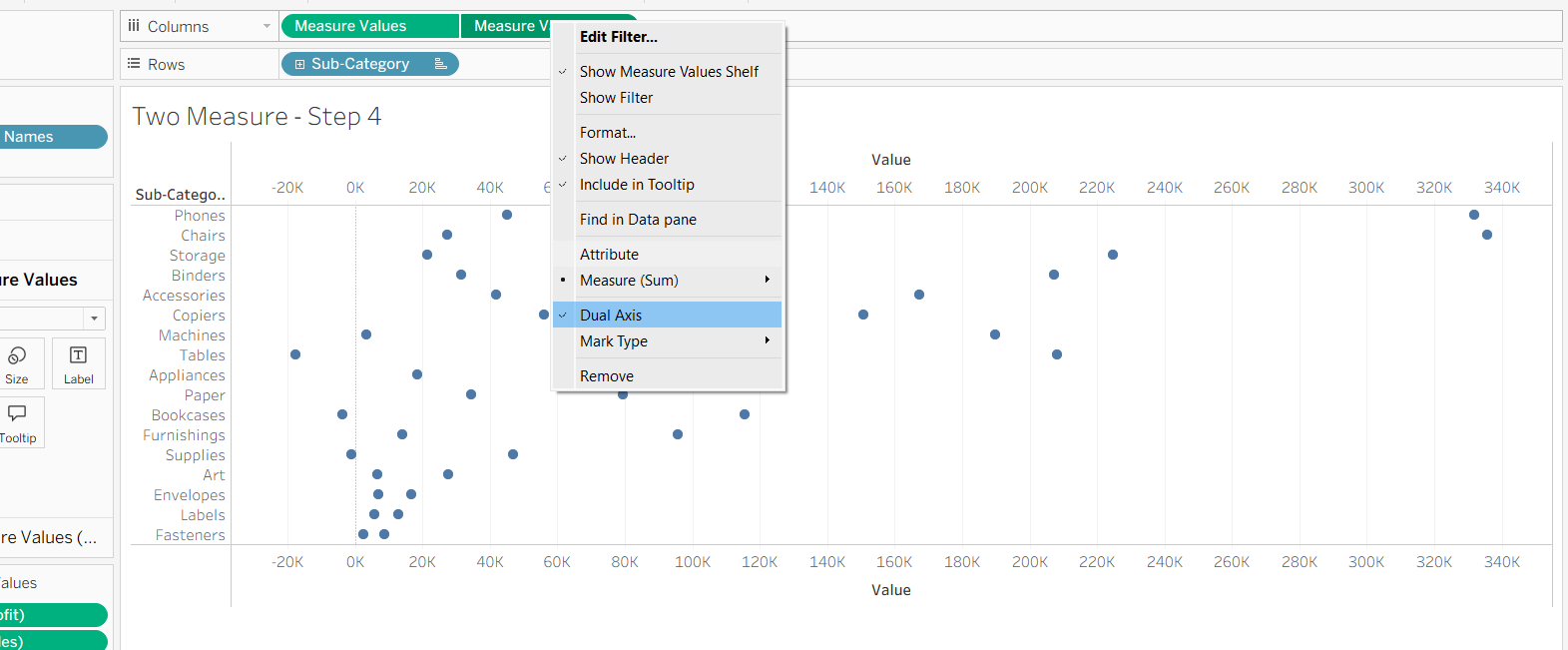
To ensure that our chart looks like the chart we made in step 2, make sure to check 'Synchronize Axis' to make our two axes from the two Measure Values align.
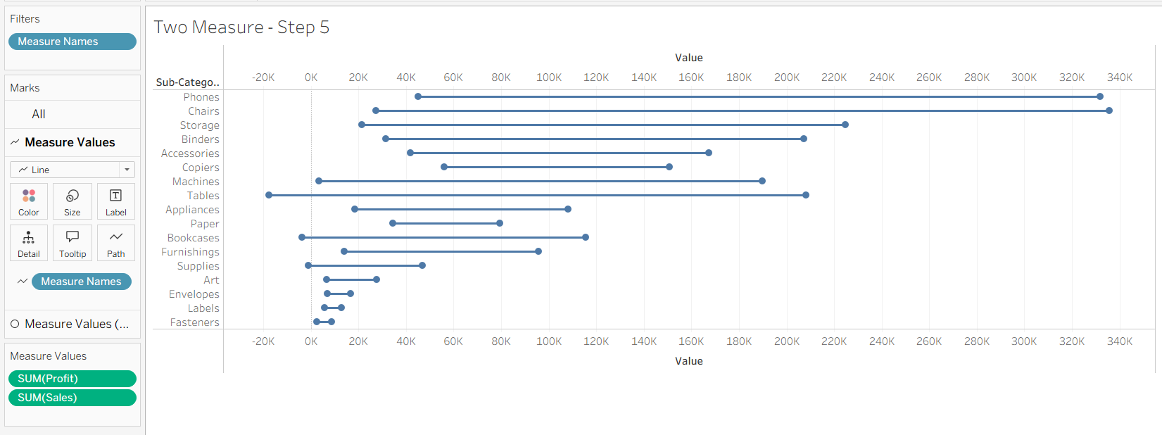
Step 5:
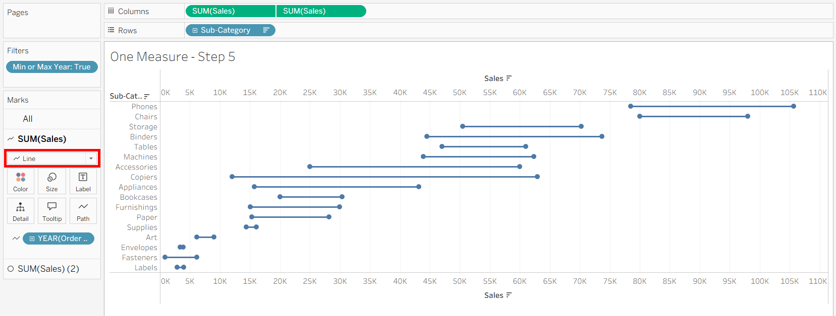
Now we can connect our dots together. On the top Measure Values tab on the marks card, swap it to a line type. It will initially not look right, so add Measure Names onto the path option to have it go between our measures, but not across our dimension.
Step 6:
Finally we can get to the extra fluff and decor! To color our dots, we can add our Measure Names onto the color of our Circle marks card. You can then later edit the colors of the measures, and even the color of the line itself.
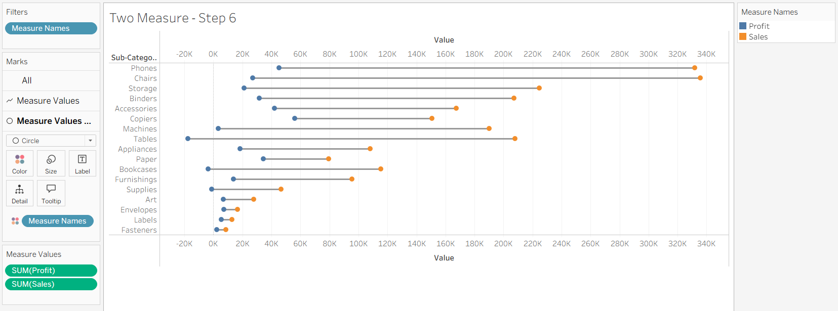
Even more measures can be added to the Measure Values during the first step of making the barbell chart. The line will connect together all the marks together, going from the smallest to the largest values. If the line is on top of the circles or whatever mark type you chose, you can swap around the Measure Values pills on columns to reorder how they are draw.
One Single Measure
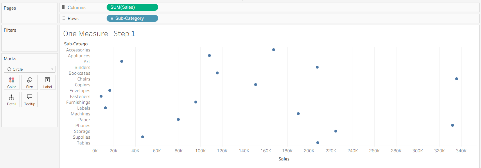
Even when we have one single measure, we can use a barbell charts to compare where the measure is across one dimension and with another. For this example, we'll be seeing how we can compare the sales from the first year and the final year across our different Sub-Categories.
The main difference between this and having two different measures is that we will be using the 'Detail' option on our marks card to split out our single measure.
Step 1:
To start, we'll put our chart together. We can put our sales onto columns and sub-category onto the rows. We'll then swap the mark type to a circle to get the shape we want on the end of the barbells. You could also have the marks be squares or shapes for example of different types of endings.
Step 2:
Next we'll create a way to view our sales on the first and last year. To do so, we'll filter out all the other years using a calculated field.
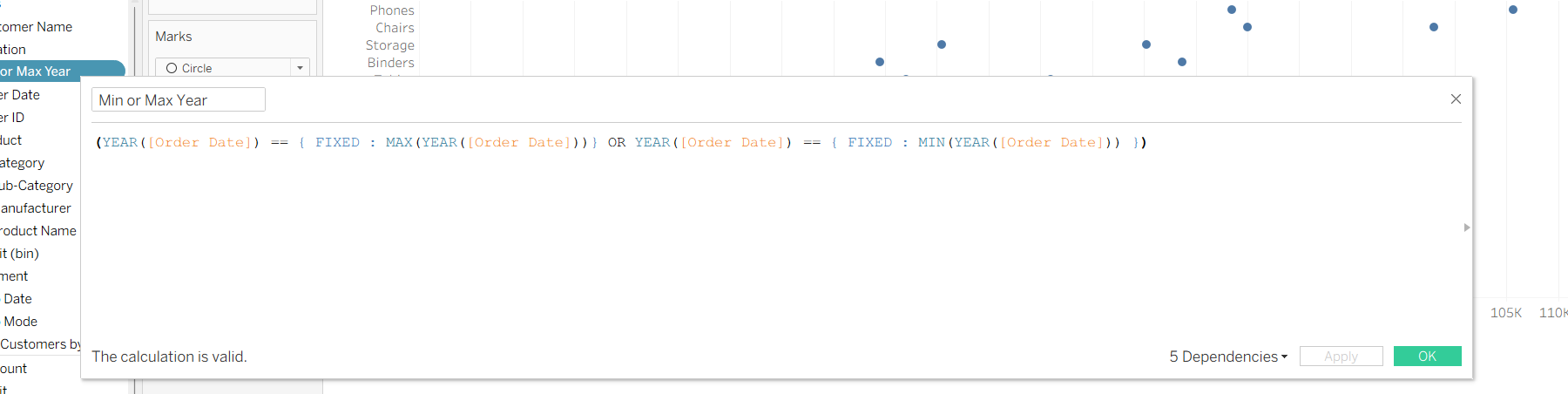
This calculated field returns true if the year is either the minimum or maximum year. This ensures that if the data updates, it'll update the minimum and maximum year automatically. The 'FIXED' parts of the calculations allows us to aggregate the table to figure out the minimum and maximum values to be used to compare with each order's year.
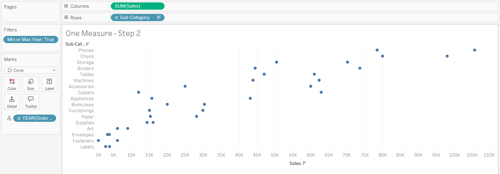
We can then put it on our filters card and select it so only return values when it is true to only return when our order year is the earliest or latest. After that, we can put our Order Date on the details section of the marks card, making sure that we are getting the year part of the Order Date. This will split our sales into two different parts, based on the filter that we have created.
Step 3:
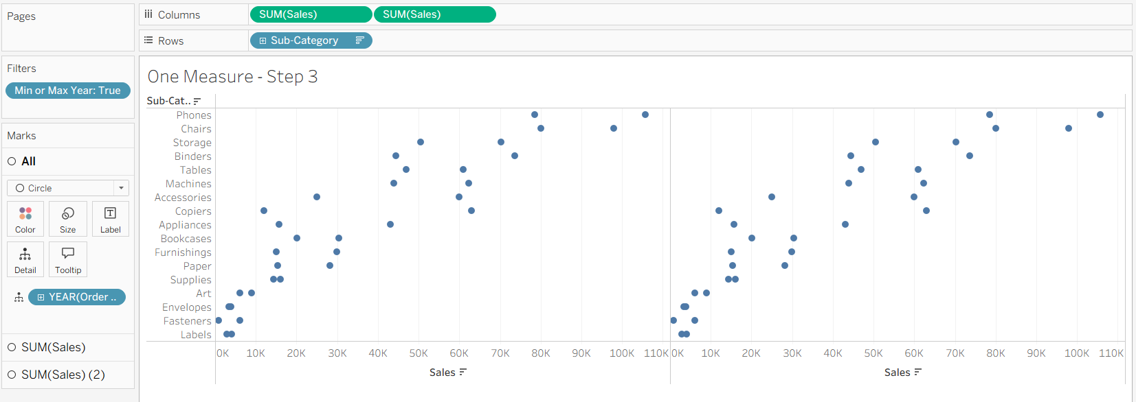
Similar with our two measures method, we'll put another pill of our sales onto our columns to create a second chart next to the original.
Step 4:
Again, we'll right click on our second pill on columns and tick the 'Dual Axis' to combine our axes.
We'll do the same again to synchronize our axes by right clicking on the pill or the header and ticking 'Synchronize Axis'. This will ensure that our marks will line up.
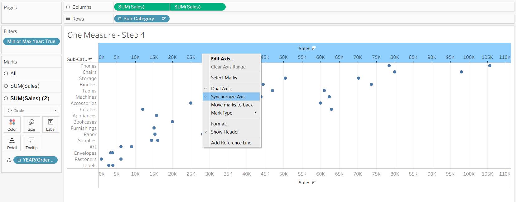
One thing to keep in mind about how this can be done with our single measure, is that we don't need to use the same aggregation when we are putting together our values. This means that synchronizing the axes is even more important. Once you want to introduce a different measure onto the chart, that's when the Measure Names and Measure Values are needed instead.
Step 5:
To create the line connecting the marks together along our dimension on the rows, we can change the mark type of the first marks card of our sales. Then you'll need to change what you have on your detail for that card onto the path to have it connect the measure together, stopping it from going across our rows.
Step 6:
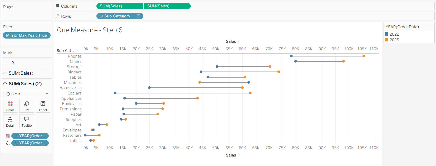
Now we can get to decorating it again! We can put a copy of our detail onto the color to add some color onto the ends of the barbells, being able to do the same with the line depending on which marks card you are looking at. You can also change the width of the line by changing the size of the line on its mark card.
And with all of that put together, you're free to format your barbell charts with either a single measure or multiple measures!