


A workaround when dual axes aren't playing nice
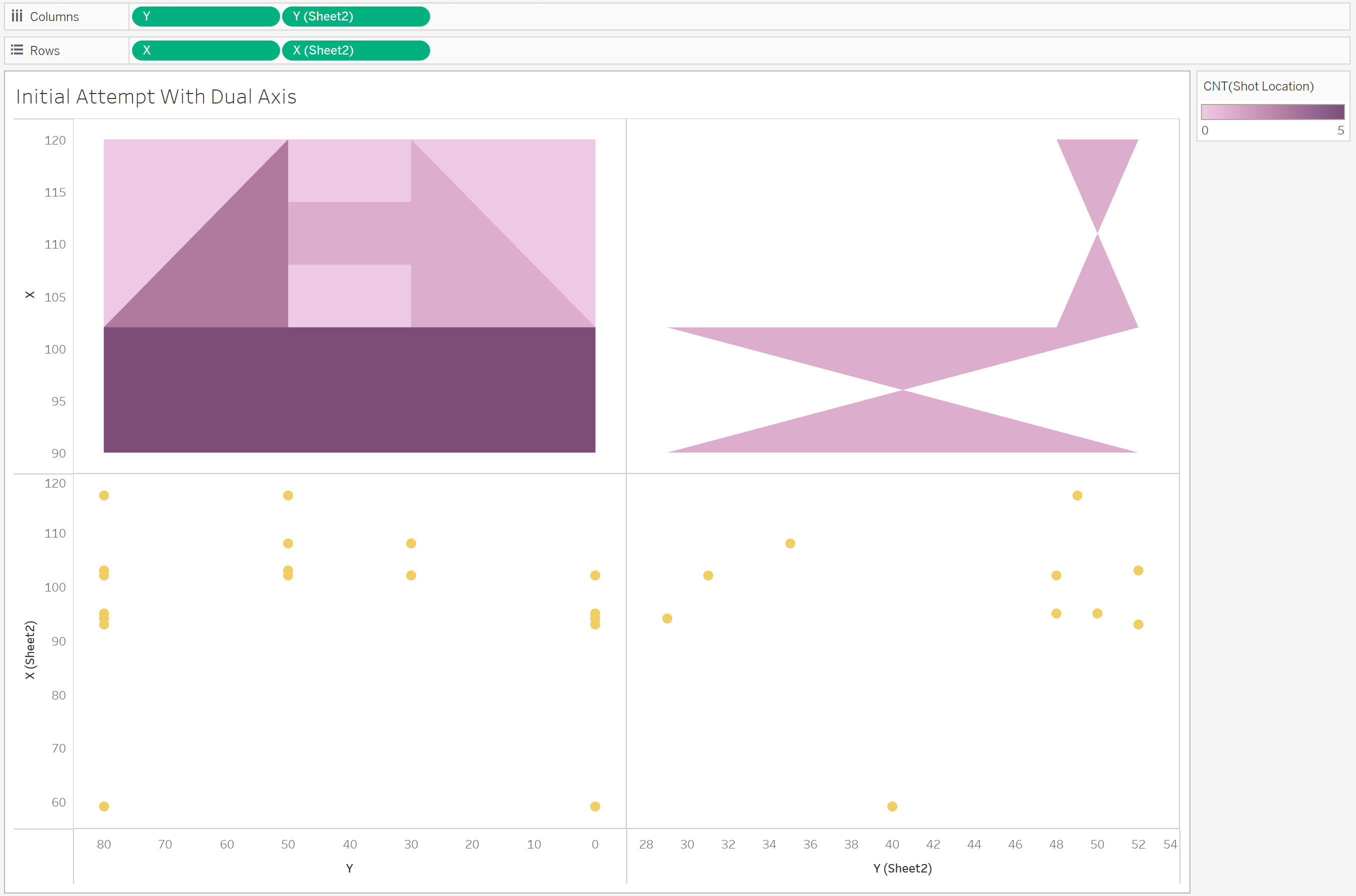
I recently ran into a frustrating issue while building a football dashboard in Tableau. I had two layers I wanted to combine: a heatmap of pitch zones, and individual shot locations plotted as dots. My first instinct was to use a dual axis, but that didn’t go to plan.
When I set it up, the heatmap appeared in the top left, and the shots landed in the bottom right. Even after syncing the axes, the heatmaps messed up...
Why dual axis didn’t work
The problem is that the heatmap and the shot locations came from two different data sources. Tableau doesn’t handle that well when you try to overlay them using X and Y — unless the structure of the data is exactly the same, it just won’t work.
The workaround: Union the data and split it with calculated fields
Here’s how I got around it:
1. Bring both datasets into Tableau
- One dataset had the pitch zones, set up to draw the polygon, with X and Y to draw each zone
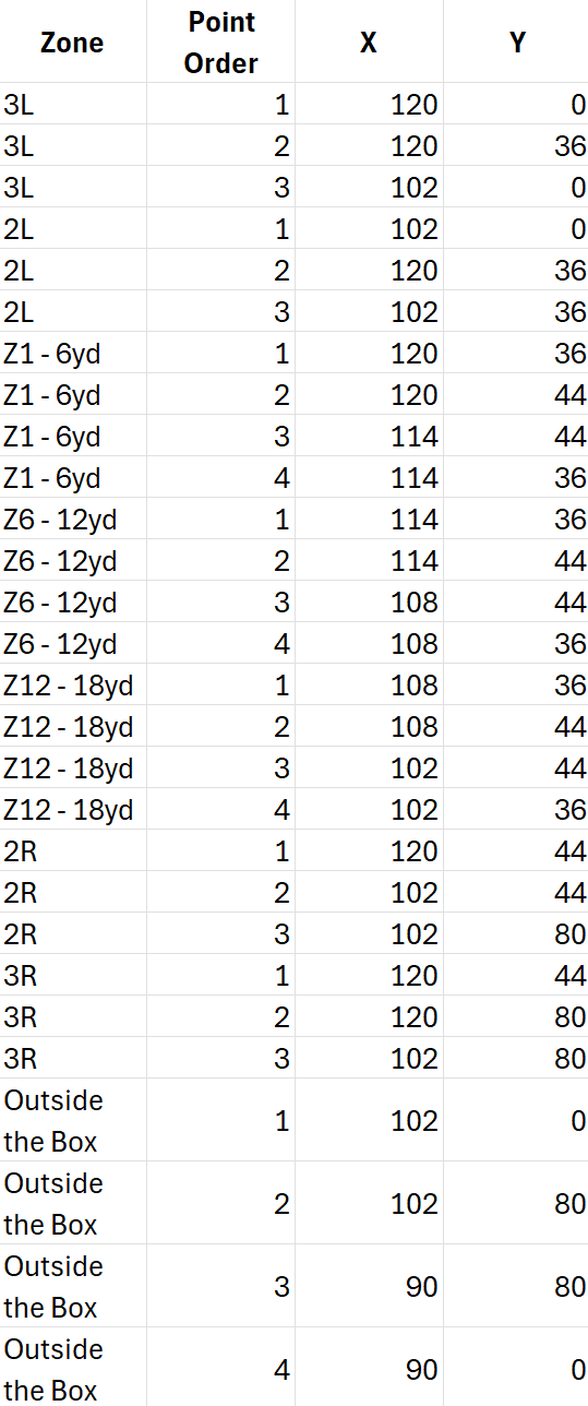
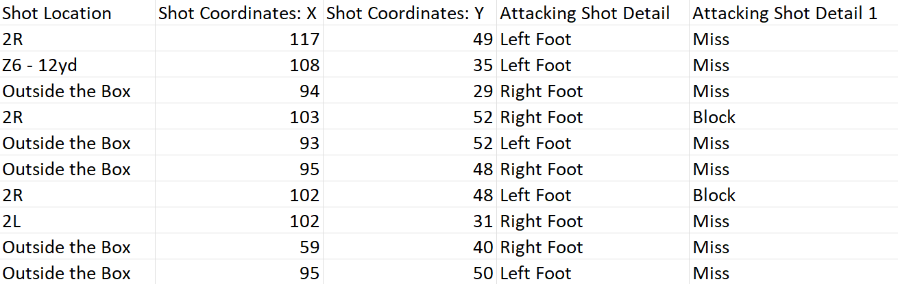
- The other had the individual shots, also with X and Y coordinates
2. Union them together
To get both layers to plot on the same axes, I unioned the two datasets. That way, all X and Y values sit in the same columns, and Tableau adds a [Table Name] field to tell the rows apart.
3. Create calculated fields to separate the layers
I then made two sets of X calculations — one for the heatmap, one for the shots:
X (Heatmap): IF [Source] = 'Heatmap' THEN [X] END X (Shots): IF [Source] = 'Shots' THEN [X] END
I can plot these against Y to give us the 2 visualisations we want to overlay.
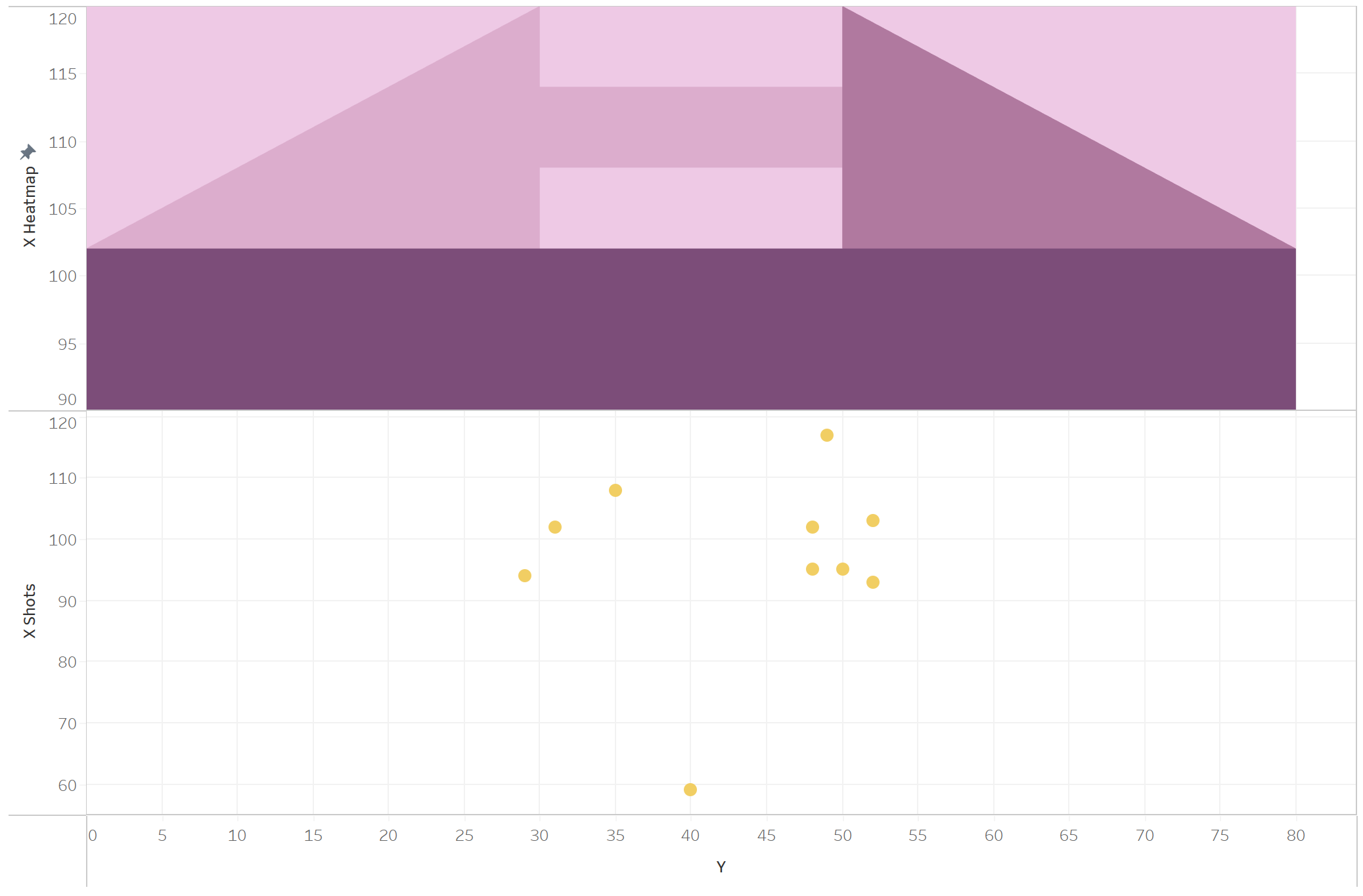
4. Build the dual axis view
- Drag
X (Heatmap)andX (Shots)onto the same axis and turn on dual axis - Synchronise the axes
- Set the mark types:
Polygonfor the heatmap,Circlefor the shots
Now both layers line up exactly as you’d expect — with the shots sitting perfectly on top of the heatmap.
5. Relate your shot coordinates back to the pitch zones (if required)
I also had to link the shot locations back to their pitch zones so I could colour the heatmap by the number of shots per zone, while still keeping the individual shots visible. This is because they were named differently in the 2 sheets. You can do this in the data source section of Tableau, and setting Shot Location = Zone.
6. (Optional)Add a background image
I added a background image of a football pitch to my chart through Map > Background images. To do this you need to know where your zones are on the pitch so it all lines up!

Final thoughts
This was one of those things that should’ve been simple in theory, but took a bit of data reshaping to work properly. Once everything’s in the same table, though, Tableau handles it well — and the result looks great.