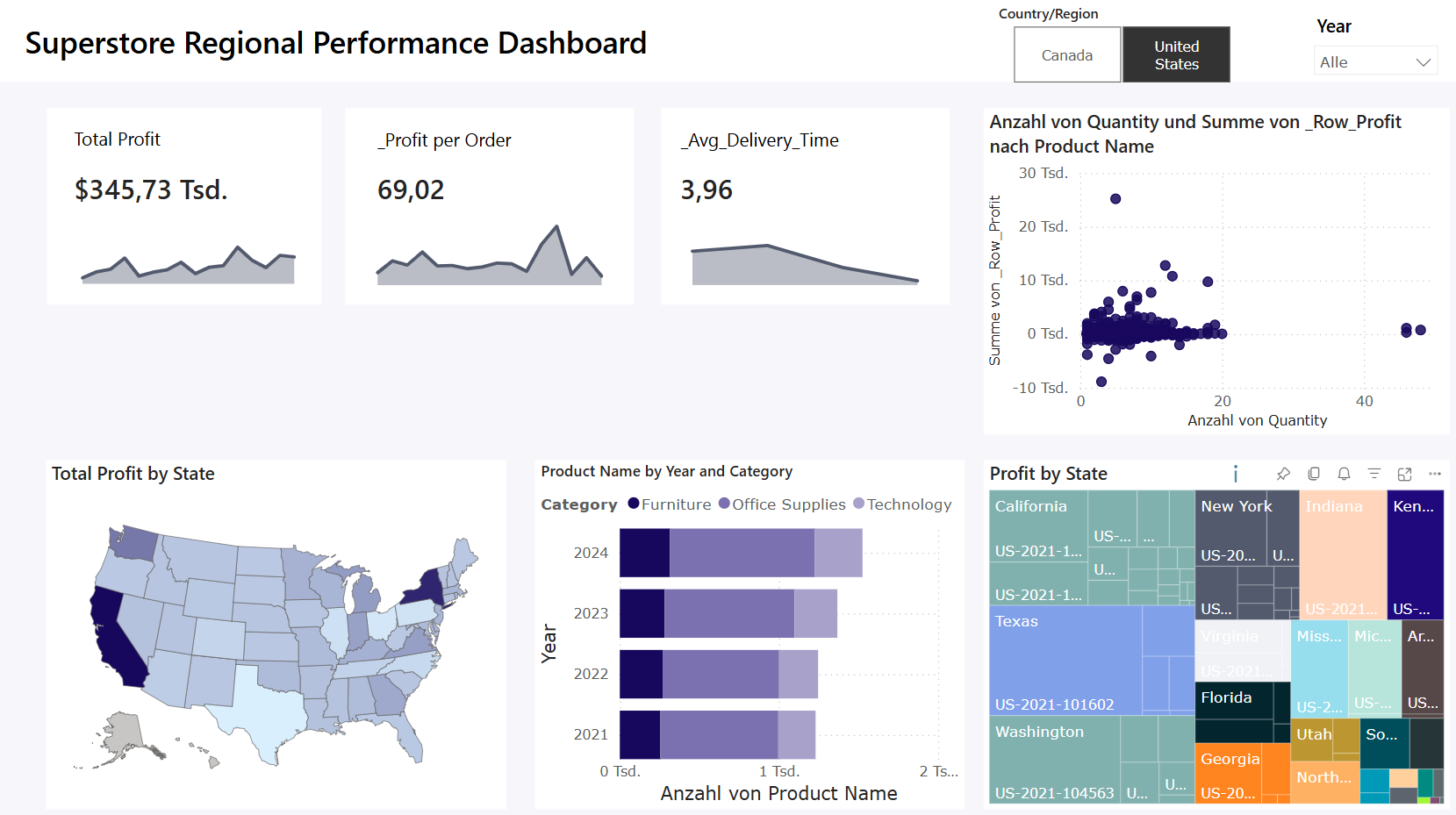
On the second day of Dashboard Week, our task was to create a dashboard in Power BI using the Superstore dataset. The dataset came pre-modelled as a star schema, so before jumping into visuals, I had to double-check the relationships to make sure the numbers were accurate — which took more time than expected.
The Main Requirements:
- Show at least 3 KPIs, one of which had to be Profit
- Write a User Story
- Answer Business Questions with the dashboard
- Uncover insights and tell a clear narrative
My KPIs:
- Total Profit
- Profit per Order (Order Efficiency)
- Average Delivery Time
My User Story:
As a
Regional Sales Director for Superstore,
I want
a visual KPI dashboard that shows key metrics like Profit, Order Efficiency, and Average Delivery Time,
So that
I can quickly identify underperforming regions or segments, detect inefficiencies in operations, and make faster decisions to drive growth and profitability.
Main Focus:
Rather than just looking at how much we sell, I wanted to dig into how well we perform — region by region, and segment by segment.
- How much profit each region really brings in
- How efficient those profits are (profit per order)
- Whether shipping operations are slowing you down (delivery time)
Safe to say, I spent quite a bit of time thinking through the User Story and how to sketch the right flow of insights — especially since I hadn’t used Power BI in a hot minute. I tried to create some fancy, custom KPI visuals, which ate up a lot of time. After a good chunk of troubleshooting, I ditched the complexity and went back to classic KPI cards — which honestly did the job just fine.
Lesson learned: Start with the basics. Nail those first. If there’s time left, then go wild with the fancy stuff.
Looking forward to the next dashboard challenge tomorrow - hoping to improve my time management now that I’ve got my Power BI brain warmed up again.
Looking forward to the next dashboard challenge tomorrow - no more Power BI this time, but I’m curious to see what data we’ll work with next.
But for now, here’s version 1 of my dashboard

