


In the sixth week of The Data School, we were tasked with the topic for Makeover Monday (MoM): creating a clear story and drawing conclusions from a highly experimental dashboard about Marvel movies.
Not sure what MoM is? Check out my previous blog post here.
Given Visualization:
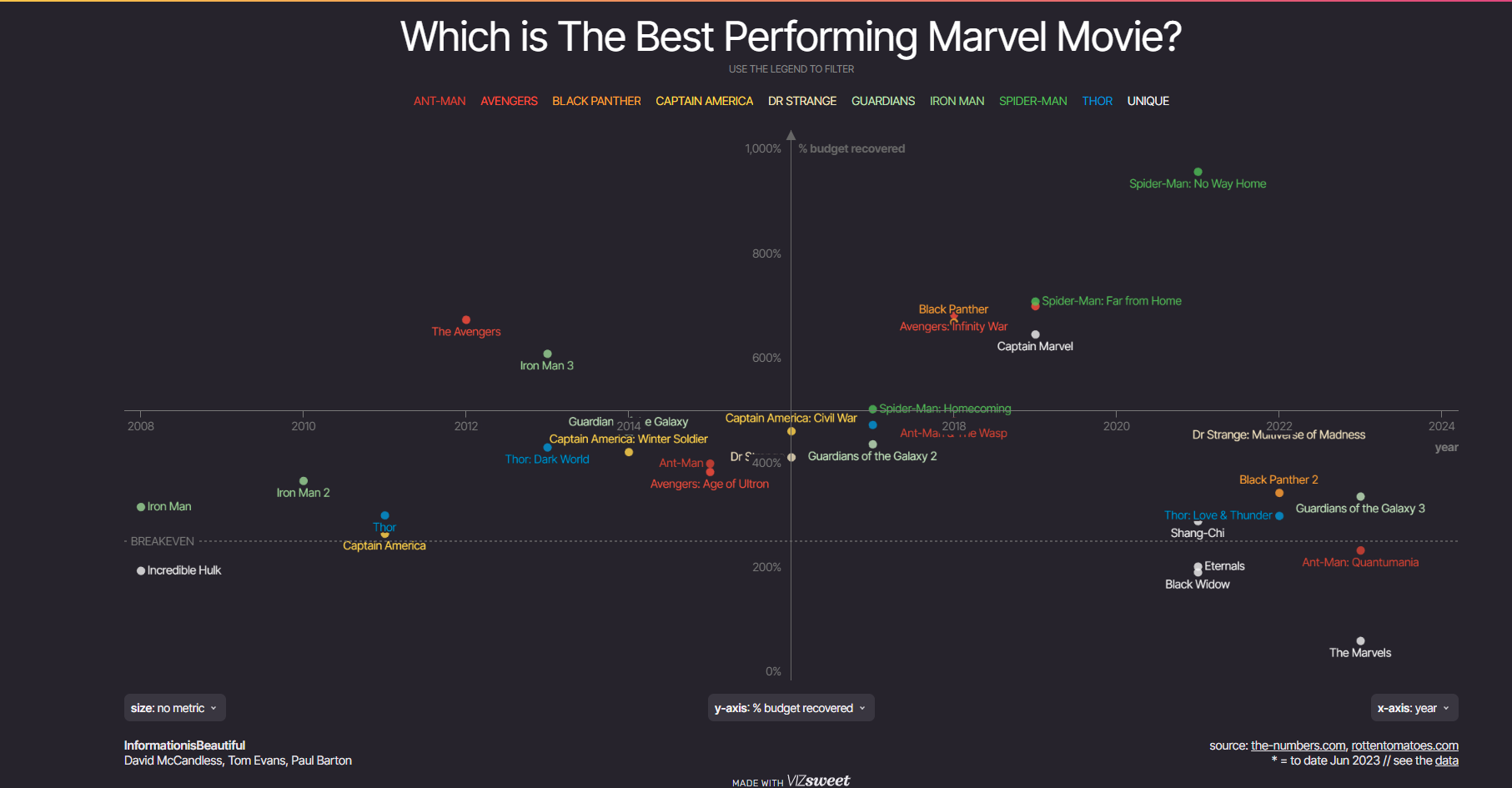
First I looked into the Data to the see what information we are dealing with. The dataset provides detailed information about films in the Marvel Cinematic Universe (MCU), including worldwide, domestic, and international revenues, budgets, as well as critics’ and audience scores. It is further enriched with metrics like opening weekend performance, second-week drops, and release years. The categorization into franchises such as "Avengers" or "Spider-Man" enables insightful analyses of the films’ performance and popularity, both financially and among audiences and critics.
The dashboard "Which is the Best Performing Marvel Movie?" by Information is Beautiful provides an interactive visualization of the performance of 30 Marvel films based on various metrics such as critics' scores, audience scores, worldwide gross, and budget recovery. It allows users to compare the movies across different criteria, offering insights into the success factors behind each film.
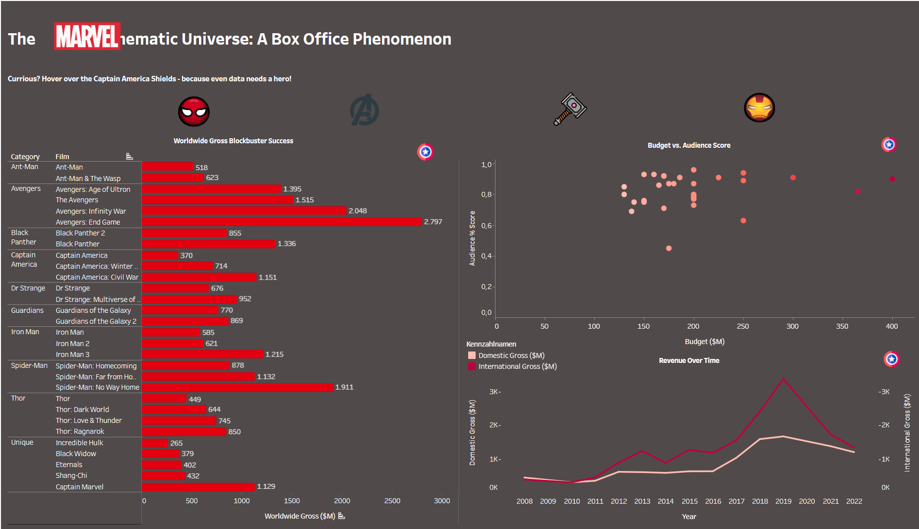
My initial approach focused on decluttering the graph by using a bar chart to display the Worldwide Gross by Film and Category. This chart provides a clear and concise overview of how the blockbusters compare in terms of financial success. To add an interactive element, I included Captain America shield info buttons—hovering over them reveals additional details about the chart.
In the upper right corner, you’ll find a scatterplot visualizing the audience score (%) against the budget (in $M). Interestingly, while most movies appear to achieve solid audience scores regardless of budget size, there is a subtle trend. Films with budgets in the $150–200M range tend to have audience scores between 0.6 and 1.0, whereas a few higher-budget films consistently score between 0.8 and 1.0.
At the bottom right, there’s a dual-axis line chart tracking revenue trends from 2008 to 2022. Domestic gross ($M) is plotted on the left axis, and international gross ($M) on the right. The chart vividly illustrates the explosive growth of Marvel's revenue over time. Peaks in international earnings underscore the franchise's expanding global appeal, with record-breaking films like The Avengers and Endgame standing out.
This dashboard represents a balance between explanatory and exploratory design—offering a narrative while encouraging users to engage with the data and uncover their own insights. Finding this balance helps create a compelling and accessible story that enhances the analytical experience.
To our surprise, in the seventh week of The Data School, our task wasn’t the usual hunt for a new Makeover Monday dataset. Instead, we were asked to revisit one of our previous Makeover Monday projects and create a new iteration—essentially a Makeover of a Makeover Monday, or as I called it, a MoMMo! I chose the Marvel Dashboard because there were still a few things that bothered me and I wanted to improve them. By the way, don’t mind the formatting issue in my title—it seems to have shifted, and I still need to figure out that bug!
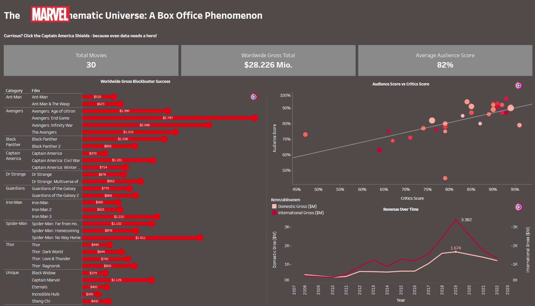
At first, I planned to use the Avenger icons (beneath the sub-title) as KPI information, but I later decided to completely switch up the icons. Honestly, it came down to a preference for style. The sleek KPIs in a brighter grey tone give the dashboard a much cleaner and more modern look, in my opinion. While I think bar charts are one of the best visualizations and should be a staple on most dashboards, I found myself wanting to experiment a bit. I didn’t want to lose my bar chart entirely, but I wanted to try something new. Inspired by what we learned in Tableau during DS1 training, I decided to go with a lollipop chart instead! It’s such a simple yet visually appealing chart type, and honestly, I’m slowly becoming obsessed with trying out new styles—especially when they’re as easy to implement as this lollipop chart.
Let’s move on to the next chart in the upper right corner. In this scatterplot, I made a change by swapping the comparison between audience score and budget for a comparison of audience score and critics’ score. The points are now size-coded based on the budget, providing more insights within a single view.
For the line chart, I added the peak values for domestic gross as well as the corresponding peak value for international gross, making it easier to identify key milestones in Marvel's revenue growth.