


Today, we’re diving into Info-Buttons — a handy tool to enhance the usability of your Tableau dashboards. One of the first lessons I learned during my job application at the Data School phase was the importance of simplifying and decluttering my dashboards. Compressing all the information on my dashboard not only made the visualization cleaner but also allowed me to add more context to my storyline.
An Info-Button is a perfect example of how to achieve this balance. However, it is important to avoid overwhelming your audience with too much text — focus on clarity and improving the user experience. So lets get into it!
Create a Placeholder Field
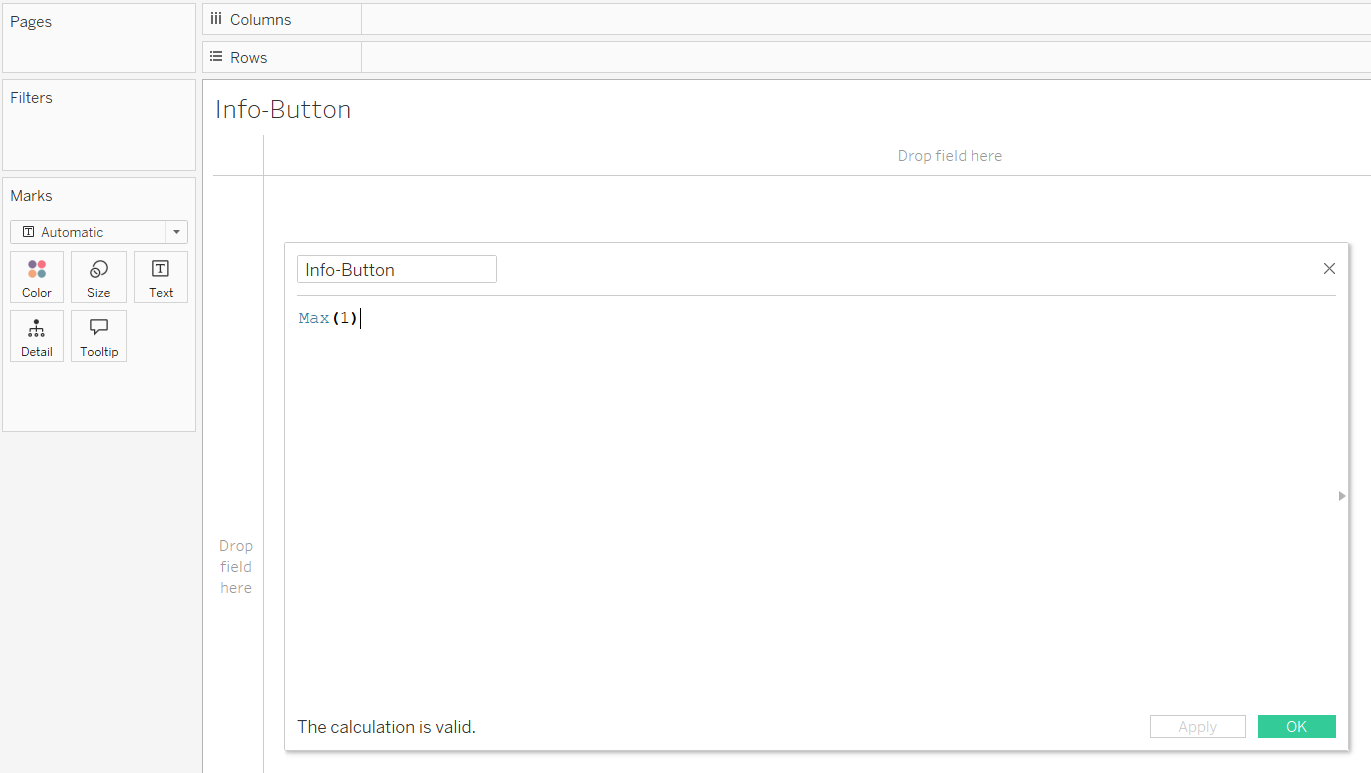
Open a new worksheet and create a calculated field with the following formula:
Max(1)
This will act as your placeholder. Name this field Info-Button for easy reference.
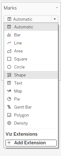
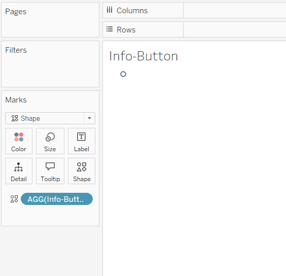
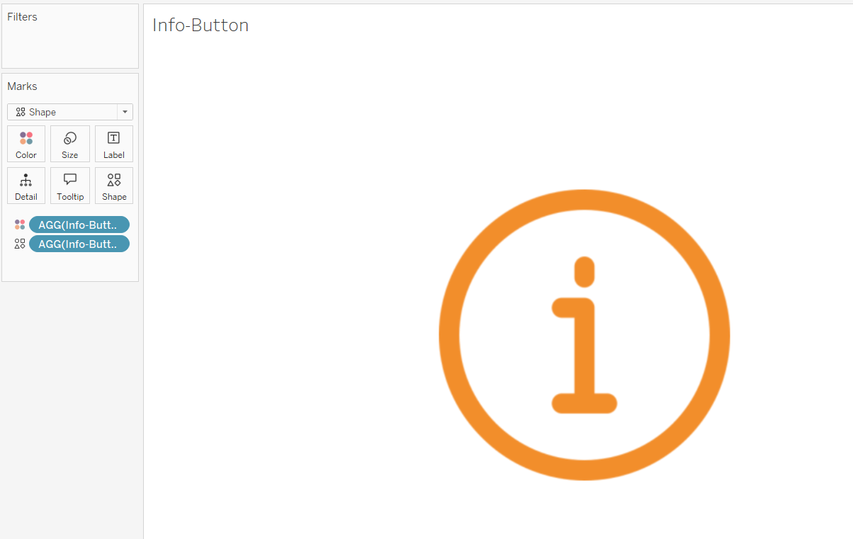
Next change the mark type to Shape and place the new created Info-Button field to the Shape shelf.
At this point, you will see a default circle shape on your worksheet. Let’s make it more visually appealing!
Customize the Shape and Size
This looks pretty neat so far. Now, we’ll take it a step further by customizing the size and shape to better fit your dashboard design. First, change the View on the top bar from Standard to Entire View. Then, open the Shape tab in the Marks Card. This will bring up a window where you can select and edit a shape that matches your preferences.
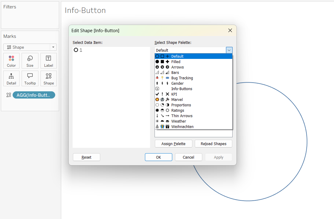
Check the Default dropdown to find more built-in options. You’ll find a variety of shapes, but for more customization, consider downloading custom icons.
Tableau already provides several built-in examples, but in the screenshot above, you’ll notice additional options because I’ve added custom icons. If you’d like to do the same, check out the Excursion section. Otherwise, feel free to skip ahead and continue with the next steps.
Excursion: Add Custom Shapes
If you want a specific style, you can add custom icons. For this tutorial, I used an Info-Button icon. Here’s how to do it:
Download an icon in PNG format. This ensures the background is transparent (look for a gray tiling background to confirm). It is also important to save the icon in a in the following location:
My Tableau Repository -> Shapes -> [Your New Folder]
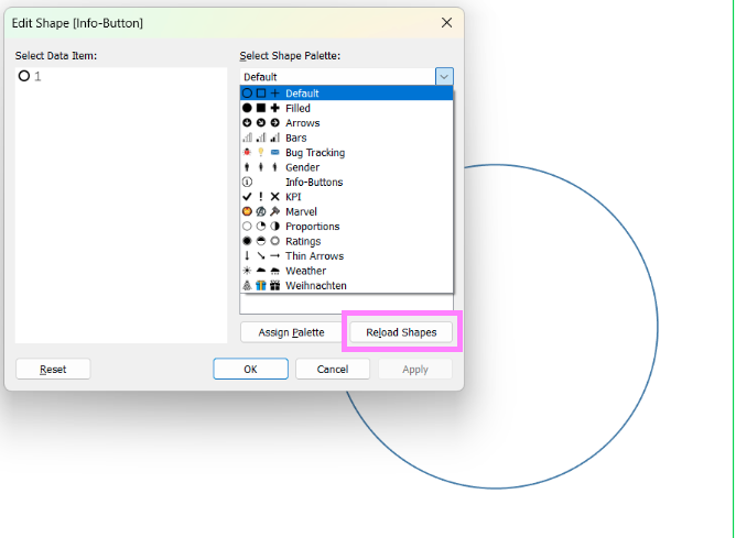
Afterward, be sure to click Reload Shapes in the shape palette to ensure the new icons are loaded and visible. Once reloaded, you’ll see the newly added icon available for use.
Assign and Style the Shapes
In the shape palette, select your Info-Button data item and click Assign Palette. To change the colors you will need to drag your created Info-Button-Field to the colors shelf.
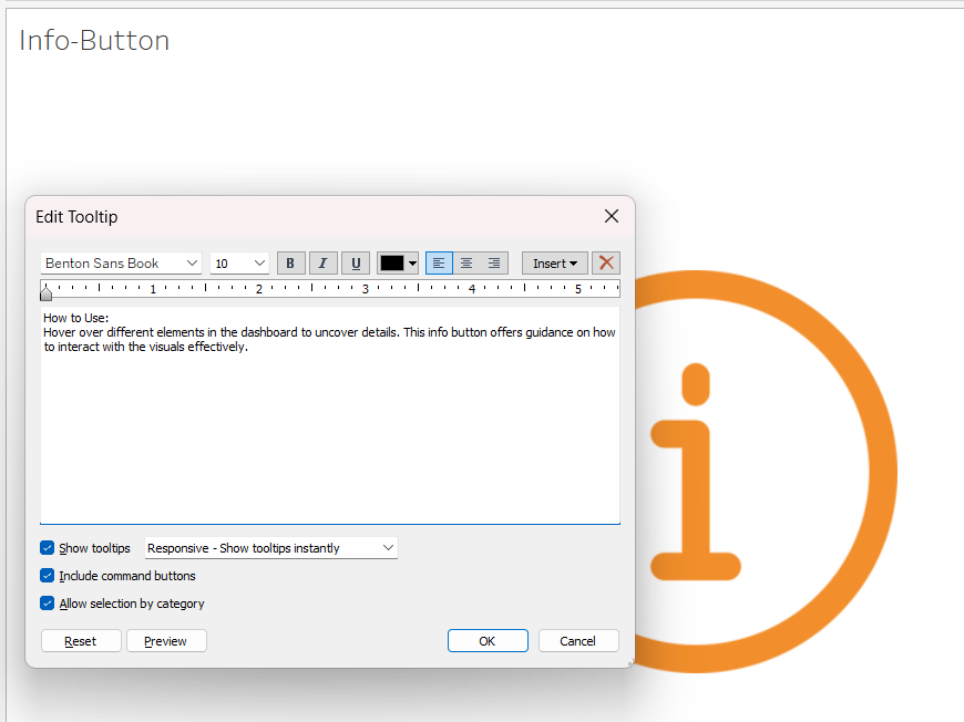
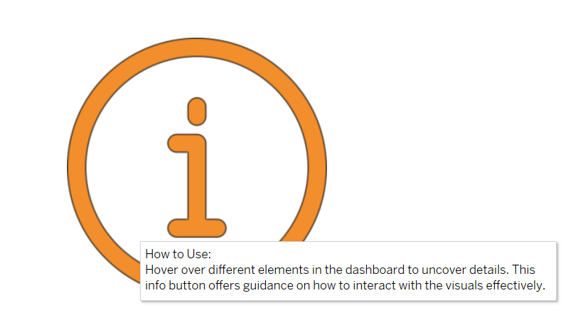
Add Information in the Tooltip
Finally, fill your Info-Button with meaningful information:
Simply click on the Tooltip option in the Marks Card and enter your details, instructions, or explanations directly into the tooltip text editor. This step transforms your Info-Button into an interactive element, providing additional context when users hover over it — all without adding visual clutter to your dashboard.
It's a wrap 🌯
And that’s it! You’ve successfully created an Info-Button in Tableau. With this feature, you can declutter your dashboards while still offering valuable information to your audience. Remember to keep your tooltips concise and user-friendly for the best experience!