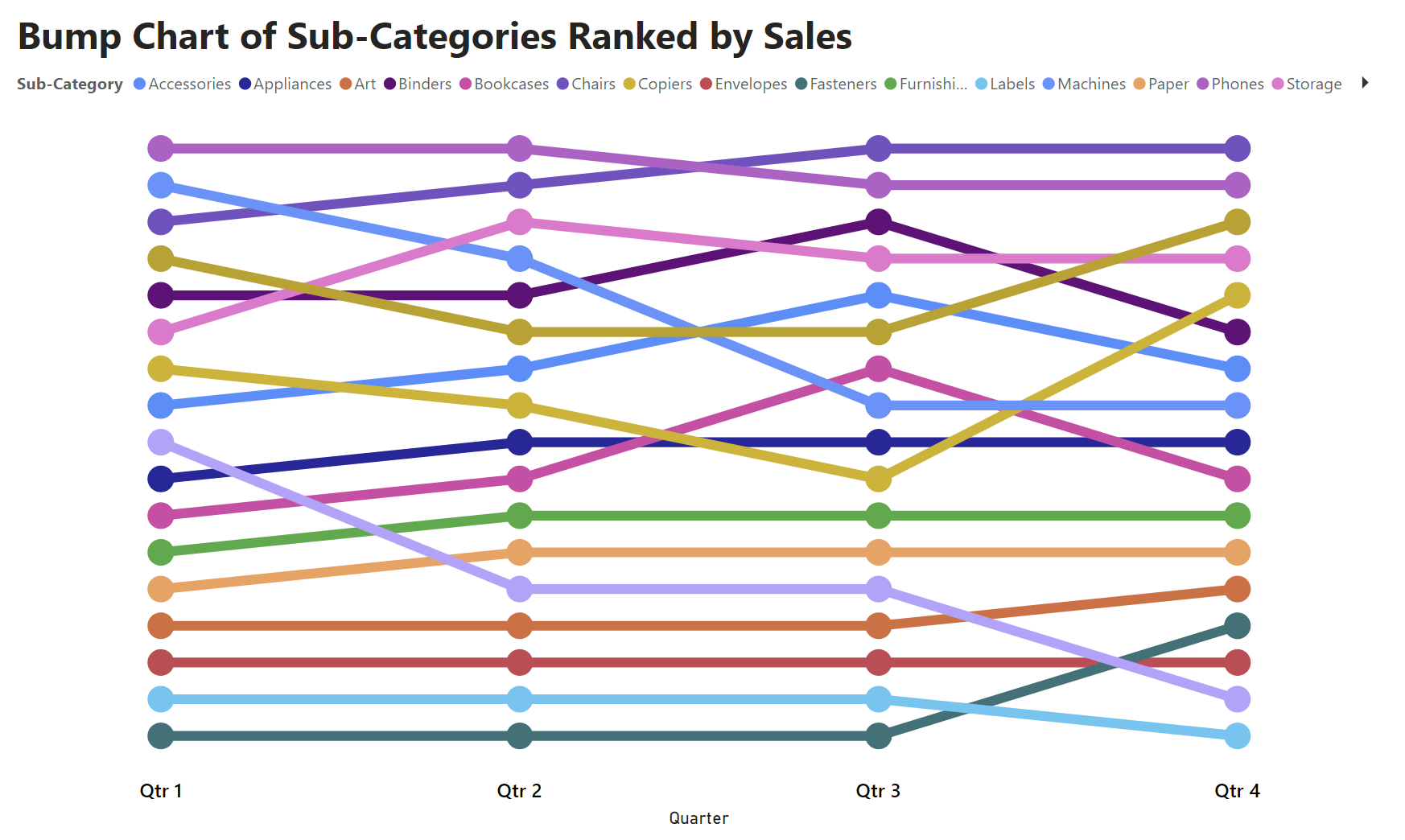
A bump chart tracks the change of rank by position of different categories over time. This is effective in visualising trends of rank position in relation to each other.
I will show you how to build this chart using the Tableau Superstore dataset, for the rank of different sub-categories by sales.
- Firstly, I created a measure for the sales column so that it is a sum
- Sum of Sales = SUM(Orders[Sales])
2. I then created a measure for the Rank which is descending
- Rank = IF(HASONEVALUE(Orders[Sub-Category]), RANKX(ALLSELECTED(Orders[Sub-Category]), [Sum of Sales])) *-1
3. Lastly, I added a line chart to the view and dragged Quarters of the order date onto the x-axis, my rank measure onto the y-axis and sub-categories for the legend.
For extra formatting you can turn on markers and choose the circle shape, and turn on data labels to visualise the rank positions.
ta-dah
this is the finished chart!