When is graph padding needed?
There are often cases where it is not possible to fix an axis as it is updated with either parameters or filters which often leads to labels or min and max points which will appear crowded or does not appear neat. This problem is solved by adding referencing lines to the min and max measures of the data being displayed which tricks Tableau in creating a larger area for your plot.
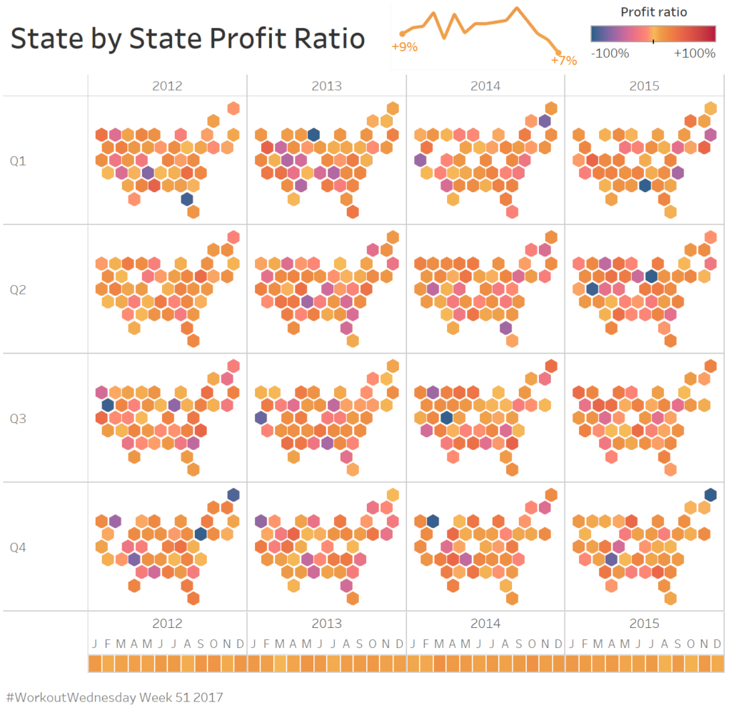
As an example, I will be referring to a #WorkoutWednesday Week 51 of 2017 posted by @VisWizBI. The interactive dashboard can be found here.

As one of the requirements, it is needed to add padding to the graph so that the labels don’t appear crowded or cut off as shown in the figure below. It is not possible to fix the axis as they need to update as filters are applied when using the interactive dashboard.

Adding graph padding in Tableau
A solution to this problem is to use reference lines that update according to the minimum and maximum values in of all the axes in the window. By multiplying the maximum value by 1.5 (for the present example) and the minimum by 0.8 additional padding can be added to the graph area. Another option is to add or subtract a constant value from the max and min respectively. The values used will be dependent on the data that is represented.
A step-by-step guide to adding the reference lines:
In the example, a date field is shown on the X-axis (placed on the columns field). To determine the max and min of this field two calculations are needed: ‘Ref line_min date’ and ‘Ref line_max date’. The following calculated fields are created:
Ref line_min date à MIN([Order Date])-24
Ref line_max date à MAX([Order Date])+15
The 15 and 24 represent the additional months that will be added or subtracted from the Min and Max date in your view.
The same process is applied to the profit ratio. However, for this axis it is more convenient to multiply the maximum value with a factor of greater than 1 while the minimum is multiplied with a value between 0 and 1. Another set of reference values is created with a calculated field:
Ref line_min profit ratioà WINDOW_MIN([Profit ratio])*0.7
Ref line_max profit ratio à WINDOW_MAX([Profit ratio])*1.01
For the specific data that was being investigated in a factor of 0.7 and 1.01 was ideal for enough padding within the chart area. If possible, it is better to multiply the min and max within the window with a factor, as the result will always be relative to the values being investigated where summing or subtracting a constant value will not and may cause large discrepancies in the view of the graph.
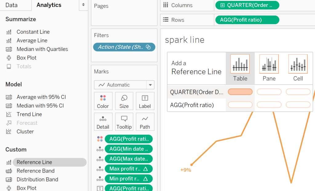
A final step that remains is to add the reference lines to your sheet. Select the Analytics tab in the top left corner and under the custom area, drag the Reference Line onto your sheet. Four different reference lines are added, all across the table: two reference lines for the date field and two for the profit ratio field.

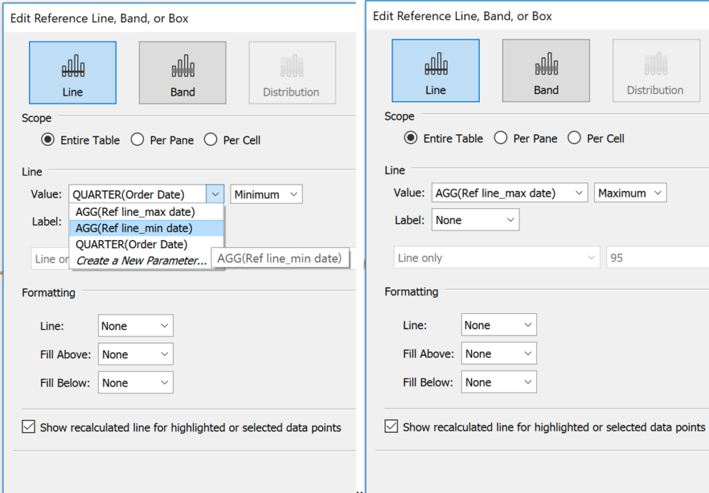
The window that pops up gives an option to apply the line to a value defined by the calculated Ref line_min date or Ref line_max date. The Ref line_min date is added to the Minimum side of the date axis while the Ref line_max date is added to the Maximum side of the date axis.

For both the reference lines set the Label, Line, Fill Above and Fill Below as None and select OK.
Repeat the process for the profit ratio axis.
When inserting the sheet onto a dashboard the additional padding will create space for the labels which will always have space below and around the data points they are describing.
If you have any thoughts or comments please feel free to contact me on LinkedIn or Twitter.
