Reference lines are visual elements that can be added to visualization and provides useful context and comparison of information to the users. In this blog post, we'll explore the process of incorporating reference lines into our charts, enhancing their informativeness and utility. We will be using Sample Superstore dataset for the demonstration.
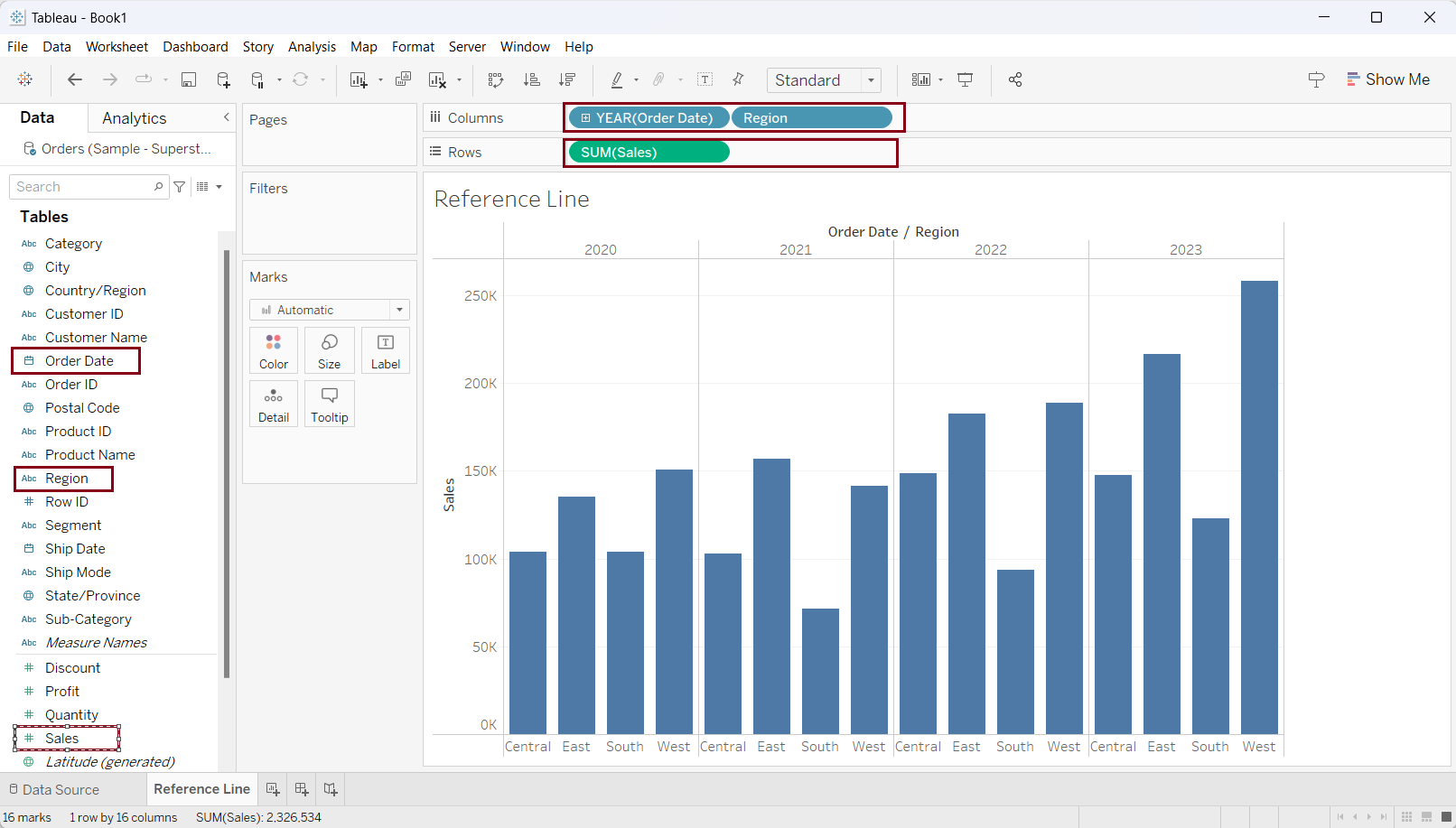
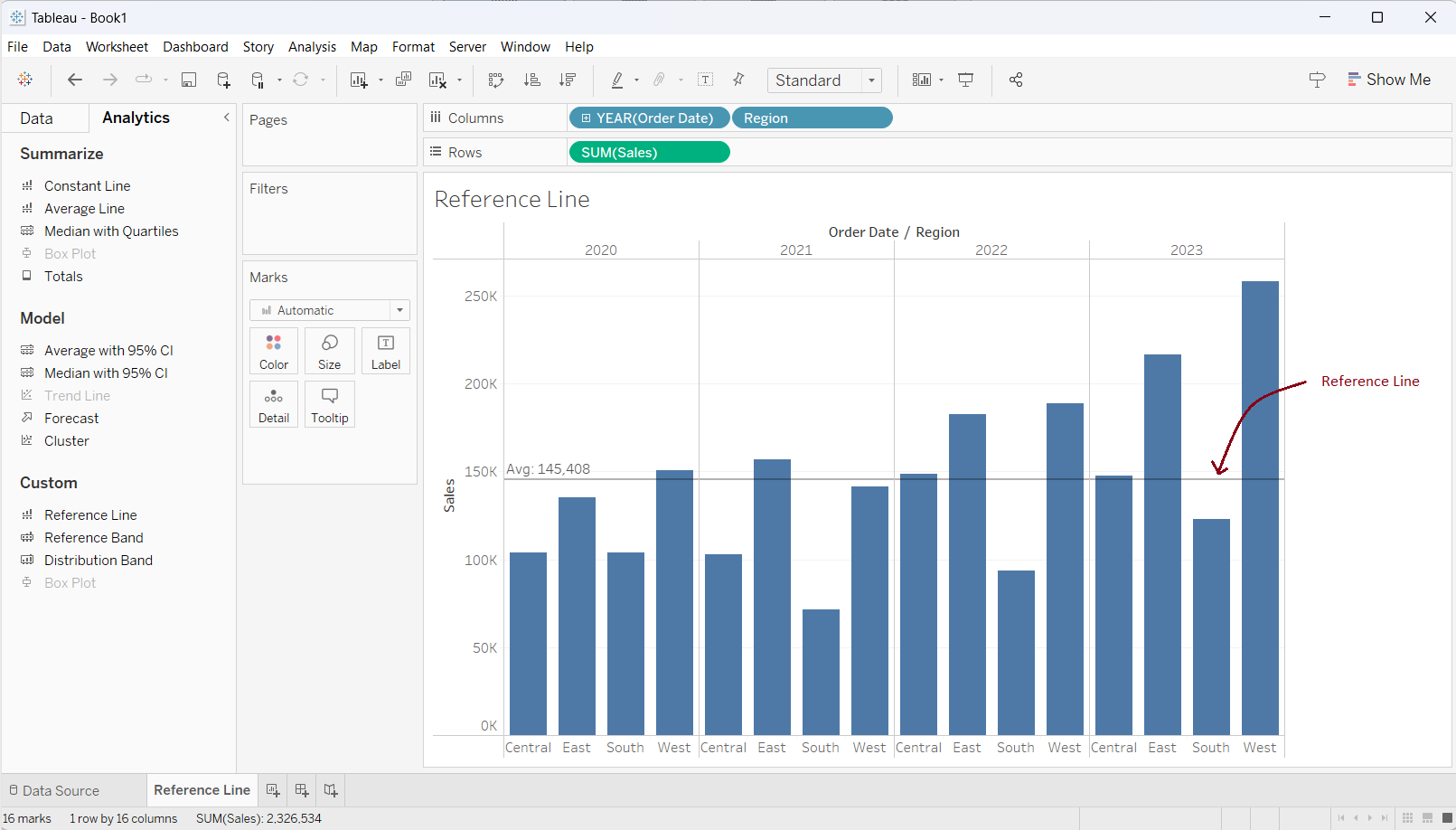
First, let us create a bar chart showing sales in different regions across years. Drag 'Order Date' in column shelf and select 'year'. Again, drag 'Region' in the column shelf. Finally, drag 'Sales' in the row shelf. As shown in the screenshot below, we have created our desired bar chart.
Now, it's time to add reference lines to provide some context.
Scenario 1: Add a reference line that shows the average sales considering the values of the bar in the view.
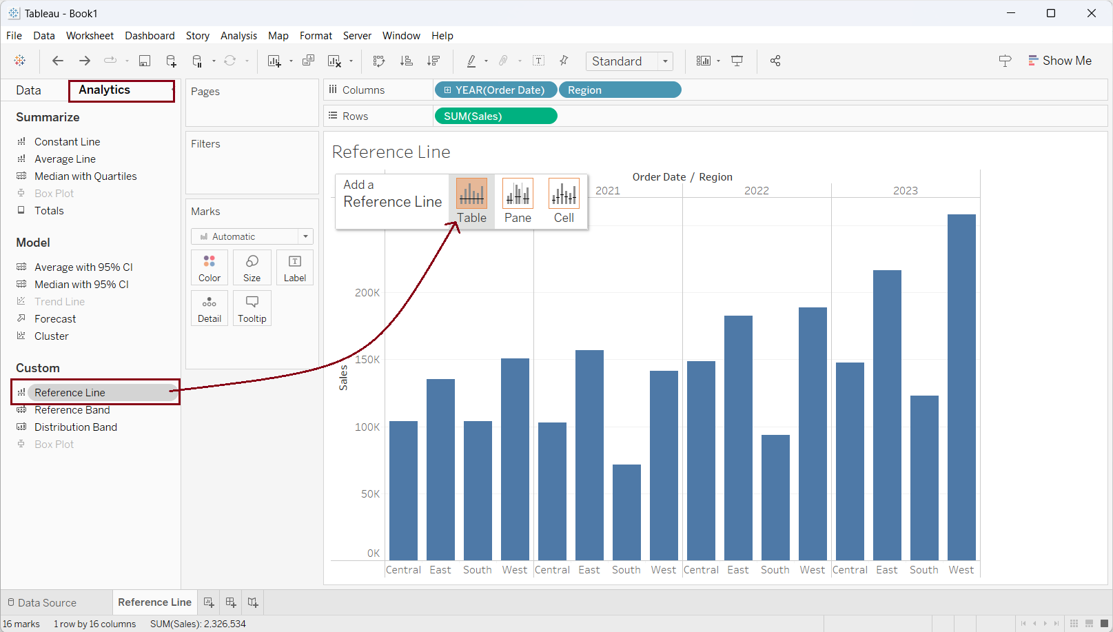
Select 'Analytic' in the left pane (right to 'Data' Pane). Under the 'Custom' category select 'Reference Line' and drag it into the view and drop it on 'Table' as shown in the figure below.
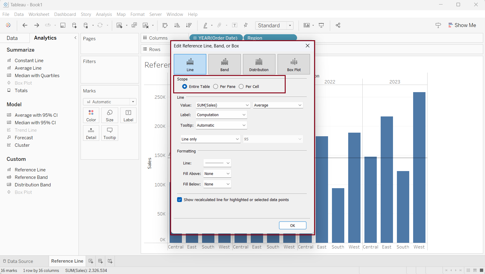
After dragging the Reference line into the 'Table' section, an 'Edit Reference Line, Band, Box' window will appear as shown in the screenshot below. Select 'Entire Table' radio button under the 'Scope' Segment.
Before applying the reference line, let's explore the options available in this window.
Within the 'Line' category, we have the option to select a field from the dropdown menu labeled 'Value' for incorporation into the reference line.
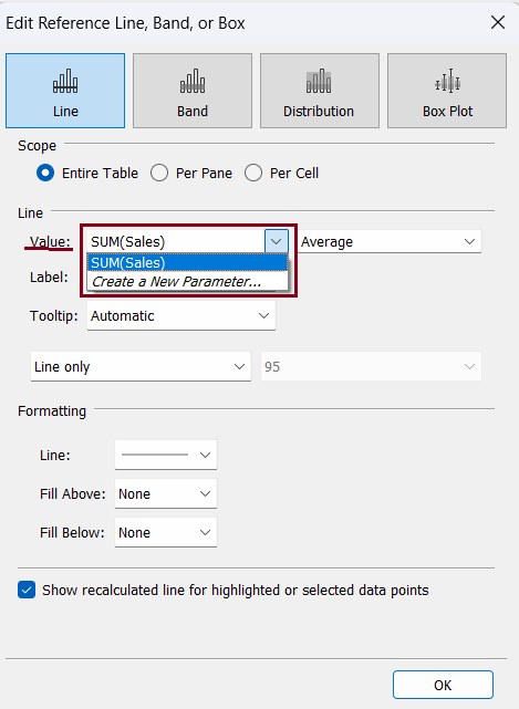
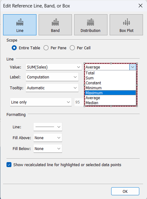
To the right of the value, we have the option to choose the aggregation method in the drop-down menu as shown in the screenshot below.
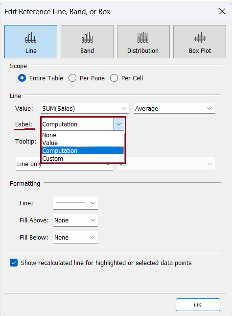
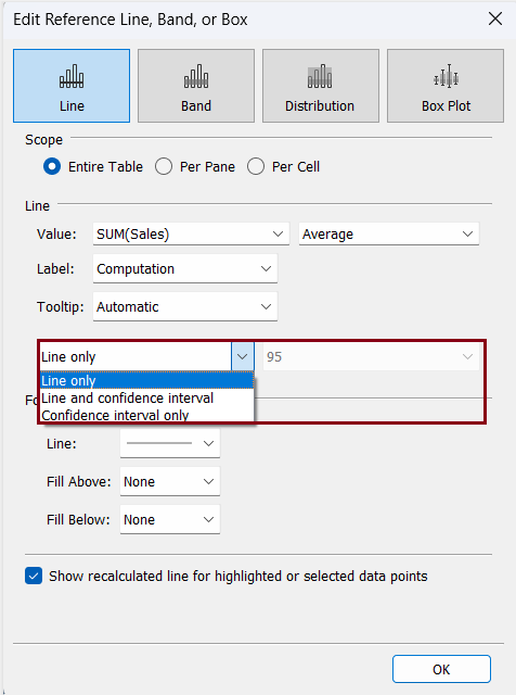
Within the 'Label' settings, you have a range of choices to determine how the reference value appears on the chart. Opt for 'None' to exclude any display, 'Value' to show only the value, 'Computation' to exhibit the aggregation method, and 'Custom' to present a label customized according to your preference. Should you choose 'Custom', a designated input box will emerge to the right of the label option.
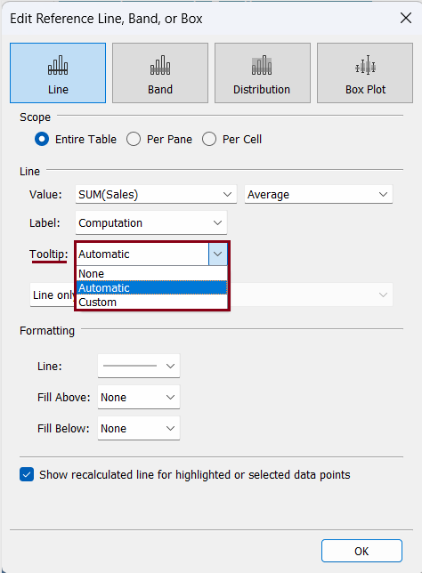
The 'Tooltip' provides you with 'None', 'Automatic', and 'Custom' options in the drop-down menu. This allows you to choose appropriate tooltips for your reference line.
We also have the option to show the confidence interval along with the reference line as shown in the screenshot below.
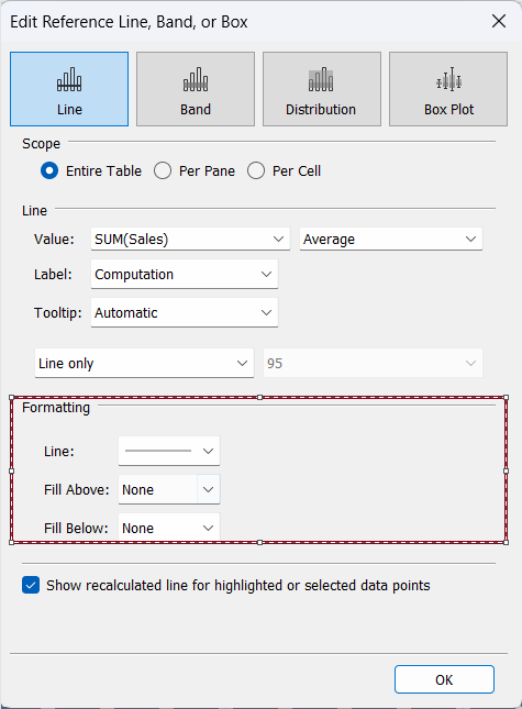
Also, we have available choices to format our reference line, as shown in the screenshot below.
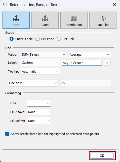
To achieve our objective of adding a reference line showing the average sales based on the values within the view's bars, we will choose the indicated options as presented in the screenshot below, and then proceed to click 'OK'.
The reference line has been added to our graph chart which shows the average of sales across the values in the bar in the table.
Scenario 2: Add a reference line that shows the average sales for each year (Per Pane)
We can add a new reference line following the similar process, however, we will be editing the current reference line for this purpose.
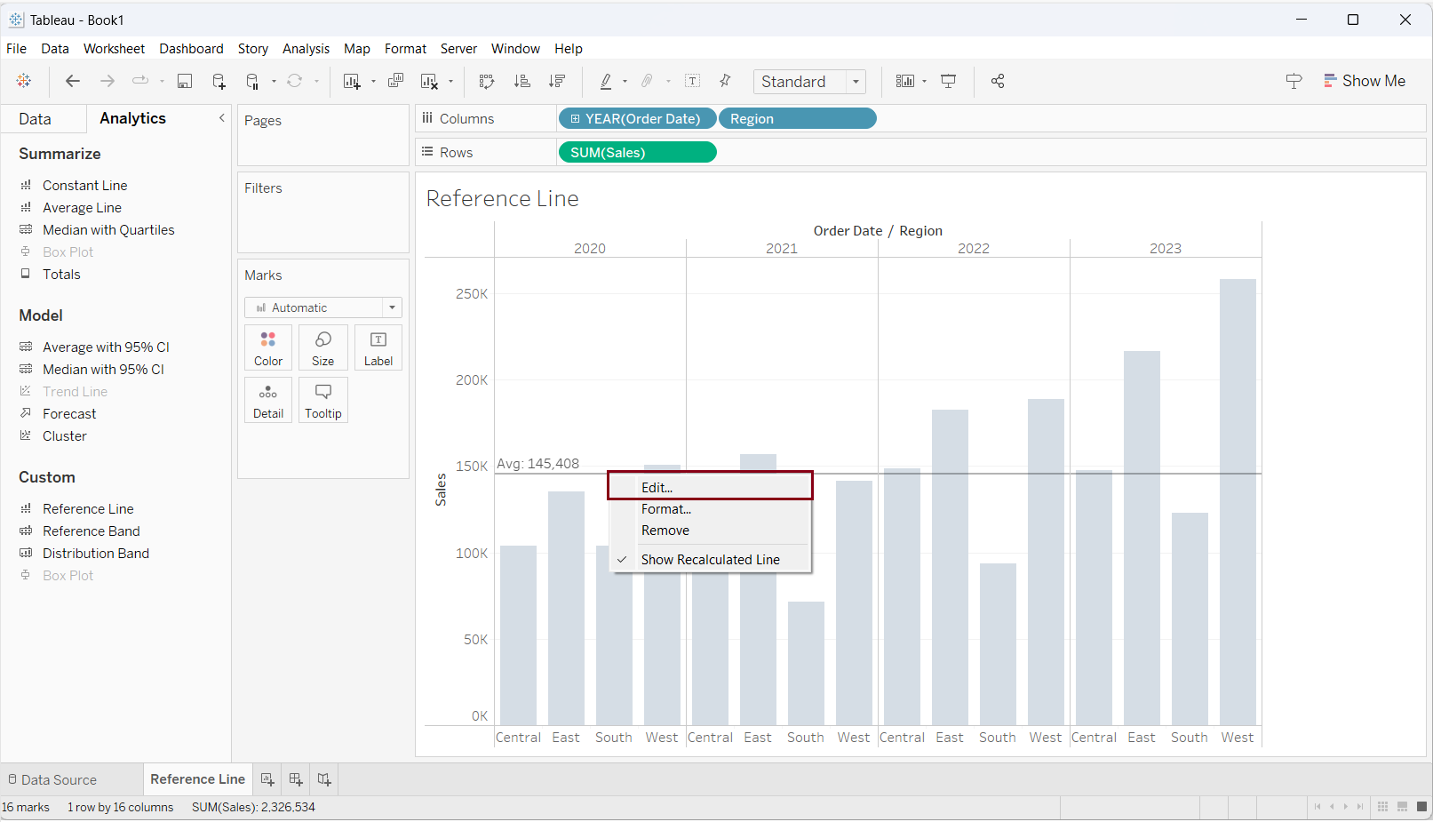
Hover over the reference line, right click and select 'Edit...'.
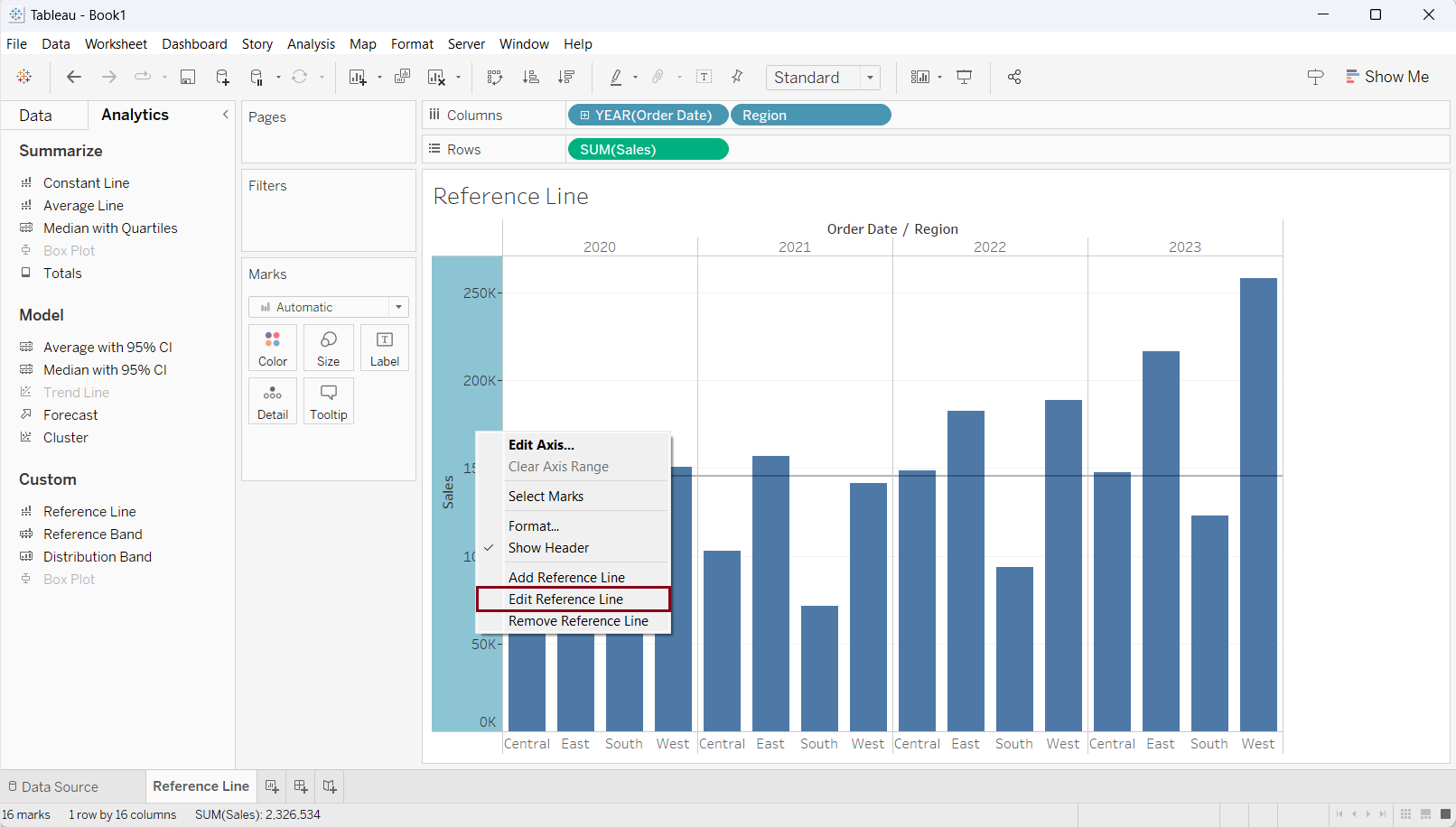
Alternatively, we can right-click on the 'Sales' axis and select 'Edit Reference Line'.
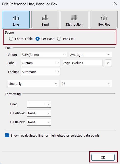
'Edit Reference Line, Band, and Box' window will appear. Select 'Per Pane' radio button under the 'Scope Section' and Click 'OK'
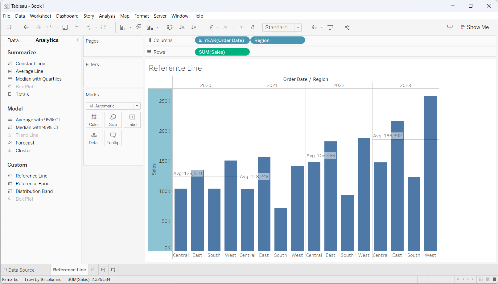
As a result, the reference line has been updated in the bar chart which shows the average sales for each year.
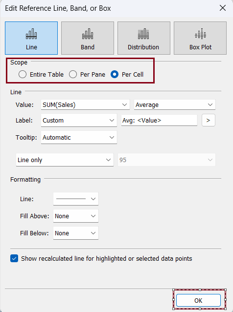
Similarly, if we want to show the reference line at a cell level or the bar level, we can choose 'Per Cell' radio button under the 'Scope' section as shown in the screenshot below.