


Tableau Desktop is an exceptionally powerful tool that enables us to create insightful visualizations and dashboards from complex datasets. During my second week of training at the data school, we delved into Tableau Desktop and gained hands-on experience in generating a wide range of meaningful charts and dashboards. The user interface of Tableau Desktop is designed to be straightforward and user-friendly, although beginners may require some time to familiarize themselves with it. In this blog post, I aim to provide a concise overview of the essential aspects of the Tableau Desktop user interface, offering valuable guidance to new users. It's important to note that the demonstrations presented here are based on the 2023.2 version of the application, which might exhibit slight variations compared to previous or forthcoming versions.
Start Page
When you launch the Tableau Desktop, you will see a page as shown in the screenshot below.
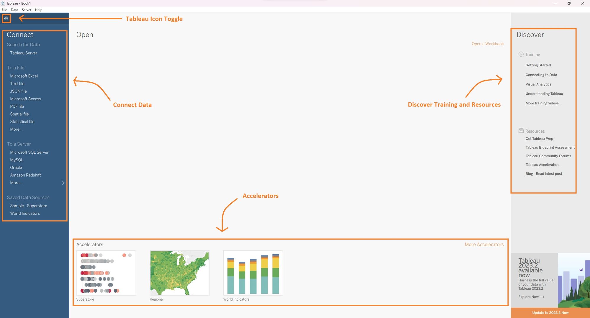
In this window, you can,
1. Connect to a data source via Tableau Server, flat files (CSV, spreadsheet), database servers (MS SQL Server, Oracle) and Tableau saved data sources. However, if you are using Tableau Desktop Public edition you will not be able to access the database server and saved data sources.
2. Discover training and other resources that will assist you to get started with Tableau Desktop.
3. Access accelerators which allow you to use ready-to-use dashboards developed by Tableau, connect your data, and customize it as per your need.
4. Click on the Tableau icon in the top left corner (below the menu bar) to toggle between the start page and the workspace area of the application.
Data Source Page
Once you have connected to your data or switched to the workspace page using the Tableau icon, you will be directed to the primary interface of Tableau. On this interface, you will notice a Data Source page positioned in the bottom left corner. Clicking on the Data Source page will display a view similar to the screenshot below.
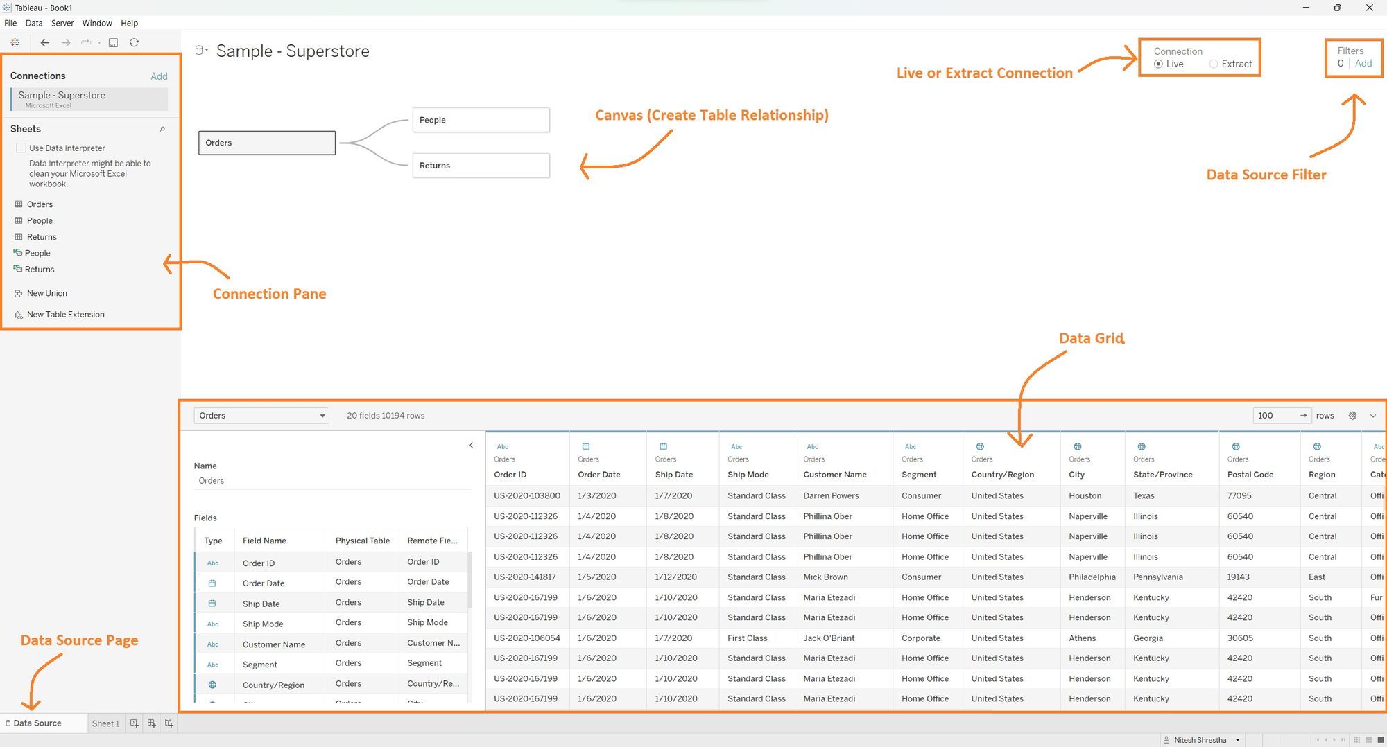
1. In the connection pane you will find the data source you are connected to. This section allows you to modify your data source or add additional data to your project as needed.
2. You can easily drag and drop your data sheets from the connection pane to the canvas which will allow you to visually create relationships between tables such as JOIN and UNION.
3. In the Tableau Desktop version you have the flexibility to change your connection type to Live or Extract connection. However, this feature is not available in the Tableau Desktop Public version. For a comprehensive understanding of the Live and Extract connection, you can refer to a blog post written by one of the data schoolers.
4. In the top right corner of this view there is a data source filter. This feature enables you to add filters that include or exclude specific rows from the data source before loading it into Tableau for analysis.
5. At the bottom of the view, you can explore the data grid, which displays the top 100 rows of your data. Here, you have options to modify the data type to suit the requirements of your analysis.
Workspace Area
To access the workspace area, simply click on the "Sheet1" tab located in the bottom left corner. This action will open a new view, as shown in the screenshot below.
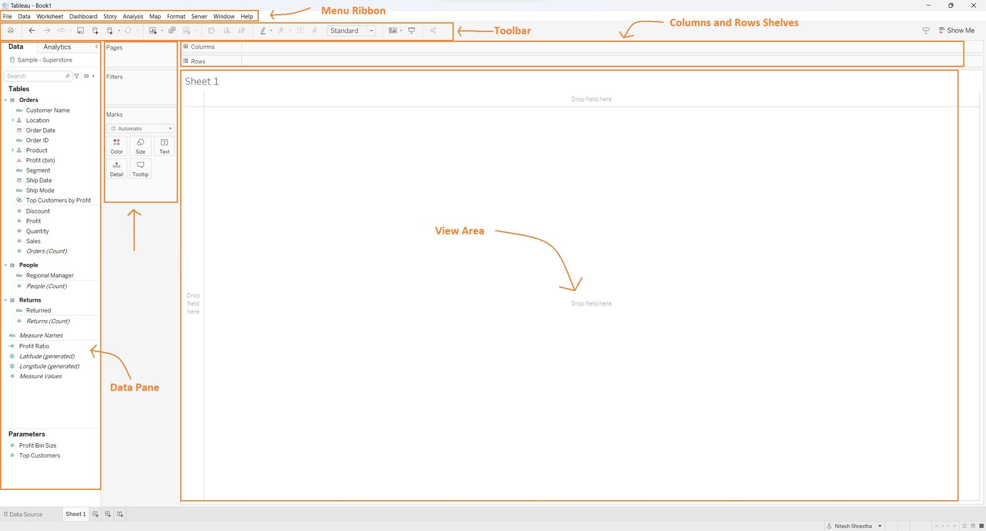
1. The top of the screen features a menu bar or ribbon, which includes various menus such as File, Data, Worksheet, Dashboard, Story, Analysis, Map, Format, Server, Window, and Help. These menus provide access to different functionalities and options within Tableau.
2. The Data Pane, located within the workspace, displays the fields from your data sources. Each field is represented by icons and colors that indicate its data type. By dragging and dropping these fields into the view area, shelves, and cards, you can create visualizations.
3. The Page, Filters, and Marks cards are positioned on the right side of the data pane. These cards allow you to manipulate your visualization based on the filters and characteristics. Additionally, you can customize the color and size, and add details and tooltips to enhance your visualizations.
4. You can drag fields to Column and Rows Shelves to change the structure of your visualization based on the x and y-axis positions. This allows you to create different types of charts and visualizations.
5. You can observe and interact with your visualizations in the view area of the workspace.
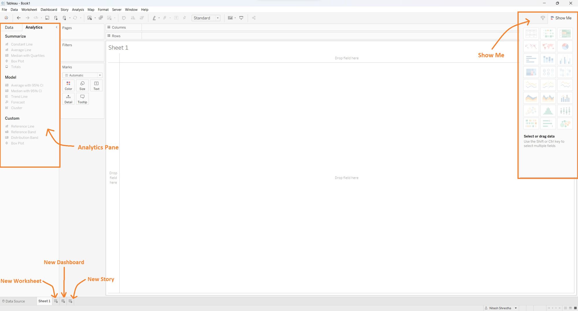
6. On the left pane, you have the option to switch between the Analytics Pane and the Data Pane. You can add analytical objects from the Analytic Pane to your visualization. You can choose from options like summarize, model, and custom to enhance your analysis.
7. The "Show Me" option located at the top right corner offers a convenient way to quickly generate visualizations based on the fields you have selected in the Data Pane
8. Located at the bottom left there are icons with a plus sign you can add new worksheets, dashboards, and story tabs as per your requirement.
Tableau Desktop provides a user-friendly environment with easy data connectivity, drag-and-drop functionality, and customizable options for creating visually appealing visualizations. Take advantage of these options to develop your skills in data visualization!