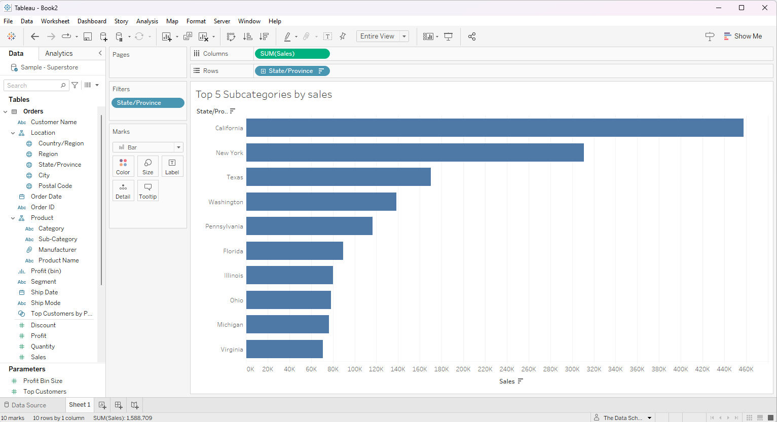
In Tableau, Dimensions represent categorical or discrete fields. We utilize dimension filters when we want to narrow down the view within a workbook based on specific conditions related to these Dimensions. Although dimension filters are low-level filters, according to Tableau's order of operations, it processes before Measure and Table Calculation Filters. This sequence ensures that dimension filters act as an initial step in data filtering and segmentation before any further aggregations or calculations are performed.
In this blog, we will discuss on the application of dimensional filters and the options available using some case scenarios. For the demonstration purpose, we are using the Sample Superstore dataset.
Scenario 1 (General Option)
We aim to visualize a bar chart showing the sales across US states in the central region.
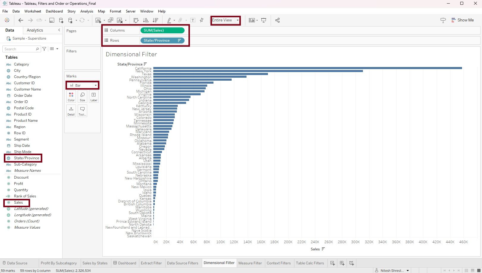
Step 1: Drag the 'State/Province' dimension into rows and the 'Sales' measure into columns. Change the visualization into 'Bar' and select 'Entire View'
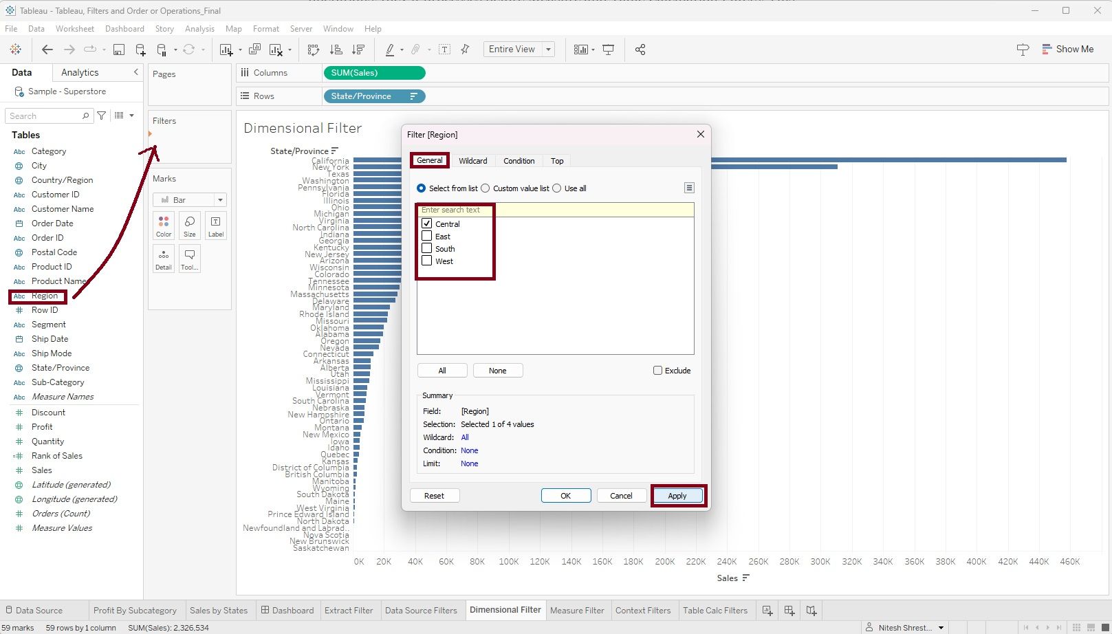
Step 2: Drag the 'Region' dimension into the 'Filter Shelve'. A filter window will appear. On the 'General' tab click 'Select from list' and select 'Central' region. Click 'Apply'.
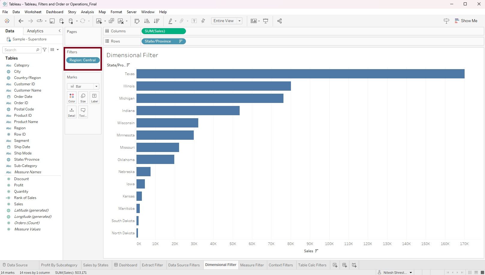
Now, we have a bar chart showing the sales across US states in the central region.
Scenario 2 (Wildcard Option)
The store wants to analyze its sales by products and identify products with names containing a specific keyword 'Office'
Step 1: Drag 'Product Name' into rows and 'Sales' into columns. Change the visualization into 'Bar' and select 'Entire View'
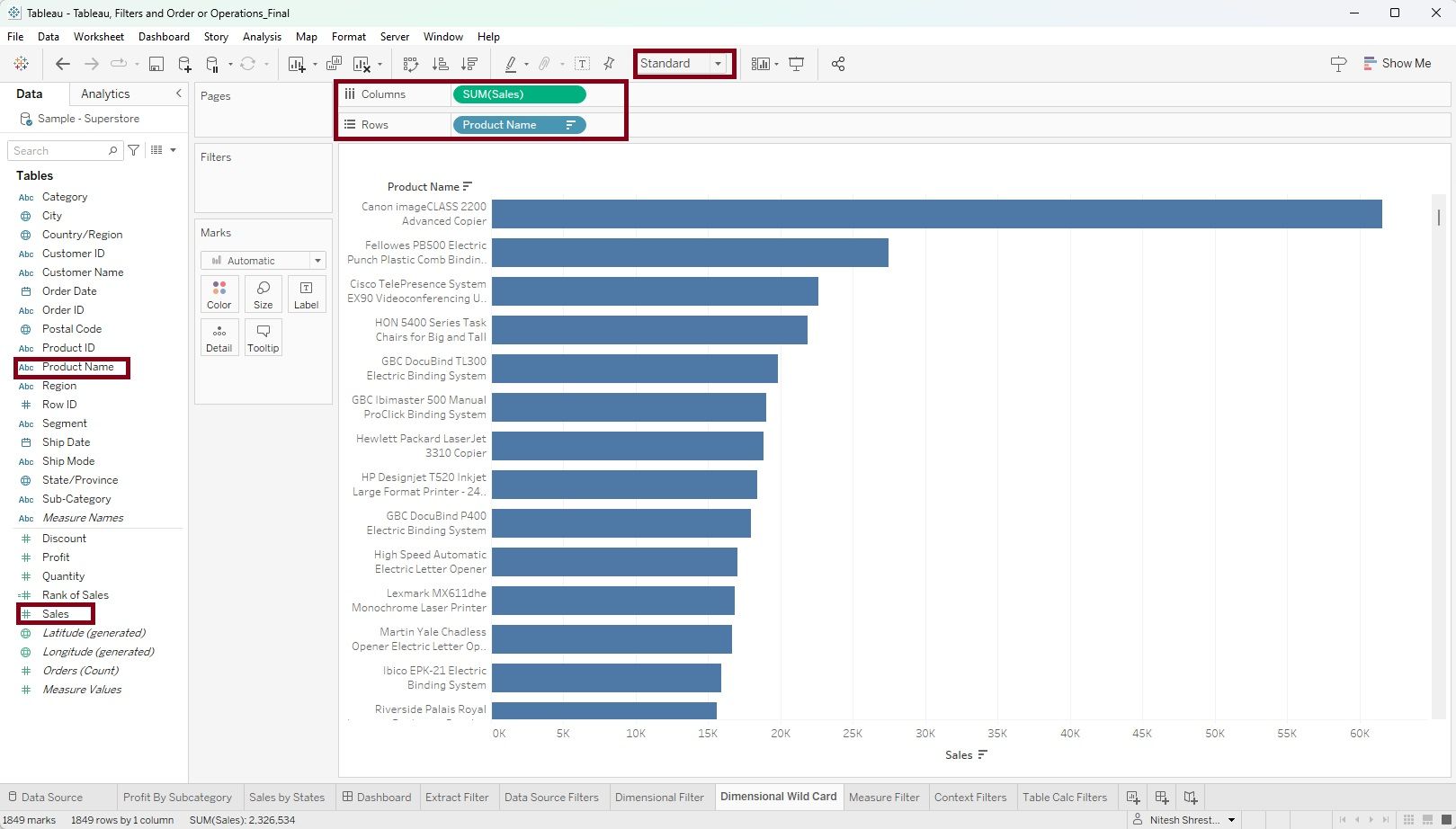
Step 2: Drag the 'Product Name' dimension into the 'Filter Shelve'. A filter window will appear. On the 'Wildcard' tab click 'Contains' and type 'office' in the match value option. Click 'Apply'. Alternatively, you can also use 'Start with', 'End with' and 'Exactly matches' options to meet your requirement.
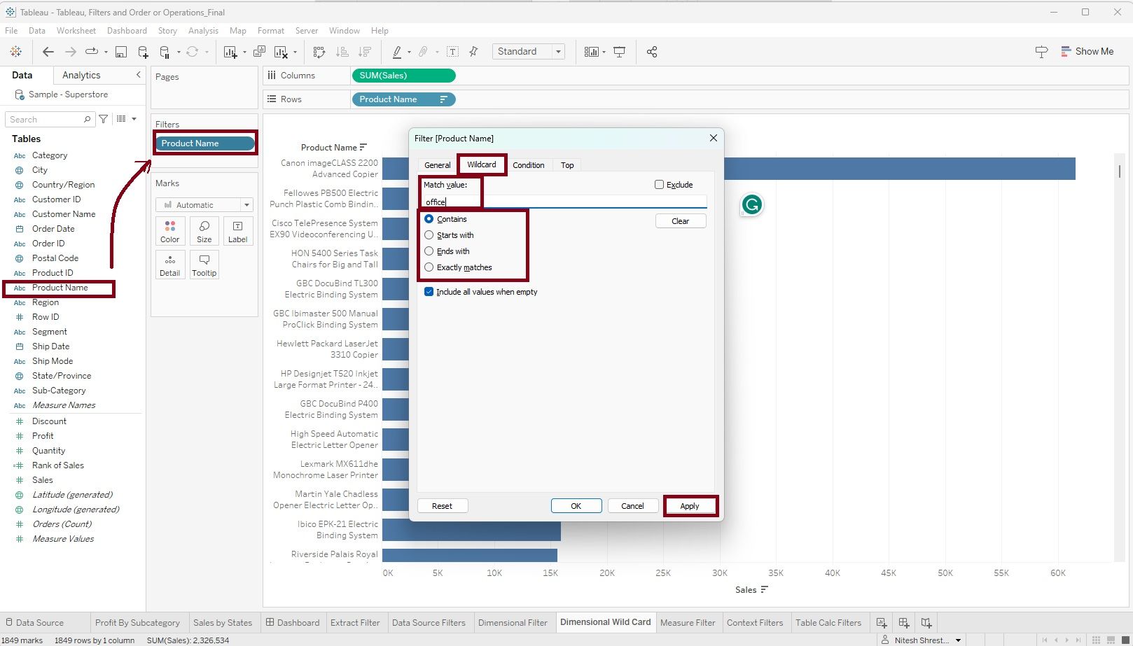
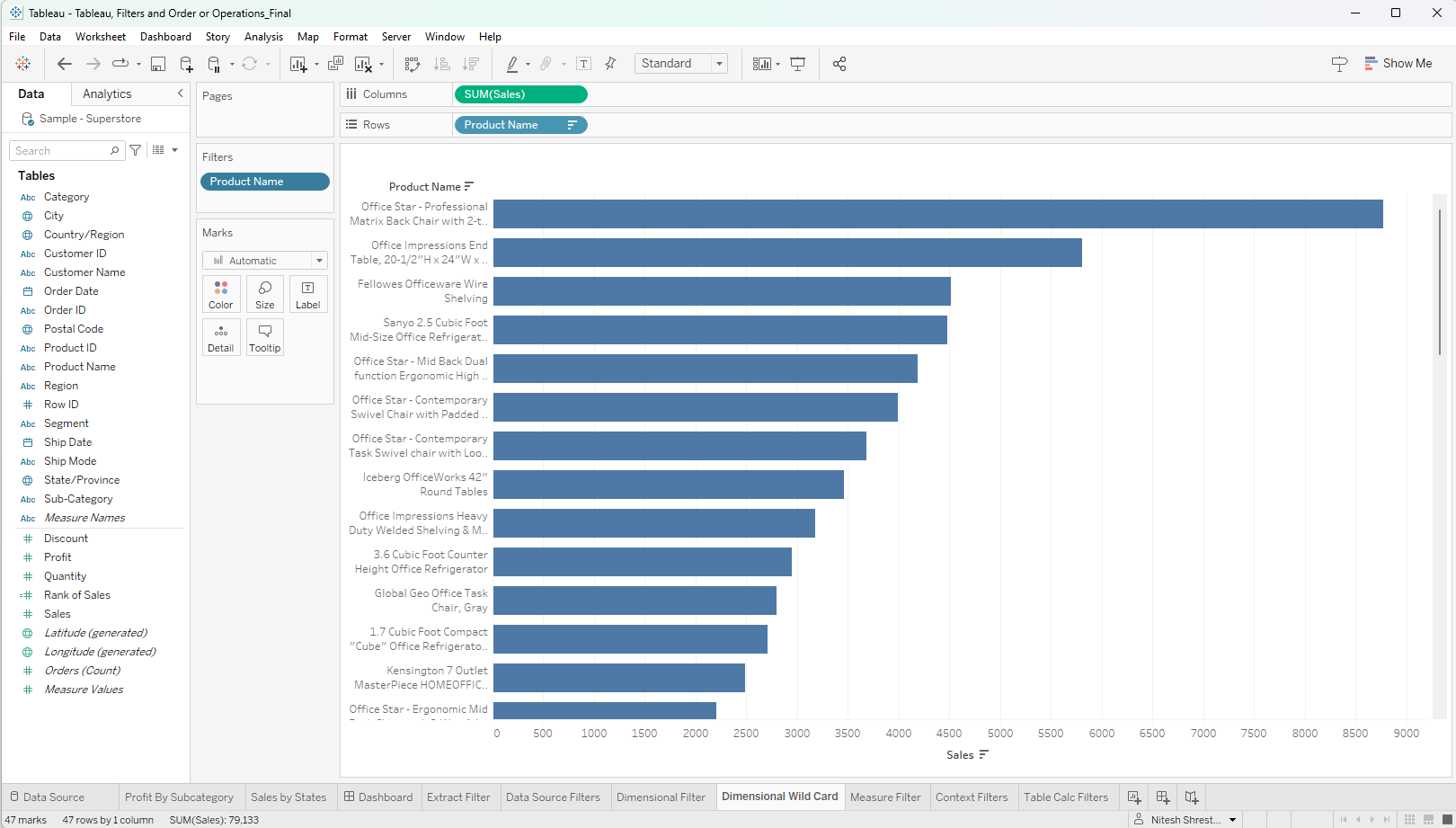
Now, we have a bar chart showing the sales by product names containing the keyword 'Office'.
Scenario 3 (Condition Option)
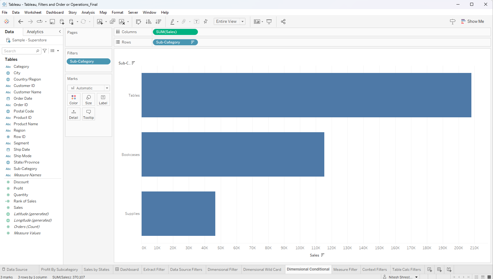
The store wants to analyze sales by Sub-category in which profit is less than zero (loss).
Step 1: Drag the 'Subcategory' dimension into rows and the 'Sales' measure into columns. Change the visualization into 'Bar' and select 'Entire View'. Sort by Sales.
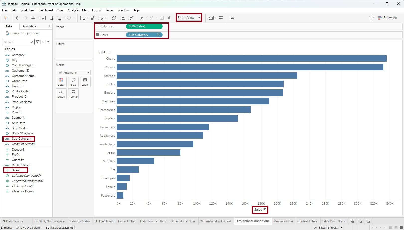
Step 2: Drag the 'Subcategory' dimension into the 'Filter Shelve'. A filter window will appear. On the 'Condition' tab click 'By Field' , select 'Profit' and 'Sum' in the drop down menu, apply condition by selecting '<' sign and 0. Click 'Apply'. You can also use other options if there are any other conditions.
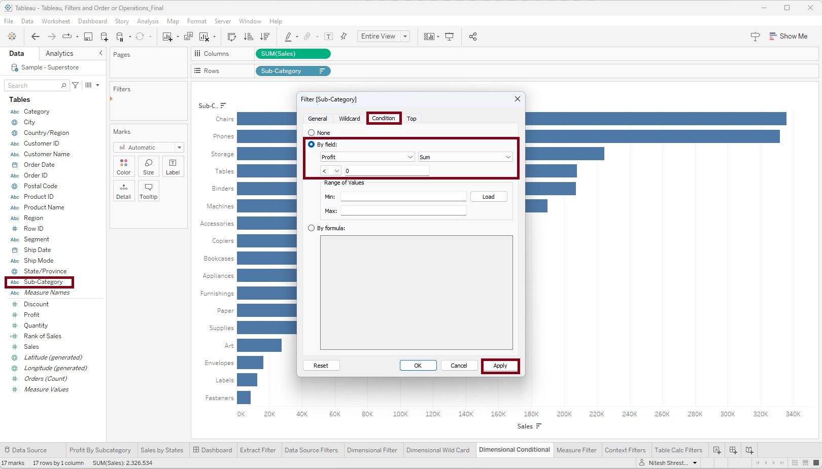
Now, you we have a bar chart showing sales of Subcategory in which the profit is less than zero.
Scenario 4 (Top N)
We aim to identify the Top 10 States in terms of sales
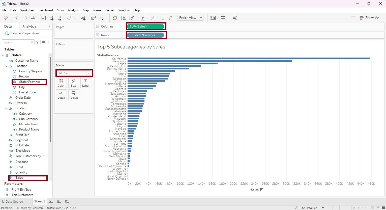
Step 1: Place the dimension 'State/Province' onto the Rows shelf and the measure 'Sales' into the Columns shelf. Choose a bar chart as the visualization type. By following these steps, you will generate the following chart."
Step 2: Drag the dimension 'State/Province' again into the filter shelve. A filter dialog box will appear. Select the 'Top' menu on the top right. Select 'By Field' radio button, and within the 'By Field' category select 'Top' in the menu, enter number '10' based on 'Sum' of 'Sales' as shown in the figure below, then click 'Apply'.
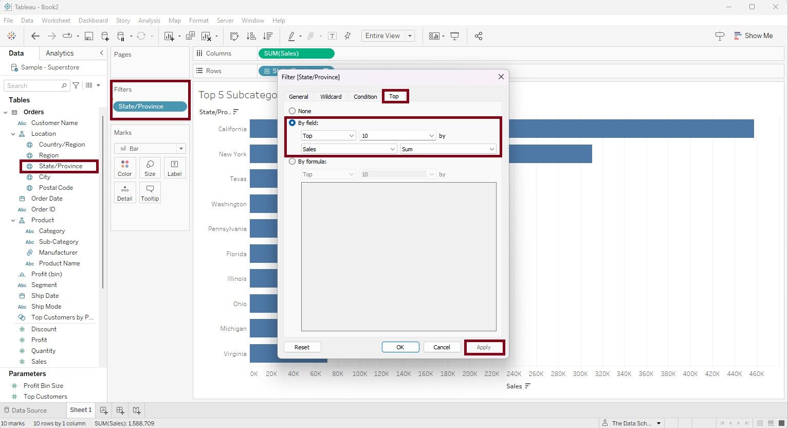
The outcome of applying this filter will be the Top 10 States ranked by sales, as demonstrated in the figure below.
