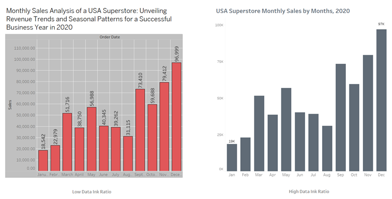
Have you ever come across a data visualization that was not able to effectively convey its message to you? One common reason for such shortcomings is a low data-ink ratio.
Data ink refers to the ink or print that represents the actual data in a visualization. The data-ink ratio measures the proportion of ink used to represent data compared to the total amount of ink used in the graphical presentation, including non-data elements.
Data Ink Ratio = Data ink / Total ink used in the visualization
To ensure effective data display, it is essential to prioritize increasing the data-ink ratio when designing any type of visualization. This means utilizing data ink exclusively and minimizing or eliminating non-essential ink. By doing so, the focus remains on the data rather than unnecessary design elements.
Here are some key best practices to enhance the data-ink ratio:
- Choosing a simple chart type that effectively communicates your information.
- Minimizing or toning down decorative elements, keeping the audience's attention on the main data.
- Using labels and annotations when necessary, avoiding excessive text that may distract from the core message.
- Removing chart clutter, including gridlines, 3D effects, and extraneous elements that don't contribute to data understanding.
- Purposefully optimizing the use of colors, applying them to highlight important elements while using lighter shades for less significant ones.
- Crafting clear and concise titles and subtitles that provide context to viewers.
- Utilizing titles and subtitles to indicate legends, thus freeing up space and reducing visual noise.
Now, let's explore an example that demonstrates the application of these practices and observe the resulting improvements in data visualizations.

