Trend lines within Tableau serve as statistical tools designed to approximate trends or correlations among variables and to represent how one variable changes with another. Tableau gives us five types of these trend lines: Linear, Logarithmic, Exponential, Power, and Polynomial. In this blog, we'll focus on the Linear Trend line and guide you on adding it to your visualization.
Linear trend lines are straight lines that best fit the data points to estimate their relationship. With the linear trends, the formula is represented as follows:
y = b1 * x + b0
where,
y is a dependent variable
x is an independent variable
b1 is the slope/coefficient of the line.
b0 is the intercept of the line.
We can evaluate whether the line fits well by checking the R-squared and p-value. The R-squared indicates how closely the trend aligns with the data; a score of 1 is a perfect fit, so values near 1 are good. Similarly, the p-value reflects the significance level as a probability. Generally, a p-value below 0.05 is considered favorable.
Now, let's look at an example and add a linear trend line in Tableau. I will be using Sample Superstore dataset for this demonstration.
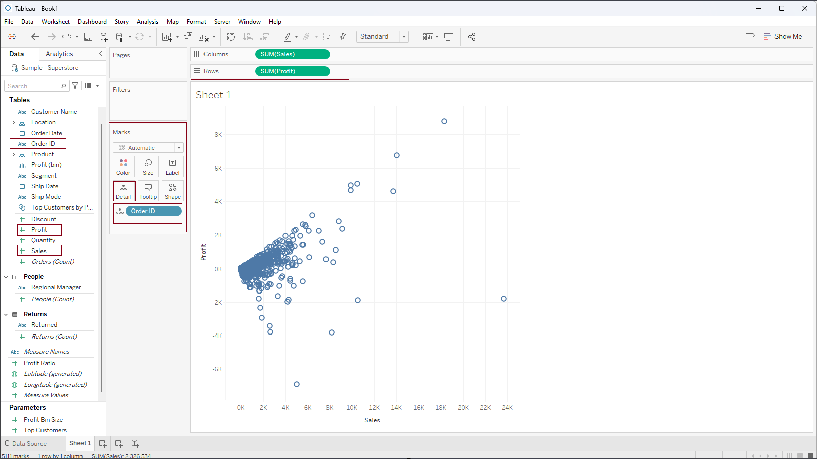
Step 1: Drag the ‘Profit’ (dependent variable) in rows and ‘Sales’ (independent variable) in columns. Drag ‘Order ID’ inside the Marks shelf into the Detail box. This action will generate a scatter plot similar to the image displayed below
Step 2: From the 'Analytics' pane under the 'Model' section, select the 'Trend line' and drag it into a view. 'Add a Trend Line' box will appear, then drop it into the 'Linear' type as shown in the screenshot below.
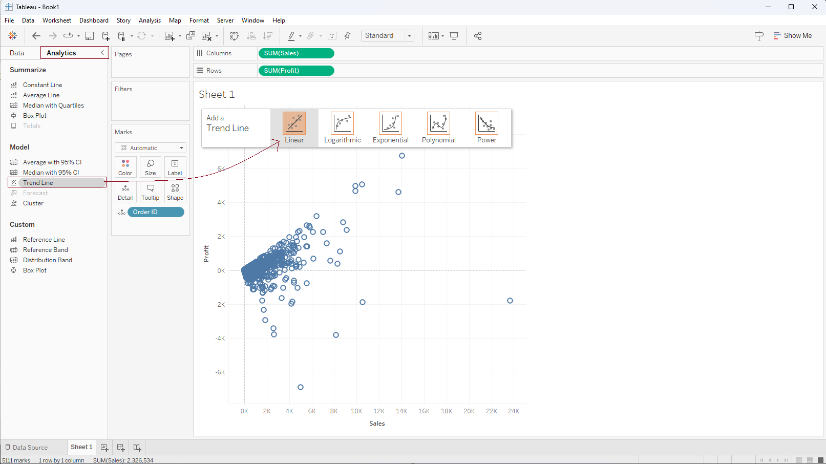
Tableau automatically adds a linear trend line to the view as per the data points. If we hover over the trend line we can see some basic information on the Tooltip (R-squared value, p-value) as shown in the screenshot below.
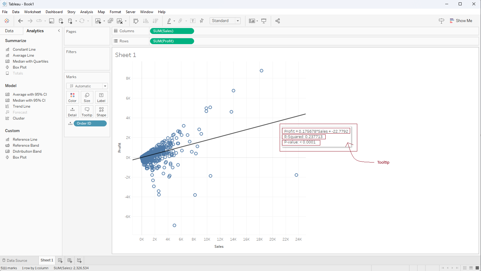
Observing the results, the R-square value stands at 0.23, and the p-value registers as less than 0.0001. Despite the p-value being lower than the significance level (0.05), the R-square doesn't approach 1. Based on this, we can infer that the linear model might not be the best fit for the data points.
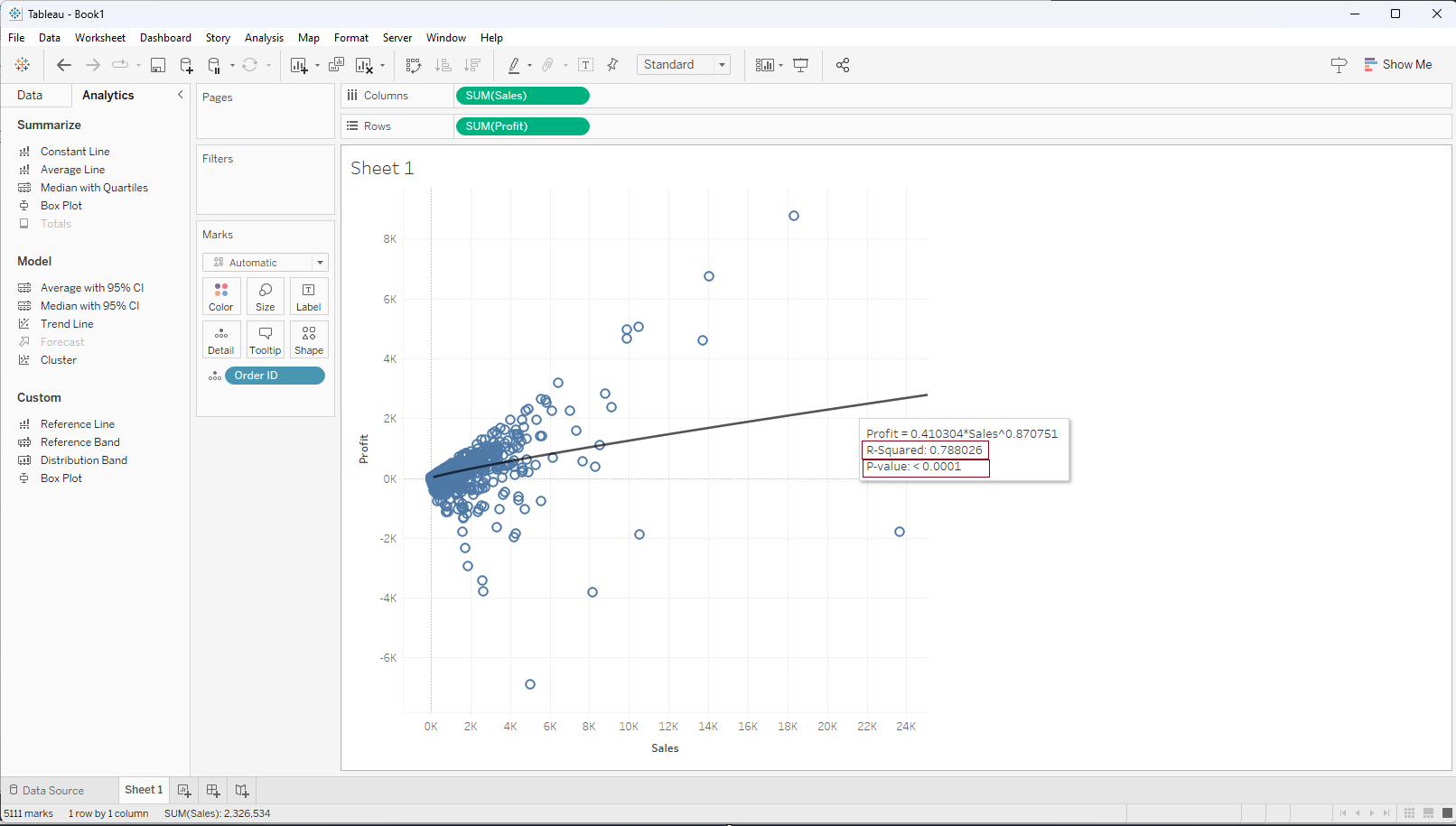
We have the option to explore alternative trend models such as Logarithmic, Exponential, Power, and Polynomial. By adding these models to the view, we can analyze the values and determine which model offers the best fit. Upon comparing the different models, I found that the Power trend line model seems to align best with the data points, as it exhibits an R-squared value of 0.78 and a p-value below 0.0001.