When we are working on making dashboards as impactful as possible, to truely support the executives making well thought out descicions in a faster and more precise manner, Key Performance Indicators (KPIs) play an important role. They tell a bigger picture story along side the more detailed or granular visualisations, we as data analysts provide to the desicion makers aswell. They are big and highly visible aggregated numbers (or BINs) that keep businesses on track, highlighting successes and pinpointing areas that need attention. But to make KPIs even more actionable, we can give them some additional analytical context. This can be any comparison of that displayed BIN to a different category, product or most commonly come across, a previous timeframe of same length. Imagine looking at your KPI and immediately knowing not just the current performance, but how it stacks up to past periods through a clear percent change. Today, I'll walk you through how to create KPIs that don’t just display data, but communicate trends of important metrics at a glance.
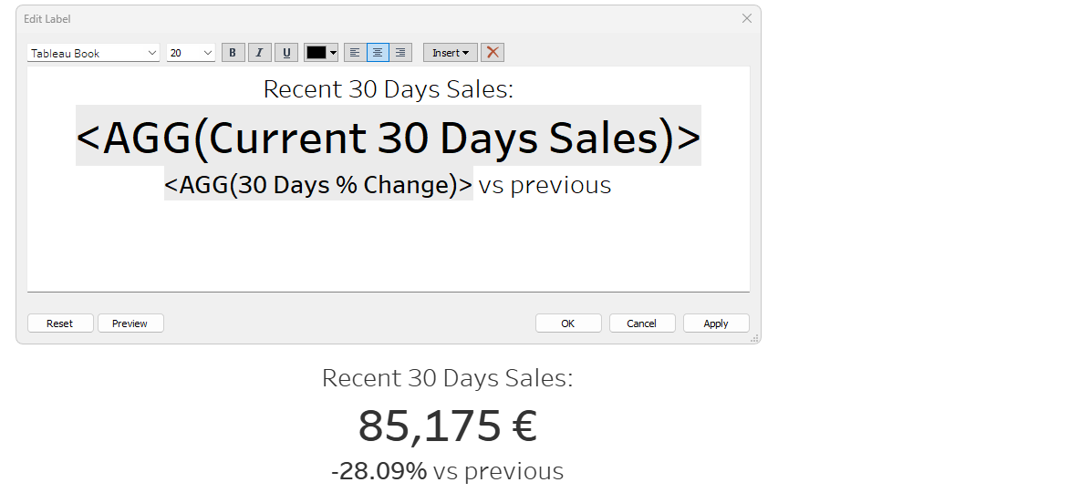
After this tutorial you'll know how to create a KPI just like this:

It displays the aggregate number of in this case sum of sales for a specified amount of time and compares that through a change in percent to the sametimeframe before that.
You could of course use any other aggregation and timeframe for your version, this is just a common example. So let's start building it.
Our goal is to create 3 calculated fields, which in this case represent the sum of sales for the last 30 days, the sum of sales for the previous 30 days and a field that calculated the difference between these two as a percentage:

Current Timeframe Aggregation
Okay then, let's start with the first calculated field. The sum of sales for the past 30 Days.
Here is what you'll need to write:

We are using a IF condition within our aggregation function to check wether or not a row of data should be in- or excluded into the aggregation. The IF condition in this case looks at the Orderdate of a row and then decides wether or not its bigger than the DATEADD function that is configured to represent a date thats 30 days before todays date. If the condition is met, THEN Sales will be used within the aggregation.
Here is just a slight adjustment that was useful for the Superstore dataset I am using in this demonstration:

I changed the date that the DATEADD function counts from to be the maximum date in the dataset instead of today to display the 30 most recent days of the dataset instead of the 30 recent days from today. For this I used the MAX funtion and put it into curved brackets { }.
Previous Timeframe Aggregation
The second step now is to create a similar calcualtion to display the aggregation for the same amount of time that was previous to what we just made.

As you can see for the previous timeframe we just need to make a few adjustments. We need to replace the ">" at the start of the IF condition with a "<=" to include all dates that are before or are 30 days prior and we need to add another condition with AND that uses the same structure, but excludes all dates that are more than or exaclty 60 days prior.
Change in Percent
Our last and very easy calculation to create is the change between the current and the previous period as a percentage. This is how:

We subtract the previous from the current within brackets and divide that by the previous for our desired result.
Arranging
For our very last step we only need to drag both our current timeframe aggregation and our percent change field onto the labels marks card:

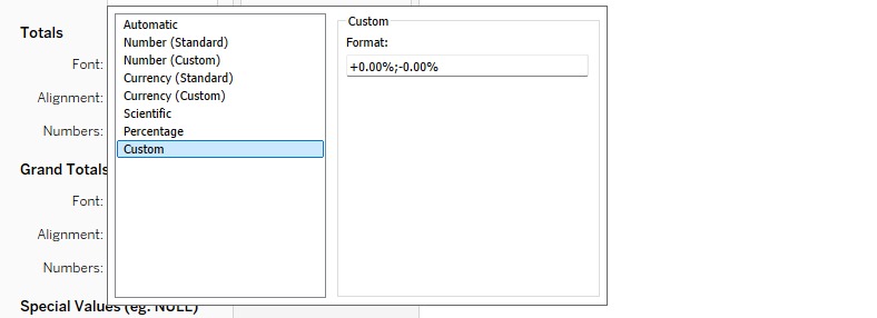
Then adjust the number formats to be a currency and a percentage, but be careful and apply a custom number format to the change in percent with the following syntax to ensure that there will be a plus infront of the number if the change was not a negative one:

And finally adjust the label:

This was all we need to do to create a even more helpful version of our all so beloved KPI. I hope you I explained all of this well enough and that you could follow me along nicely. Maybe I'll show how to create other forms of context below KPIs in the future, but this is it for now.
I hope you enjoyed, have a nice one.
