The final day of our Dashboard Week was occupied with the probably most fun and satisfying for the most of us - the Personal Project.
In previous weeks, we already got the opportunity to work out things like the general idea, the source of data and first sketches in 3 houres summed up.
Project Idea
A tableau dashboard that keeps track of my personal workouts, sleep patterns and overall health statistics to further my endurance and strength with better insight and thus a increased sense of accountability. My data provider (Fitness tracker) already has a useful app to keep track of most things, but is lacking some insights and metrics I would really like to keep track of.
Data
I have now worn a Whoop, which is a fitness tracker that is ment to be worn 24/7, for more than 5 months. This means I've already collected plenty of data to start with about my sleep, physiological health and workout frequencies and intensities. Conviniently my fitness tracker has a export data button in the iOS app and can send me all my data spread out to 3 comma seperated files via e-mail.

Additionally I wanted to add just one more table that I've set up myself and keep up to date manually. I created a google spreadsheet to keep track of how many pull ups I did on specific days, where I chose to do them, because I've nothing else exercise related planned. I created this spreadsheet to monitor my progress on pull ups and was sure that displaying them on this dashboard would be a nice addition.

User story
AS A: boxing enthusiast who will soon have his first fight
I NEED TO: plan my weekly exercise and rest accordingly
SO: I can ensure to exhaust my body to the right amount in order to advande when it comes to endurance and strength and not overstrain myself into a physical decline
BY: interacting with a visually pleasing dashboard of my personal health and exercises
Sketch
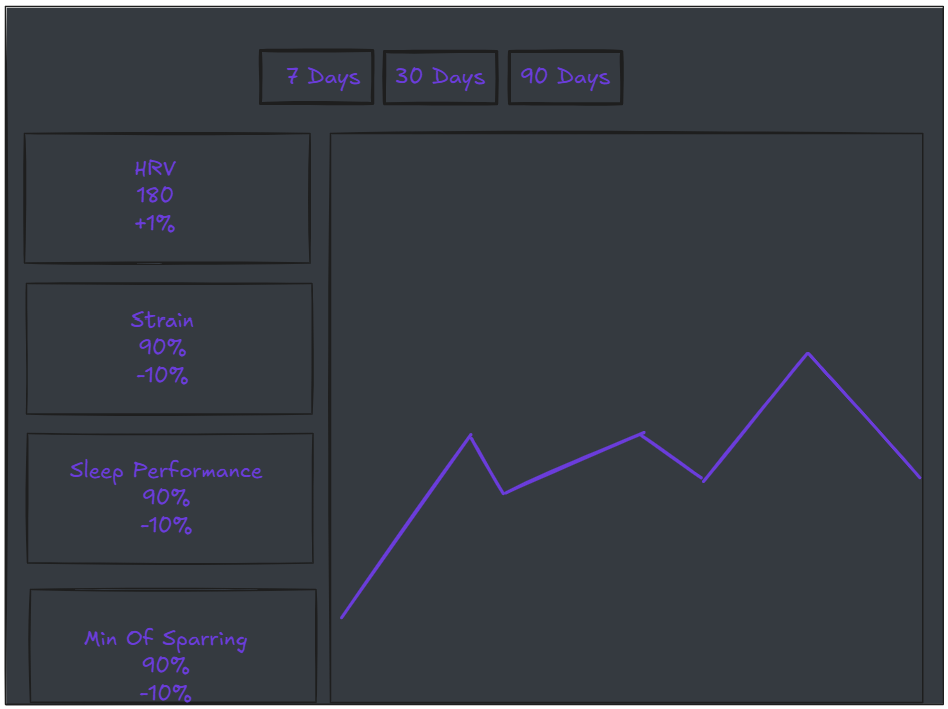
Within the 3 hours before the dashboard week, I got to finish a first very rough sketch. I wanted there to be several timeframes to select at the top to get a more detailed or bigger picture view if wanted and all important metrics on the left side on a scroll bar with the big aggregated number and a percent change compared to the timeframe before. On the right side I intended to put a variable big chart that changes depending on wich metric I selected on the left to gain a bigger picture overview for that metric.

How The Dashboard Weekday Went
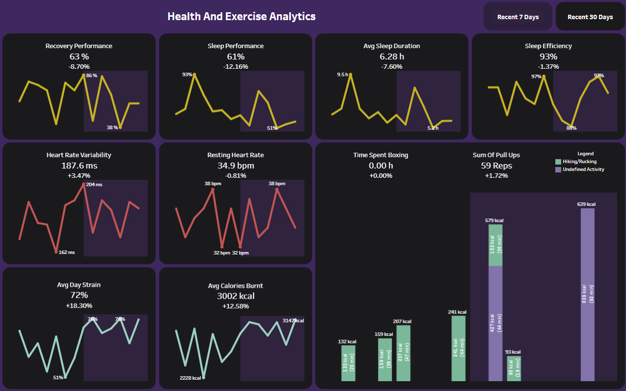
Since I already had my idea and all my data was already available and clean, I went straight to visualizing in Tableau. I looked through every dataset and picked the metrics that are of importance for me. For each I created a line or bar chart with a set timeframe and a KPI with a big aggregated number and a comparison to the previous timeframe.
Since this dashboard was adressed to me, I chose to spend some extra time for my dashboard design and establish some rounded corners. For this purpose I've already created a rounded corners dark mode template in my free time that was of great use now. I could just paste the dashboard from my template into this projects workbook and copied the rounded edges container multiple times with my new visualizations inside. These rounded edges containers are made up of 4 containers, 4 blanks and 4 images for the litteral corners.
Here you can see how it works (I added some padding to each object just for clarification):

The end result was a first version of a dashboard I’ll use frequently in the future to ensure my training is on the right track so I can win my first boxing fight in 2025. One disclaimer: In the "Time Spent Boxing" KPI, you can see that I didn’t include it in the following screenshot. This was due to not bringing the necessary hip mount to the training sessions, resulting in lost data. However, with this dashboard in place, I’ll make sure to track these workouts in the future.

But as I just mentioned, this is just a first version and I want to change multiple things to get more use out of it.
Next Steps
- In this first version I only had time to create 2 timeframe pages (7 & 30 days) with one of them being incomplete and I would like to have a additional all-time page.
- For better visual oversight I would like to add little sybols to each of the metrics.
- Most importantly, I want to create a automatic refreshing schedule for retrieving my fitness data instead of manually asking for a extract via e-mail.
