With the very soon end of the training phase of my cohort DSDE8, we enter int0 the very last stage, which is the Dashboard Week.
Day one was about creating a visually pleasing personal resume for our Tableau Publich, which we can keep working and improving on for our whole visualization journey.
Step 1 - User Story
First we needed to define a user story for developing a clear direction to head into and keeping the goal in mind. Mine looked as following:
AS A current and future data employee
I NEED TO display my academic and professional life as simple and clear as possible
SO employers can easily discover, understand and take an interest in my story
BY interacting with a visually pleasing dashboard of my carreer.
Step 2 - Getting Inspired
Secondly I needed to get clear on what my dashboard should look like roughly and what information I want to display in it.
For that I looked at the resume, that I used to apply to the data school and went to browse on Tableau Public.
Many resumes on Tableau Public caught my eye but few were actually good to work off of, because either they just looked cool because the person had a whole lot on there, which I don't or fancy visualizations were based on purely subjective judgement.
For example, I would often see analytical skills being rated on some kind of non descibed self assed scale, which noone can actually get a clear picture from.
This is why I decided to use a different measurement for things I would like to visualize instead of just displaying:
- Skills in Months
- Language Skills on a Scale from 0 to Native (with A1, A2, B1, ... in between)
One very often used vizz on Tableau Public was a Gantt Chart for displaying a timeline of someones carrer, which is a idea I wanted to recreate for myself aswell as one thing I saw just once, which is a little map for displaying where the person has been working or in my case is currently working.
Step 3 - Sketching
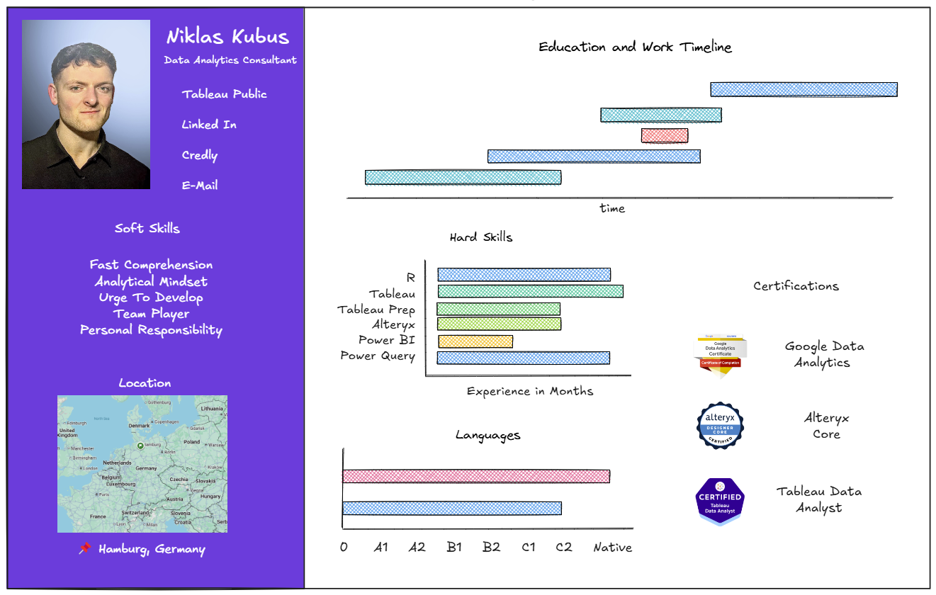
With all these ideas from Tableau Public I went into Excalidraw to create a sketch of the Dashboard I wanted to create.
I wanted to cut the dashboard into two sides with different shading for asthetic reasons only and decided to put my name and socials along with my current working location and soft skills onto the darker coloured left side. All the skills I could actually measure with either data or a certificate should then be on the right side:

Step 4 - Getting The Data
After deciding on what information to visualize and in what manner, the next logical step would be to acquire the data. In this case I needed to create it myself and chose google sheets to do that
For the carreer timeline gantt chart, I created a sheet with a column for the location, one for my position, one for what that position roughly entailed, one for the start date and one for the end date:

For my hard skills bar chart with experience in months, I created a sheet with the skills name as a column, the start date as a column, and sometimes the end date as a column so I can later create a calculated field with the training duration using DATEDIFF() between the start date and end date or TODAY().

In order to create the language bar chart with a scale I made up, I created a sheet with the language name, the numeric level for the bar size and the level as a string for later creating a dummy scale below.

The last sheet of my data set contained just a single row and was later used to create a map with my current working location.

Step 5 - Visualizing
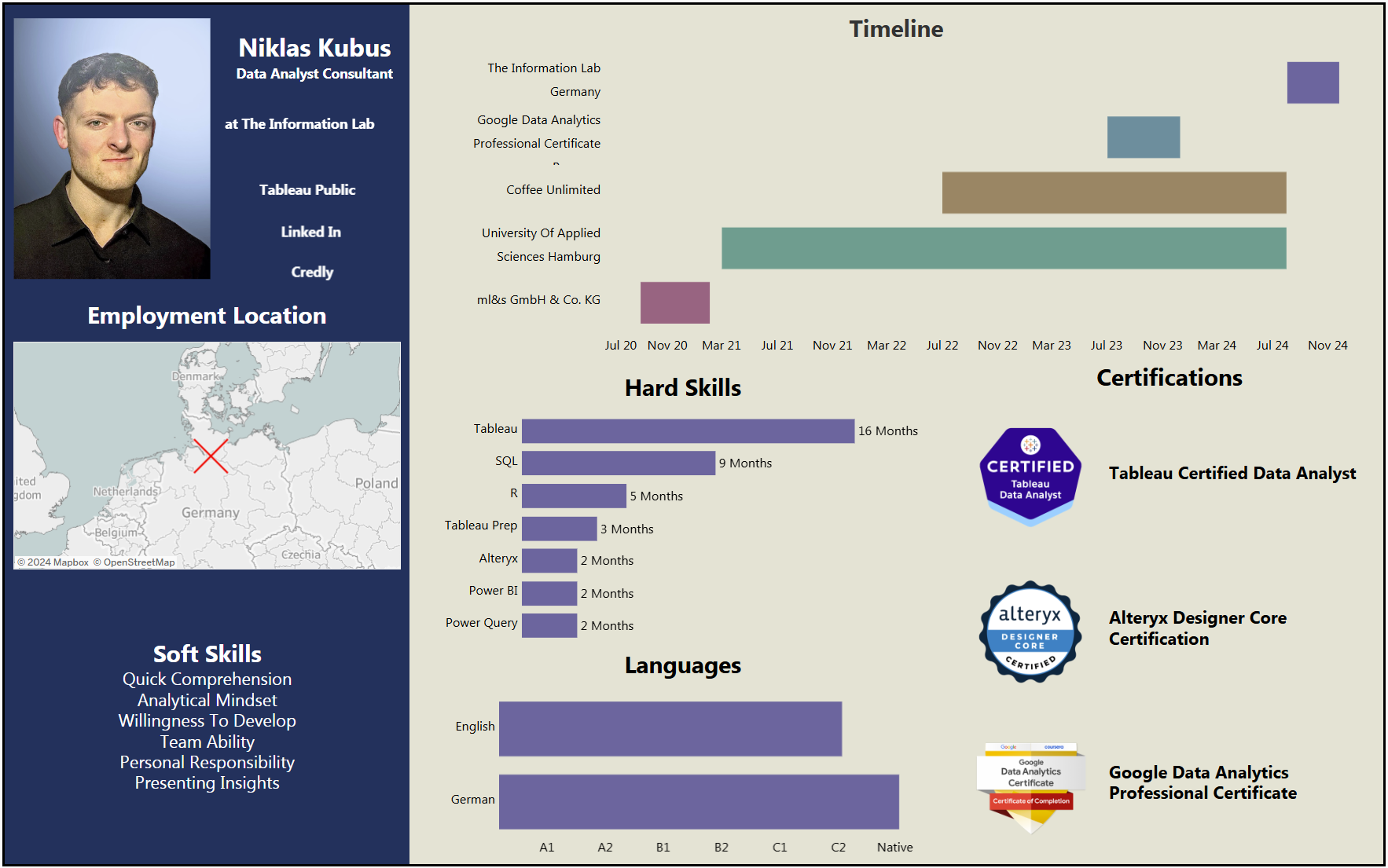
After doing all the prep work, I was finally able to move on to visualizing my ideas in Tableau. The visualisations themselfes were pretty simple to create, but took a whole lot of time comparatively. Here is the result:

https://public.tableau.com/app/profile/niklas.kubus/viz/MyPersonalDataResume/Dashboard?publish=yes
