


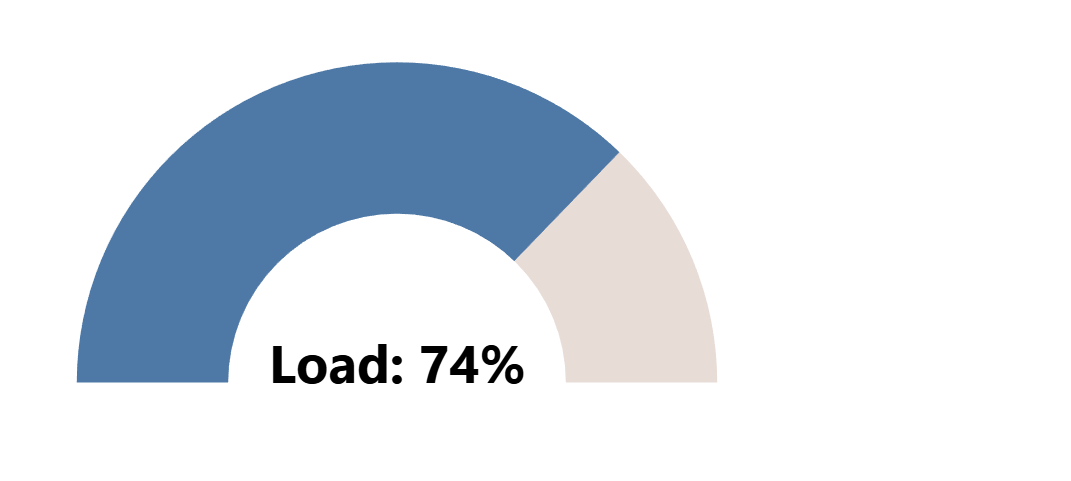
Gauge charts are a popular way to visualize progress toward a goal or display performance levels that have set scales with a bottom and ceiling value, but you need to be cautious when including them on a customer dashboard due to some disadvantages. Gauge charts are not good for comparing values between them, they take up a lot of space and visualize just a single number without any extra analytical context, but if you're dashboard has a lot of open white space and there are important numbers on set scales needing to be displayed and not compared, I say you can go for it, because gauge charts are fun to build and look at.
While creating these visualizations is very straightforward in Mircosofts Power BI, Tableau requires a few extra steps and thinking around the corner to achieve a similar effect. Today, I'll walk you through the process of building a gauge chart in Tableau, so you can add it to your dashboards aswell.
After reading this blog you'll know exactly how to create a gauge chart just like this with Tableau:
We’ll cover each step from understanding the concept to writing the calculations in order to make the process as simple and streamlined as possible to help you creating them without needing to come back to a post like this all the time.
So let's dive into it and start with understanding how it works and then to building it together:
Basic Functionality
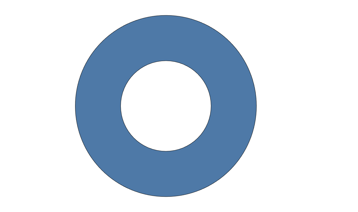
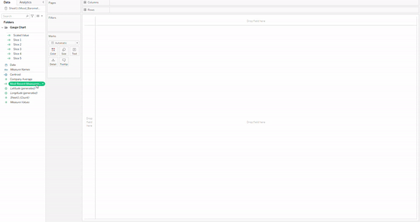
This version of a gauge chart is made up of a donut chart that really isn't much more than a white circle ontop of a pie chart by using a dual axis.
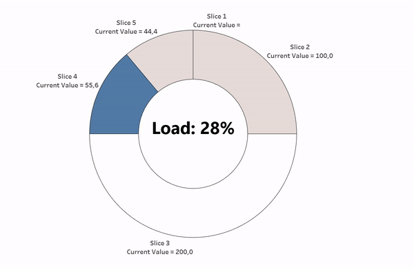
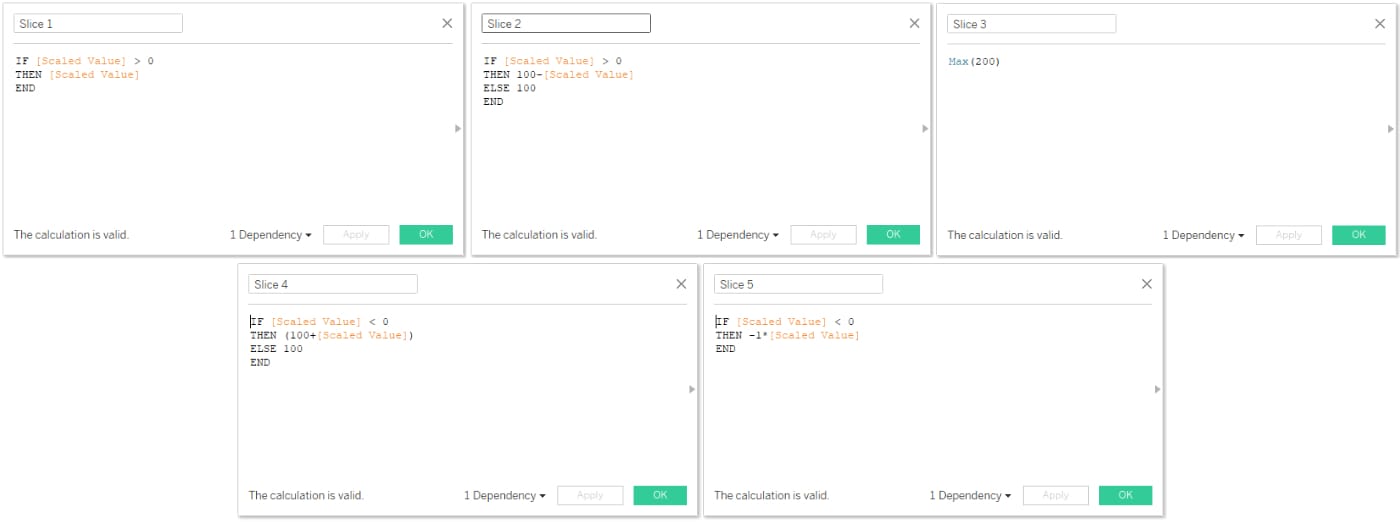
We'll then add 5 different calculated fields to the pie chart below and make their individual sizes dependant upon the measurement you have with a set scale exept for Slice 3, which will always stay at 200.
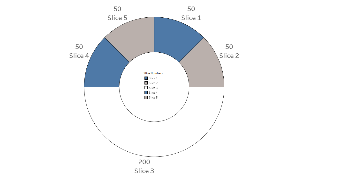
We use the variable size of the slices on top do display our measurent and since Tableau always has the starting point for pie charts at 12 o'clock, Slice 1 and 2 will be used to display a measurement of greater than 50 percent with Slice 4 at 100 and Slice 5 being on 0. On the other hand Values between 0 and 50 Percent will be displayed by using the sizes of Slice 4 and 5 with Slice 1 always staying at 0 and Slice 2 always staying at 100.
Okay now that we know how this type of chart generally works, lets build it from the ground up.
Tableau Tutorial
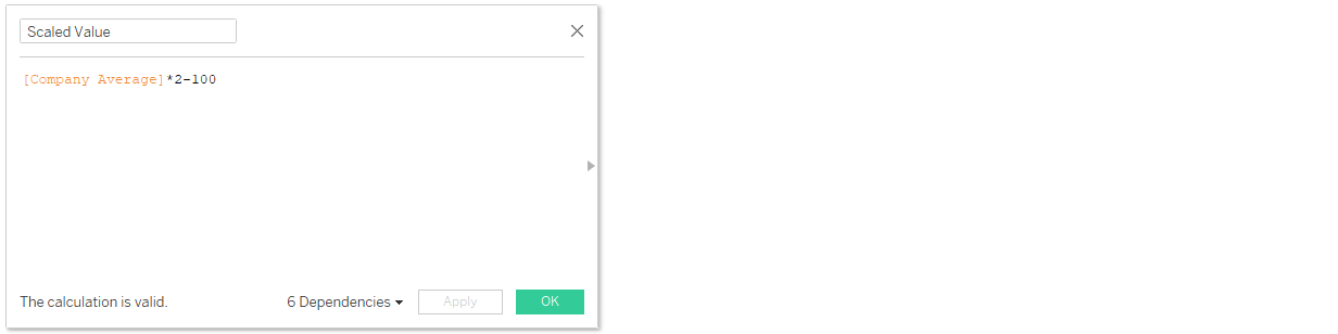
First, we'll need to create some calculated fields. One field to translate the value we want to use to a scale from -100 to +100 and 5 more calculated fields that use the scaled measure to form the different slice sizes of the pie chart.
Rescaling Our Measurement
In my case I am using a company mood barometer value which ranges from 0 to 100. The following formular shows how I translated a value from that scale to a scaling ranging from -100 to +1o0, but if the value you're using is on a different scale you'll need to adjust this formular dependant upon that.
Calculating Slice Sizes From Our Scaled Measure
With our scaled value, we can calculate the size for all of the 5 slices we need for our gauge chart, which always needs to add up to a total of 400. You can just copy these following formulars like you can see them here into your own workbook.
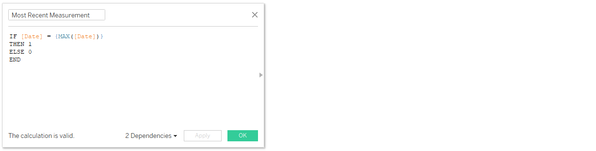
Creating A Time Filter (optional)
In my case, I have a measurement for every month and I just want to display the most recent. This is why I've created a boolean to identify the most recent entry to use this field as a dimension filter.
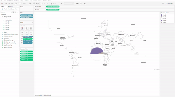
Creating A Spatial Point
This is one thing you maybe didn't see coming, but creating a geographical point, will allow us to use map layers instead of a dual axis, which has the benefit of allowing us do disable selection of pie slices, so the bottom half of our gauge can remain hidden.
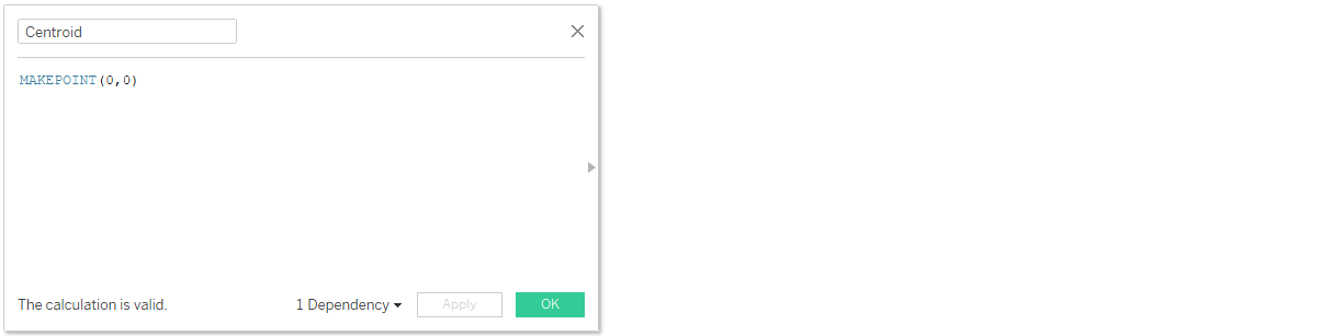
Chart Assembly
First we will convert our filter calculation to a dimension, by draggin it upward within the data pane and then drag it onto the filter card (optional). Then we'll doulbe click our spacial field to generate a map and change the marks type to pie. After that we can increase the size of our pie to the maximum and drag measure values onto angle. Within the measure values card, we'll remove all fields exept for the slice fields and then we drag measure names onto colour.
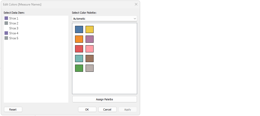
The next would be to colour the slices appropriately with slice 1 and 4 being the colour of progress, slice 2 and 5 being the colour of space left and slice 3 being the colour of your background shading.
Moving forward we'll add the spacial point a second time as a marks layer and change the marks type to circle. That circle size will be adjusted to be a little smaller than the pie and coloured the same as the background. After that we can disable selection for both marks layers, rename them and add the value we're visualizing as a label to the circle marks layer. When that is done, we change the background map to "None", hide the headers and use Ctrl+Shift+B to increase the size of our vizz.
The final touches then would be to remove all lines and borders with the formatting menu and adjust the text label on the circle marks layer.
And voilà - a gauge chart

I hope you had fun reading or following along and I wish you a lot of fun with this chart type, but please keep in mind that these are not always suitable for a dashboard since they take up a lot of space for just a single number with no more context and are a bad choice for comparisons unlike barcharts for example.
If you would like to take a look into the workbook of this blog, you can download it from my tableau public through this link.