


Mapping the Social Hierarchy of DS55
For 120 days, we weren’t just learning about Tableau, PowerBI, Alteryx, and co, we were living in a surveillance state of sneezes. What started as a fun way to check whether we were actually "a very sneezy cohort" (Carl Alchin, 2026) turned into a deep-tissue analysis of our cohort's social fabric. When we were given the privilege to turn our own data into a dashboard I thought it was the perfect time to look into the social standing of each DS55 member, through the lens of the sneeze tracker.
The Idea:
I first wanted to look into further specifics, linking our sneeze data to our DS calendar. Unfortunately (or maybe fortunately), I ran into some issue which made me change direction. I then thought about a few questions I wanted to answer:
- Who gets the most Bless You's considering amount of sneezes.
- Are people who are giving out most first Bless You's receiving them back?
- Who is blessing other the most (who has the most first Bless you's)?
- Are there any alliances between pairs?
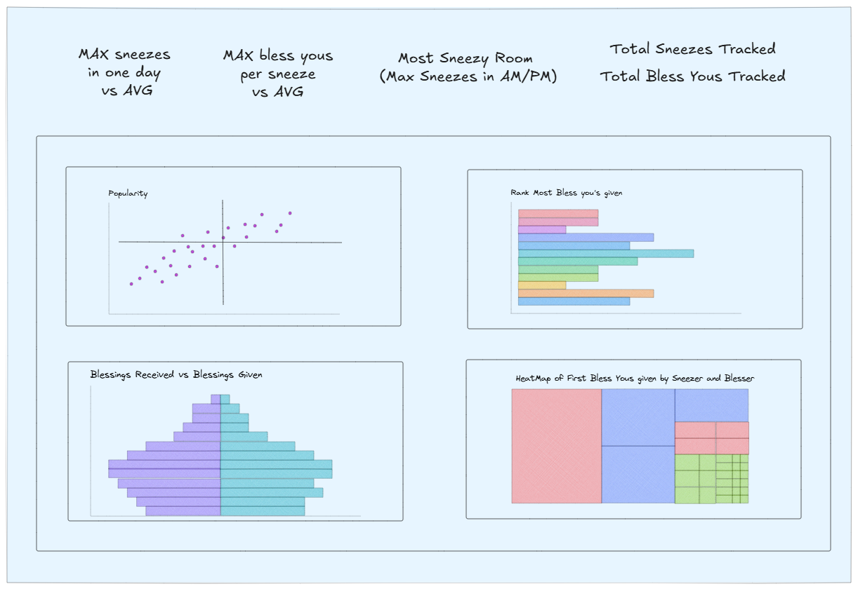
This was my first sketch (very basic):
For the Popularity Scatterplot I didn't just want to count sneezes, but quantify popularity. To do this, I had to move beyond raw totals and develop the Bless You Ratio.
This ratio of Blessings/Sneezes shows the average number of Bless You's each person receives for one of their sneezes. A ratio of 1.0 meant they were meeting the baseline of office politeness and received one Bless You. Anything higher meant they had "Social Gravity". They didn't just sneeze, they commanded the room.
The Process:
The dashboard is designed as a four-part report into the sneeze culture of the office.
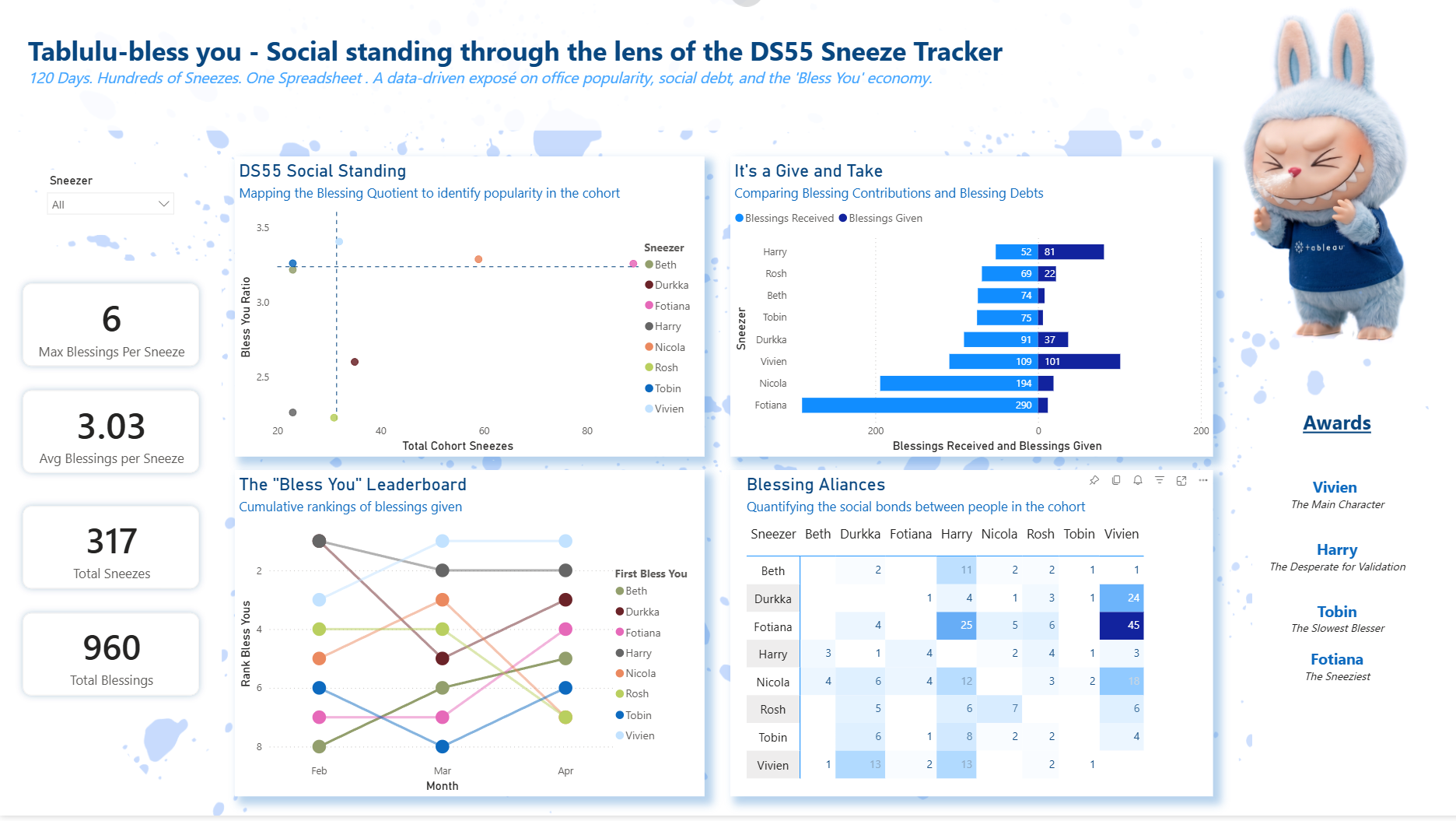
I decided to include some KPIs to show an overview of our sneeze performance (filterable by Sneezer). They are showing the maximum Blessings per Sneeze, Avg Blessings per Sneeze, Total Sneezes and Total Blessings Received. Then four charts are seeking to answer the questions I came up with before:
Top Left Scatter Plot: This is the "Popularity Matrix." It plots Total Sneezes against the Bless You Ratio. It is split into 4 parts, with the median lines, showing peoples popularity judged by the amount of Bless You's they received vs the number of times they sneezed.
The "Give and Take" (Top Right Diverging Bar Chart): This chart visualizes the cohort's Social Trade Balance. It mirrors Blessings Received (light blue) against Blessings Given (dark blue).
- It highlights our "Social Martyrs"—individuals like Vivien and Harry, who have one of the highest "Given" counts, actively sustaining the social fabric.
- It also identifies our "Social Debtors"—those who receive a mountain of blessings (like Fotiana and Nicola (myself) with 290) but have a much smaller footprint in giving them back.
The "Bless You" Leaderboard (Bottom Left Rank Chart):A rank chart that tracks the ranking of the "First Bless You" over time (Feb to April).
Blessing Alliances (Bottom Right Heatmap):The most "deep-tissue" visual on the board. This matrix crosses Sneezers with Blessers.
- Darker Blue Squares represent "Social Pacts." For example, the intersection of Durkka and Vivien (24 blessings) or Fotiana and Vivien (45 blessings) shows incredibly strong interpersonal bonds. Although these loyalties are not always returned, as the Vivien and Fotiana bond is weak.
- The white spaces are just as telling, revealing where social contracts have yet to be signed.
The Awards: To finish it off I wanted to give out awards to some of the people standing out in the dashboard.
I loved creating this dashboard, playing with the implied social aspects. This also shows the social bond we have in our cohort, where we can make these jokes and poke fun at some of the insights. It was a pleasure learning and growing with this cohort and I am curious to see where our sneezes take us.