Today’s challenge was to collect weather data from the website of the National Centers for Environmental Information (NCEI), a department of the National Oceanic and Atmospheric Administration (NOAA).

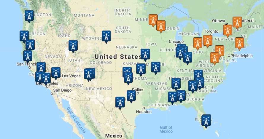
The NOAA website shows you where each weather station is, which you then select on the map to download the dataset.
Luckily, I’ve had experience finding data from this service before. In my previous life, I had to find weather stations nearby to sites where field trials on plant protection products were conducted in order to perform temperature and moisture normalisation on dissipation rates.
In the past, I’ve only ever needed to find one or two sites for two to three years so finding out how to download station data en-mass was a challenge in itself. Attempting to just select lots of stations and download through the web interface gave an error, that too much was being downloaded at once.
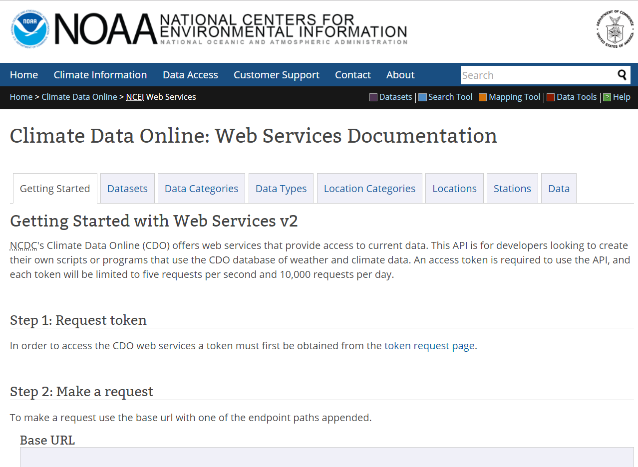
At this point, I looked to see if NOAA had an API that we might be able to use to pull down the data. However, the limitations on the API were too much for us to work around – a limit of 1000 rows per call and 10000 requests per day meant it just wasn’t feasible.

The NOAA web services API. Turns out it’s not that useful with a hard deadline set at the end of the day…
Instead, I focused on stations in the USA with the word “airport” in their names. Even then, there were 40 stations to collate, so I had to download the data in six batches.
The data from these sites varied somewhat in time span and content, so I used Alteryx for some general data preparation. Nothing as exciting as yesterday!

It looks a lot worse than it is.
Once I had the data set up, it was straight into Tableau to build some vizzes.
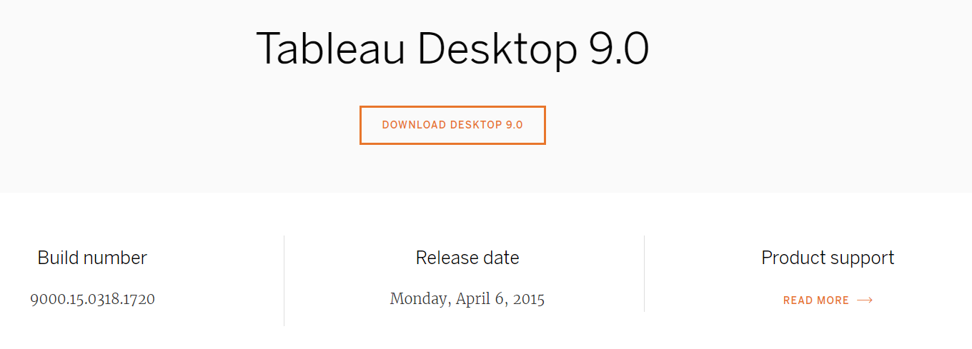
Andy also decided, at 1:30pm, that building a new dashboard every day wasn’t hard enough. Now we also had to revert all the way back to Tableau version 9, released in April of 2015!

Oh the humanity!
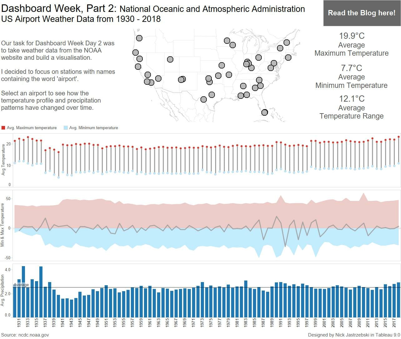
Despite being thrown in at the deep at at late notice with an old version, I managed to dig through the 500,000+ rows of data to get something worth visualising.
Click to viz to see the interactive version on Tableau Public.
Two days down, three (well, more like two and a half) to go!

