The tip of today is inspired by a thought-provoking tweet by our coach and Tableau Zen Master Craig.
I am still not sure about the extent to which I agree with the proposed rule.
I definitely agree that we have to distinguish between the use cases for storypoints and the ones for simple dashboard navigation.
However, while storypoints are very good for telling stories, it doesn’t seem that we currently have a similar handy built-in tool for dashboard navigation.
Therefore, I have to genuinely admit that sometimes navigating through dashboards using storypoints is a satisfactory user experience. But this is not always the case!
In this post I will show you how to create neat and nice buttons for dashboard navigation, which will hopefully improve the design of your dashboard, enhance their interactivity, and avoid you to disturb storypoints again when not needed.
I mean, do you really want to drive a zen master mad??
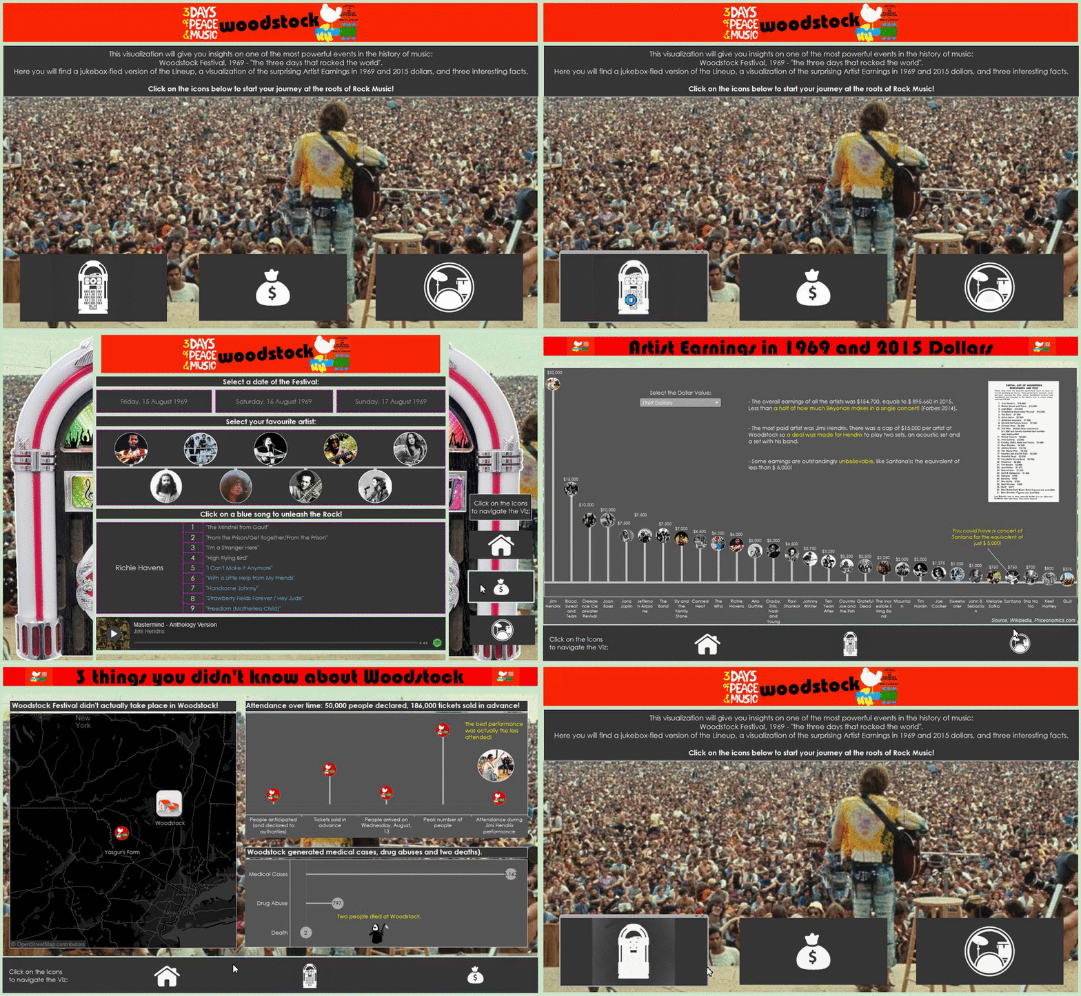
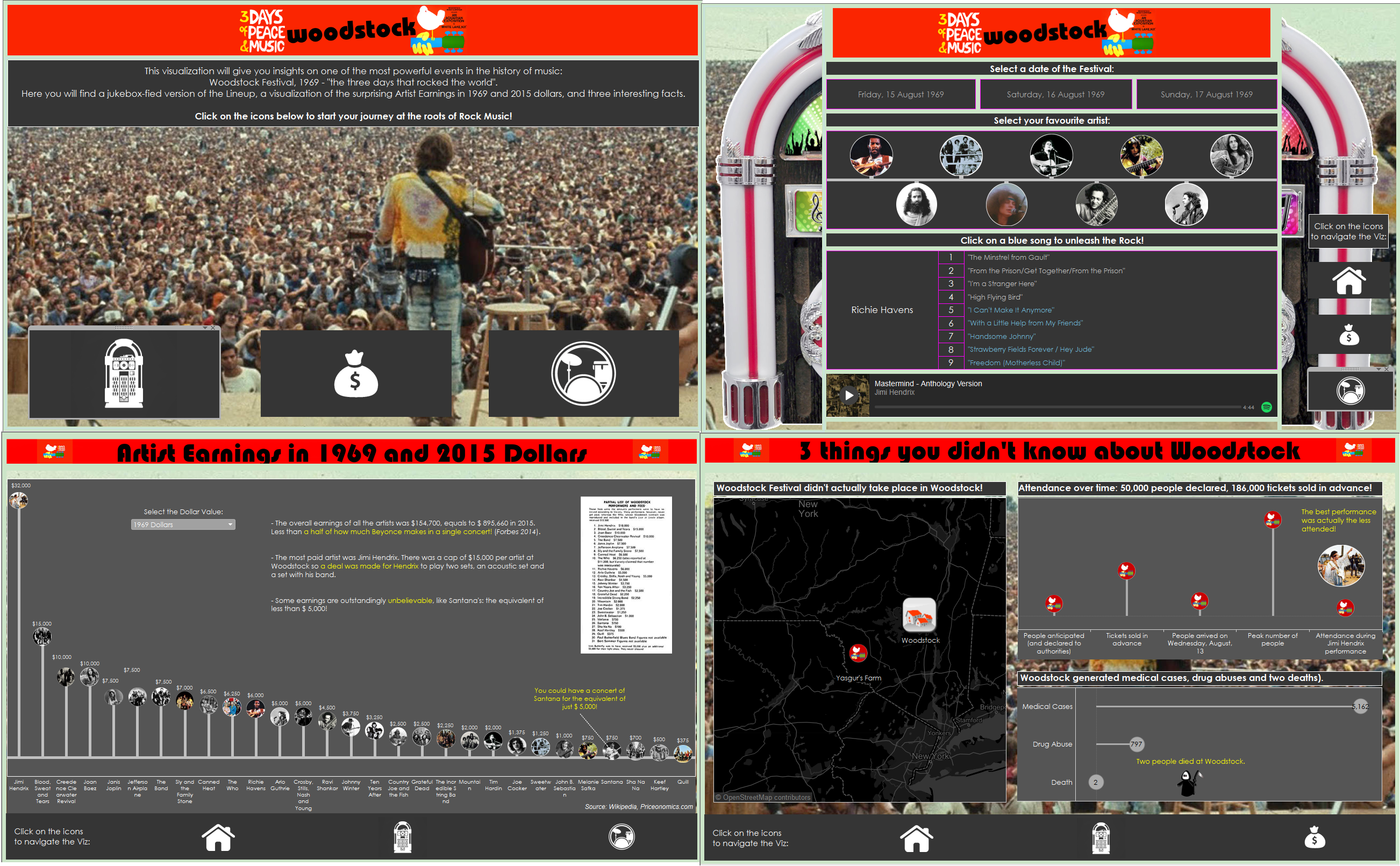
I recently used navigation button for building my entry for the IronViz competition (which you can vote here, if you like it), and therefore I am using that viz as the example of what we want to achieve.
Here below, you can see the final result:
The first step is choosing what we want to use as our navigation buttons, like texts or shapes, and build one sheet for each button, containing only the element we want to be on the button. We can do that through creating a calculated field that contains only a short text, and using it on ‘label’ or ‘shape’.
For my Viz, I used the customized shapes that I created saving a png image into the “Shapes” folder of my Tableau Repository.
Now that you have your buttons, you can just position them on your dashboard as you prefer.
As a Best Practice, you should replicate the buttons on each dashboard in the same position, to let your end user navigate the story smoothly (note that I wasn’t able to maintain the position because of the jukebox):
Now it’s time to make them work!
Let’s go to the “Dashboard” menu on the main bar, and select “Actions”, in order to open the following window.
What you want to do here, is to click on the “Add Action” button and select “Filter”.
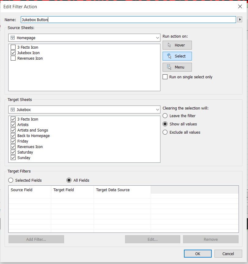
In the new window, you want to tell Tableau to show the Jukebox Dashboard when people click on the Jukebox button. Therefore, you should configure the action as follow:
Just repeat the process for each of the buttons on each of the dashboard, and you are done!
Here you can find another extraordinary use of this technique, by Tim Ngwena!
We are half the way through our #TableauTipWeek here at the Data School: Tune here again tomorrow!


