Histograms are great for summarising and showing you the distribution of values within your dataset. It does this by grouping these values into 'bins'. There are also a variety of distributions: Normal, bimodal, right-skewed, left-skewed and random distributions. These charts are useful for exploring your data because they help you see how often distinct values occur and as a result, allow you to spot any trends or patterns.
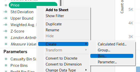
For this example, we want to see the distribution of prices across London Airbnbs. To begin with, we will create a bin from the 'Price' measure.

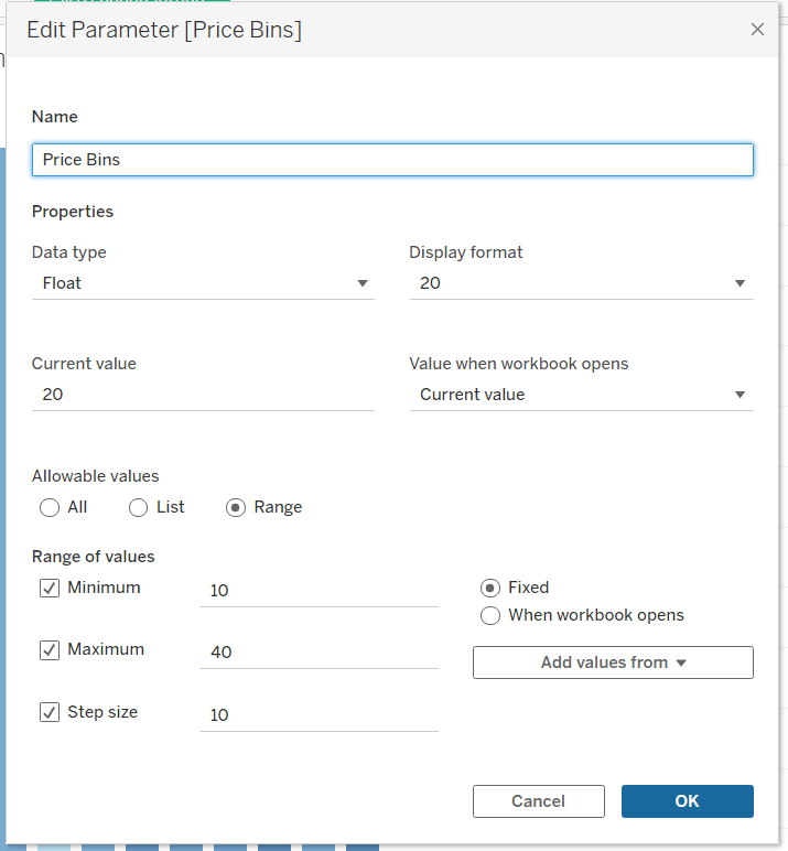
To make the histogram dynamic (allowing the user to select different bin sizes), we will create a new parameter.

Within the parameter, select 'Range' (or 'All' if you want your user to be able to type in their own bin sizes). Here is where you can select your minimum, maximum and step size. For this example, I chose the values shown in the image below.

Now that this has been created, drag 'Price (bin)' onto columns and the count of the values within your dataset (in this case the London Airbnb listings). As there are many values within this dataset, we will only look at the Airbnbs with prices <= 400. Drag the 'Name' field to the filters pane and create the conditional filter.

The chart is complete but before it's finished, we will drag 'Minimum Nights' onto colour so we can garner some more detail from the chart.

