


...And here we are, the final day of training! Our very short dashboard week is drawing to an end and here is my journey of the last 6 (or so) hours!
The brief:
Today's task, as set by coach Andy Kriebel (who knows a thing or two about Tableau!) was to take the provided dataset and have some fun with it; build things that we've always wanted to try, without having to worry about visual best practice. Say goodbye to BANs, KPIs and boring bar charts - bring on the art! The data itself was around Art Garfunkel's library and the many books he has read throughout the last half century or so.
What did I want to build?
As soon as I saw the task, I was immediately reminded of an awesome viz I'd seen recently, published by Luke Abraham, around US serial killers. One of the key features of this dash that I've always liked the look of is the arch diagram, and so I knew I'd love to give that a try! Given the presence of 'start' and 'end' dates in my data, I also clicked on that this was a more than suitable dataset given the chart type.
How did I build the arc diagram?
When it came down to building the chart, I actually followed a great tutorial from Toan Hoang, which includes the equations and steps needed to build this in an incredibly clear and concise manner!
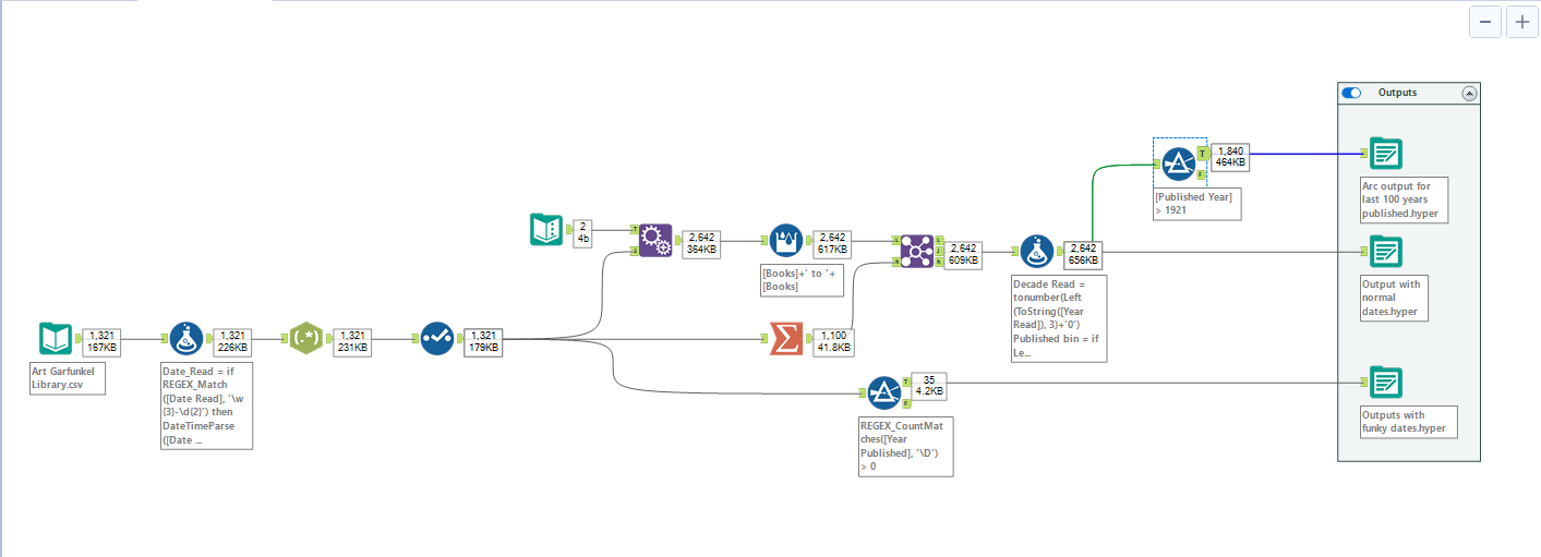
You'll note that the data needs to have certain elements when plugging this into tableau, and so I conducted a little bit of necessary prep in Alteryx to achieve this. Once I started building, I also went back and made some extra changes to my data in order to group years into decades and such to clean up the overall look of the chart. Finally, I broke off an extra dataset for books published BC and used this to build a simple jitter plot, as you'll see on my dashboard.
Final dashboard:
Overall I'm pretty pleased with the final dashboard and have had a great time building it today. Throughout our training we have constantly stuck to certain branding, appropriate chart types and often templates provided by clients, and so it was really refreshing to just relax for a day and build stuff simply because it's cool. If you'd like to check out the full, interactive dashboard then you can do so here. Otherwise, there's a screenshot below!