It's finally here, the infamous 'dashboard week'! For those of you unaware, this always falls on the final week of each cohort's training and each day requires us to process a brief, download and scope the data, take on any necessary prep, build out sketches and then create our final dashboards, before writing a blog and then presenting our day's work! So here it is, the first of three (thanks to the queen!) from myself...
The data:
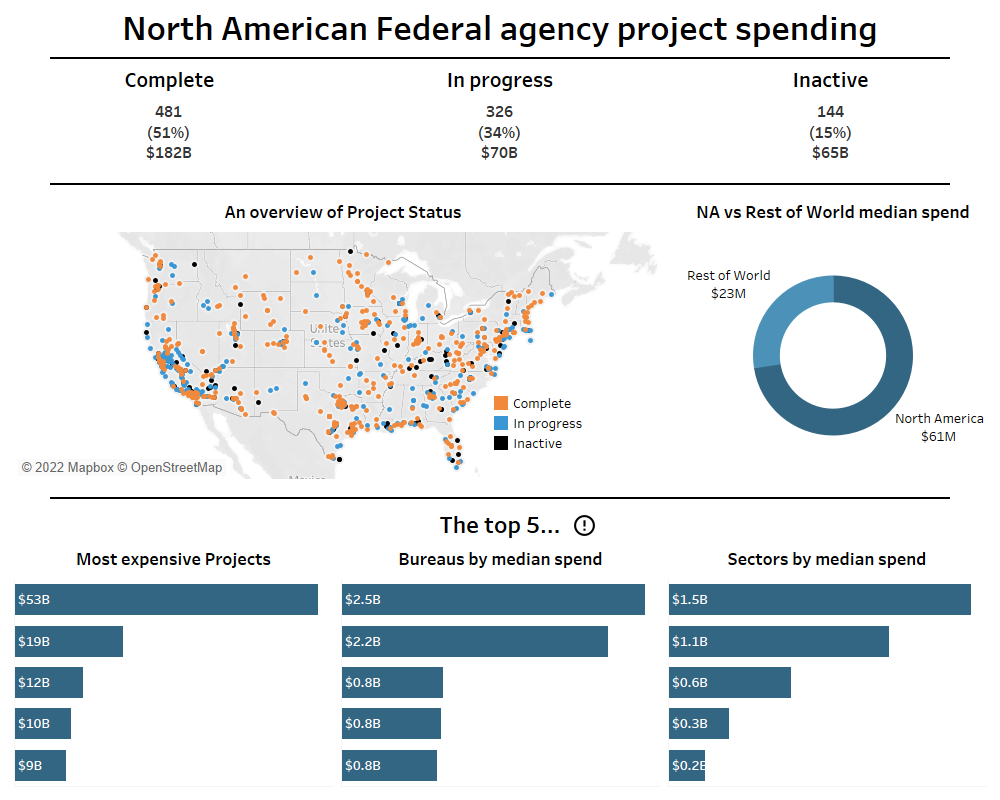
Today's data came from the 'Permitting Dashboard' website - a government initiative to create more transparency and accountability when it comes to federally-sanctioned projects. After a brief bit of scoping, I noticed that there was a lot of useless fields; many of them had far too many nulls to allow meaningful analysis or comparison and others were from free text inputs which, again, wouldn't provide much use in a dashboard. On the other hand, there were some obvious columns that instantly stood out as valuable for a dashboard focused on providing insights. I decided to direct my focus towards project costs and status, agencies and sectors as well as spatial data, as they would likely allow for interesting and valuable stories within the data.
Data prep:
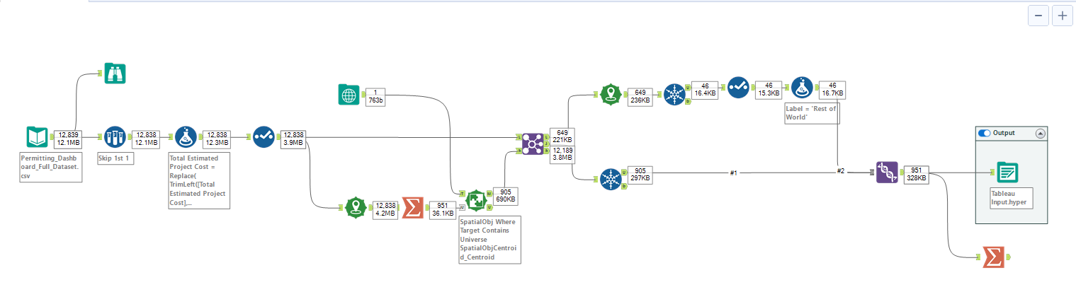
When it came to hopping into Alteryx, the data itself didn't actually require any heavy clean-up. Most of the work here was just to remove things like punctuation and ensure that fields were in a format that Tableau would be able to make sense of. However, one thing I'm particularly happy with is my use of the spatial tools here. As I mentioned above, there was spatial data - in the form of longitudes and latitudes - within the data set. After creating points and viewing these on a map, I noticed that the vast majority sat within North America. Therefore, I turned my attention to this region as it was rich in data. However, I still wanted to throw in a little bit of comparison to see how America spent, on average, compared to the rest of the world and so I used spatial matching with a custom built polygon in order to label the two groups as 'North America' and 'Rest of World'. Finally, there were multiple entries for each project as there was one for each internal milestone. Therefore, I made sure to include unique tools to draw out one entry per project and prevent duplicates of costs and such.
Sketching:
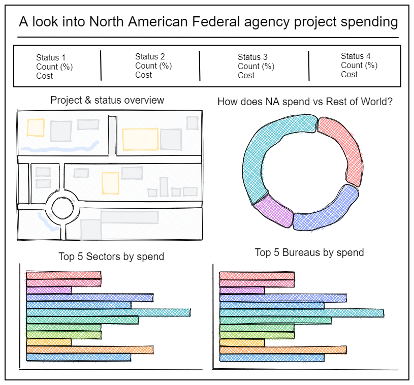
In terms of sketching, I knew I wanted to keep the dashboard fairly clean and just include a handful of charts, as well as some useful BANs. Throughout the last few weeks, we have been putting a load of interactivity into visualisations to allow for client requirements. However, as the focus of today was just on key insights, I thought I would pick a few and just stick with those as a static view. I elected to include some BANs of how many projects were in each stage, as well as a few 'Top 5s' that I think are always valuable, using metrics that would probably be most obvious/valuable if someone were to look at this with the goal of making curbing spending etc. Finally, as mentioned previously, I also made a brief comparison of North America to everywhere else.
The final dashboard:
Looking back at my scoping, sketch and intended output, I'm actually pretty pleased with my closing dashboard for a day's work. Sure, I would have loved to pack it full of interactivity and maybe even bring in other data to help flesh it out. However, in terms of the source provided, I think I've been able to put together something meaningful that allows the viewer to quickly pull some useful, key insights from the data. If you'd like to check out the full, interactive version of the dashboard then you can do so by clicking here.